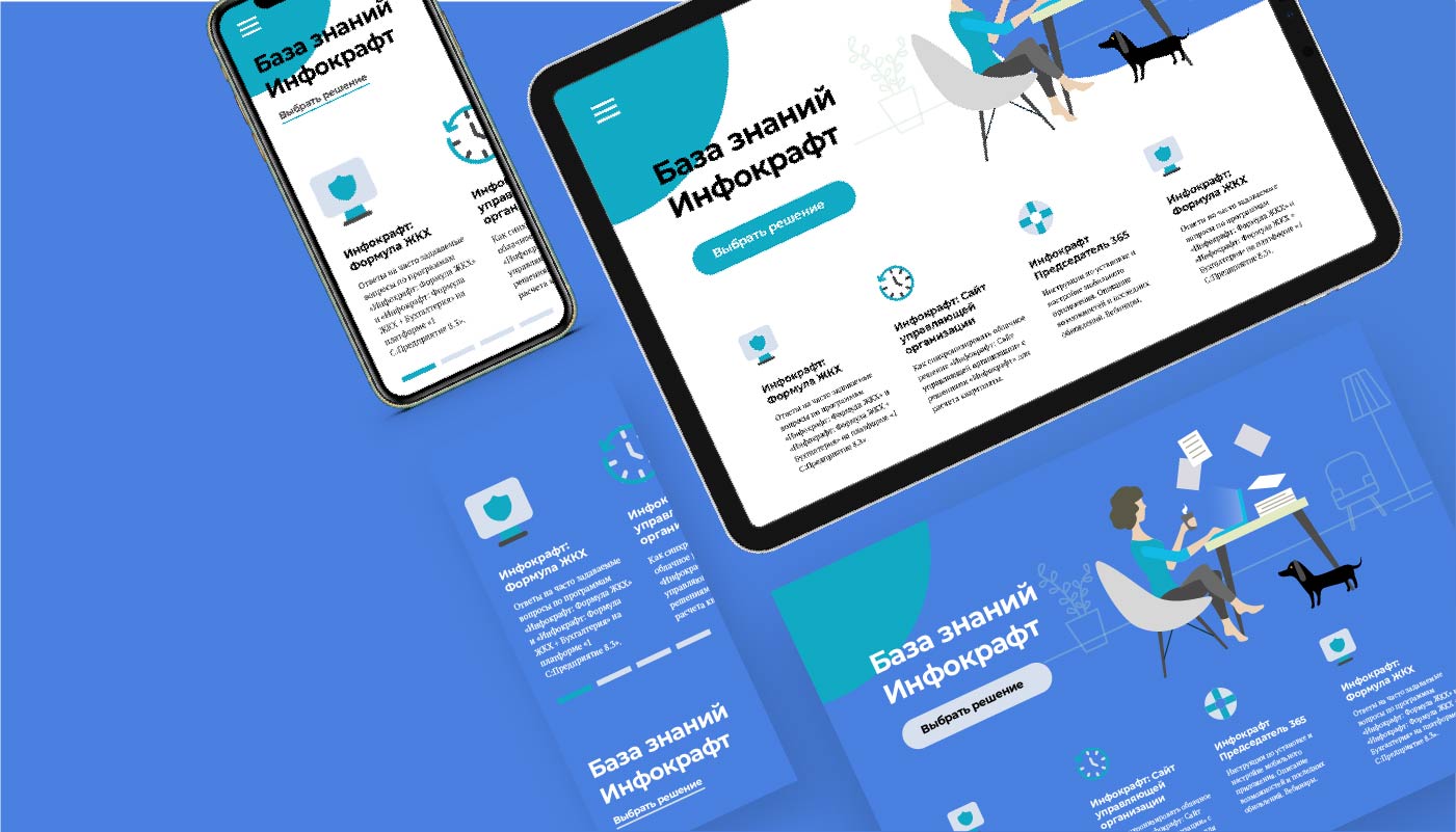
Typography
Montserrat and PT Serif in print and digital communication.
Typefaces
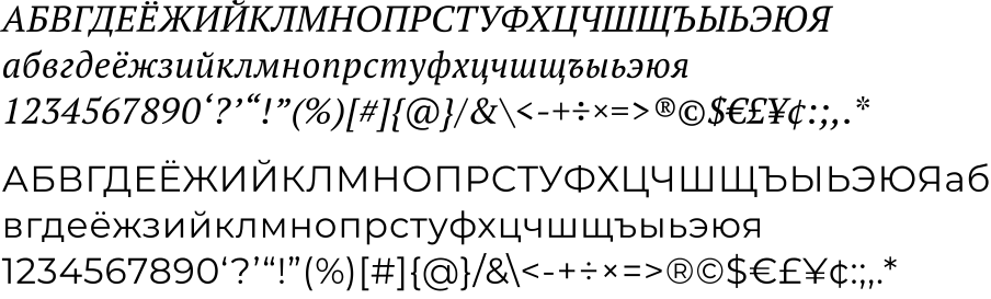
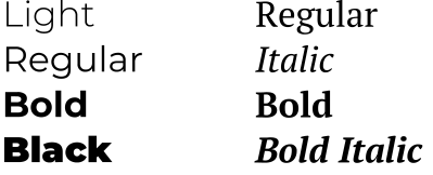
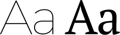
Montserrat is the geometric sans serif of the identity. Pair it with PT Serif: use Montserrat for headings and shorter text, and PT Serif for longer passages. Both families support printed and digital communication.
Principles
Use Montserrat ExtraBold to express the main idea. Keep headings short and simple, ideally three to six words. The source artwork demonstrates the intended spacing and hierarchy.
Studio navigation and explanatory text use Brenda Studio’s Cygre. The original specimens above show Infocraft’s own typefaces.
Examples
Keep the relationship between the two families consistent across documents, advertising and digital layouts. Montserrat gives headings a direct voice; PT Serif carries extended reading.