
Logo
The symbol, wordmark and rules for consistent use.
Brand lockup
The primary lockup combines the stylised Cyrillic “и” symbol and the wordmark. Use the supplied alternatives when the format or background calls for them. Keep the elements and their proportions intact; do not redraw or rearrange the lockup.



The symbol can appear independently in the applications described in this guide.
Brand symbol
The symbol is a stylised Cyrillic “и” with a hidden upward arrow. Use the supplied colour versions for white and dark blue backgrounds.


Architecture
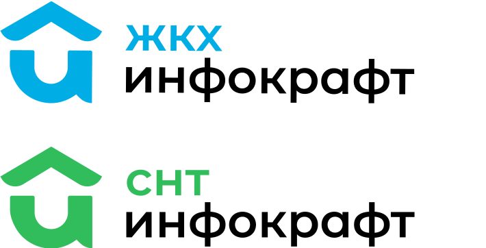
The identity extends to product solutions, desktop software and mobile applications. Each version belongs to the same family while adapting to its purpose.

Clear space & minimum size
Keep a clear area around the symbol and lockup. The original construction drawings use X as the minimum spacing unit. Keep other elements outside this area.
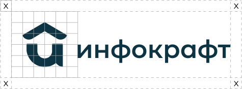

These are the minimum sizes of the symbol. Always check that the complete signature remains clear and readable in its final application.