
Research
Study the product, audience and competitive environment.
Turning a software company’s promise into a connected identity for the corporate brand, its products and the people who use them.
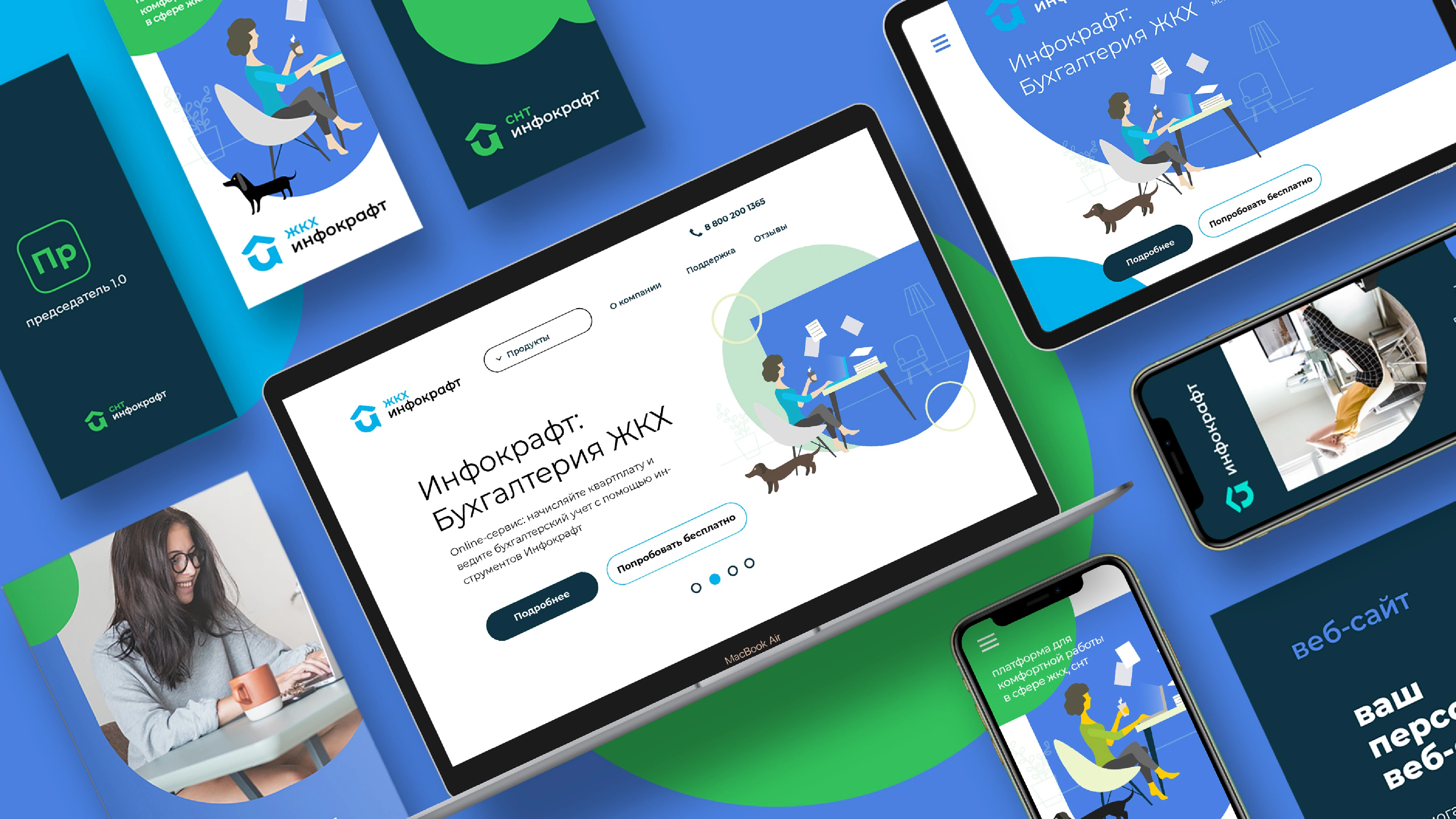
Infocraft develops software that helps professionals automate work in housing and communal services. The brief called for a redesigned logo and a visual communication system for a family of specialist software products.
The challenge was to connect the company and its products without making every expression identical. The identity also needed a friendlier, more contemporary voice for a technical category.
Study the product, audience and competitive environment.
Clarify the corporate brand and the way its product family is named.
Express useful automation as a “digital engine”.
Translate that idea into a symbol, shapes, colours and practical rules.
The strategy described modern automated solutions for professionals who value their time. Its mission was to make working life simpler.
“Digital engine” gave that promise a tangible image: software that helps move a business forward. It became the bridge between the strategic work and the search for a visual identity.
 The digital engineAutomation / Momentum / Support
The original presentation records several directions: the Cyrillic initial, documents, cloud services, the built environment and screens. These drawings show how the same strategic idea could lead to different visual structures.
The house-related route connects the software to the world it serves. The sketches test how that association can become a compact, recognisable symbol.
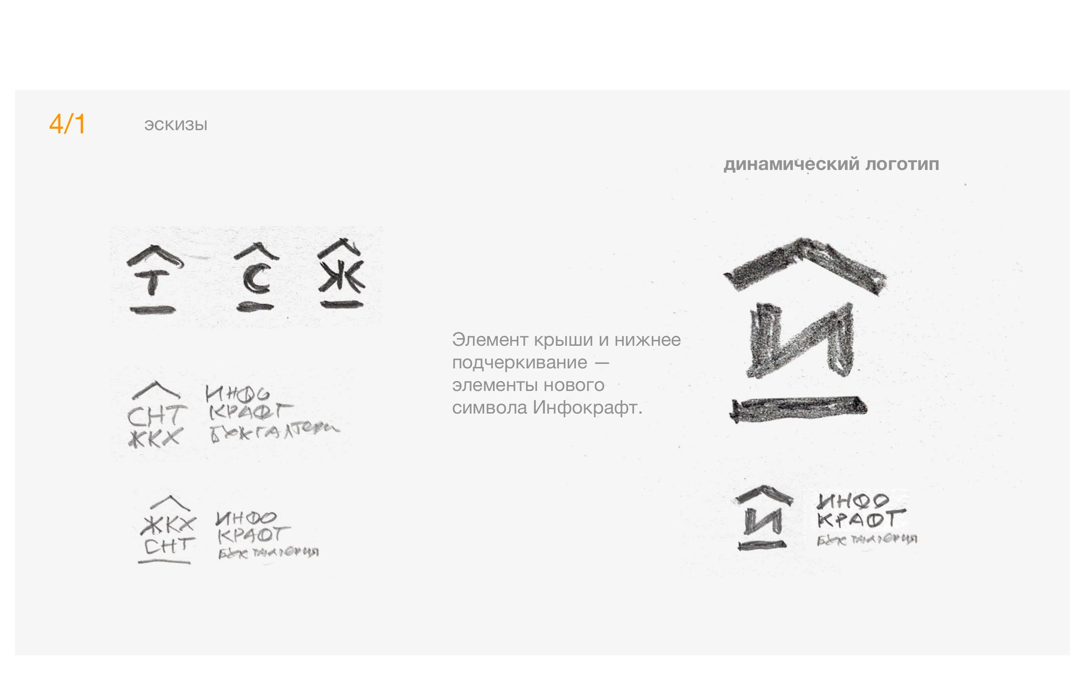
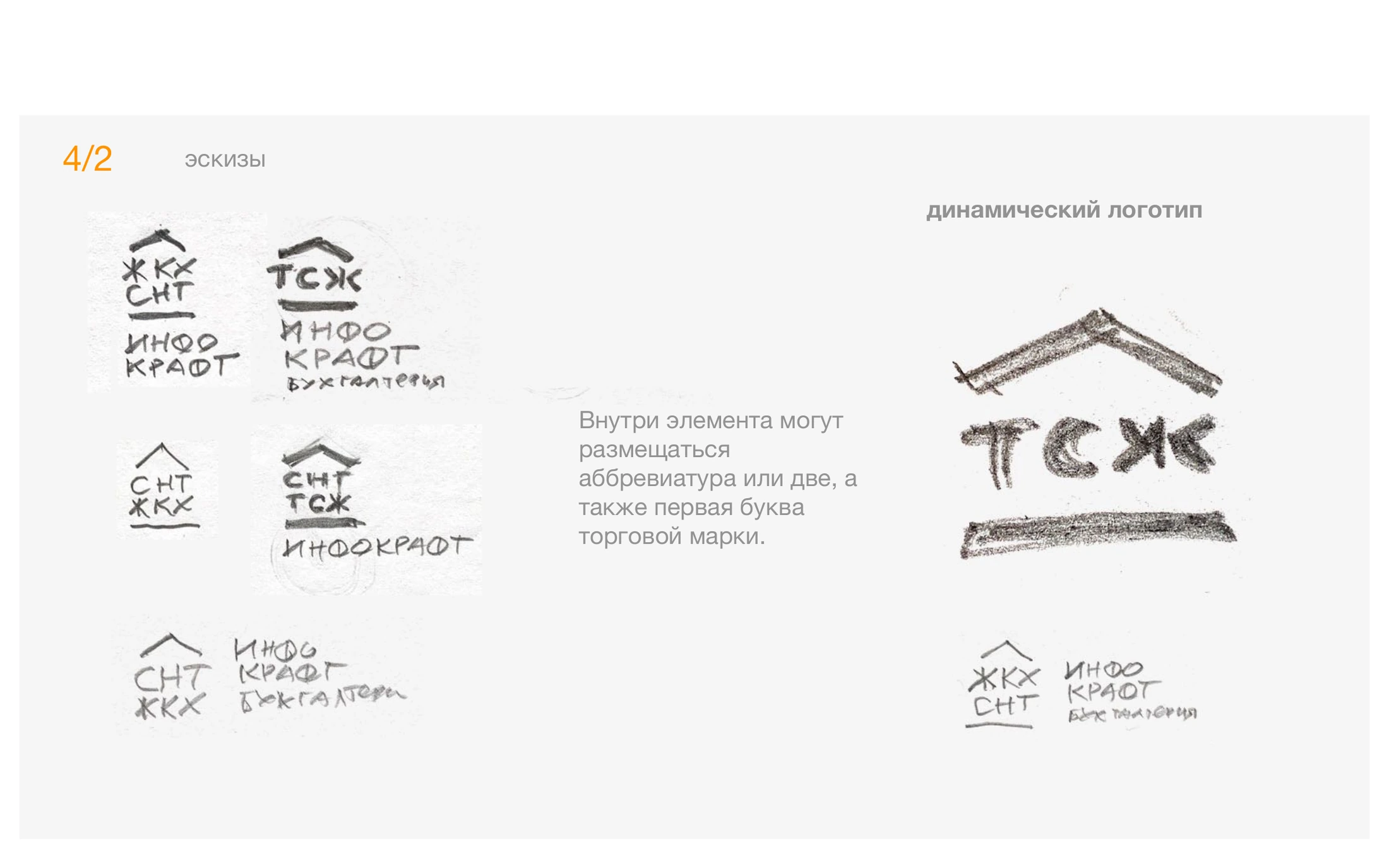
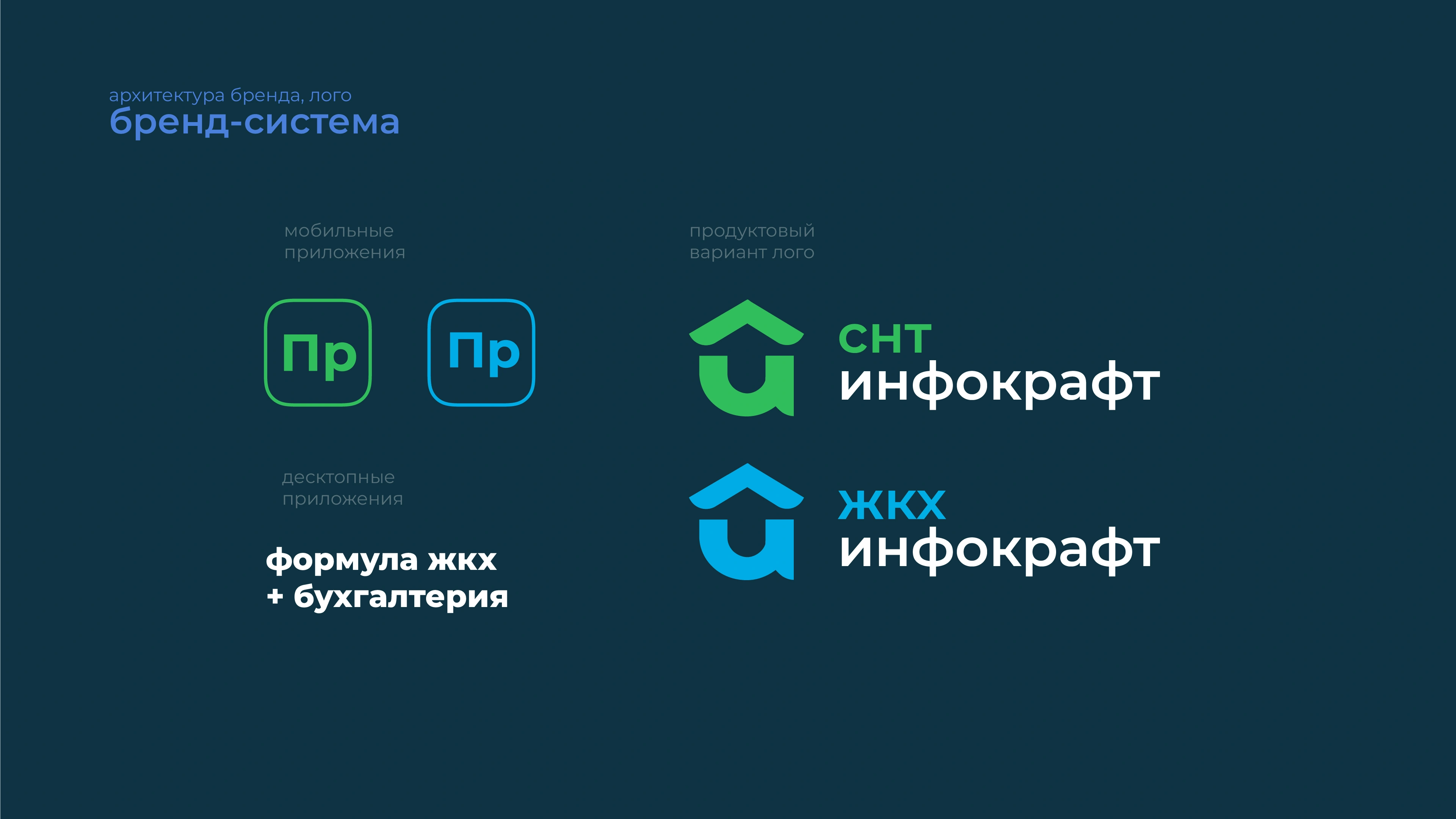
The final system brings together a compact symbol and a clear wordmark. Corporate and product identities share a family resemblance, while their colours and application marks help express different roles.
The guidelines distinguish the parent brand from housing-services and garden-community products. Recognition comes from the relationship between the elements, rather than a single logo repeated everywhere.
 Original identity / Preserved in its source language.
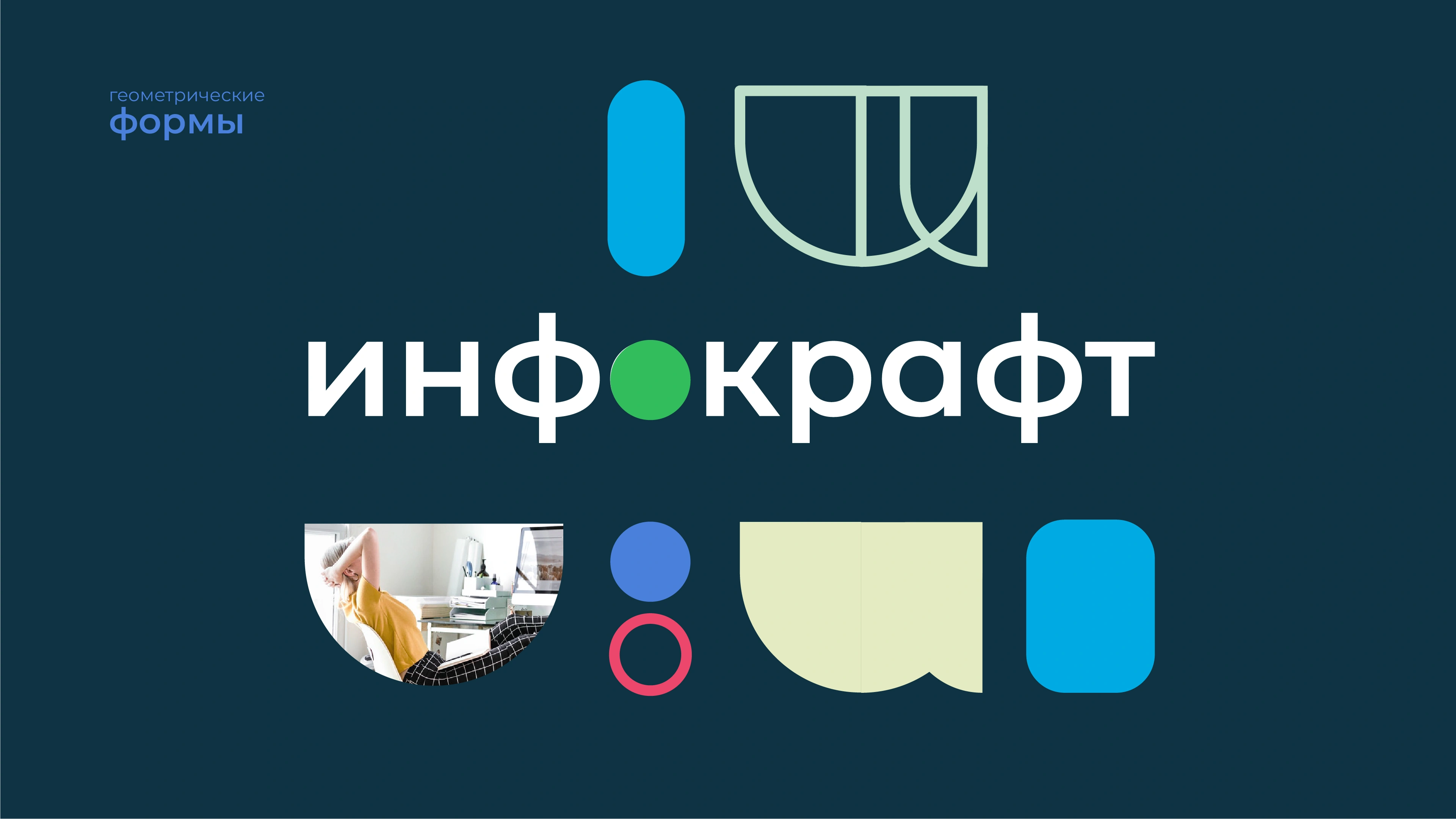
Rounded geometric elements create a repeatable graphic vocabulary. Colour, illustration and photography give the system a broader range of expression across communication.
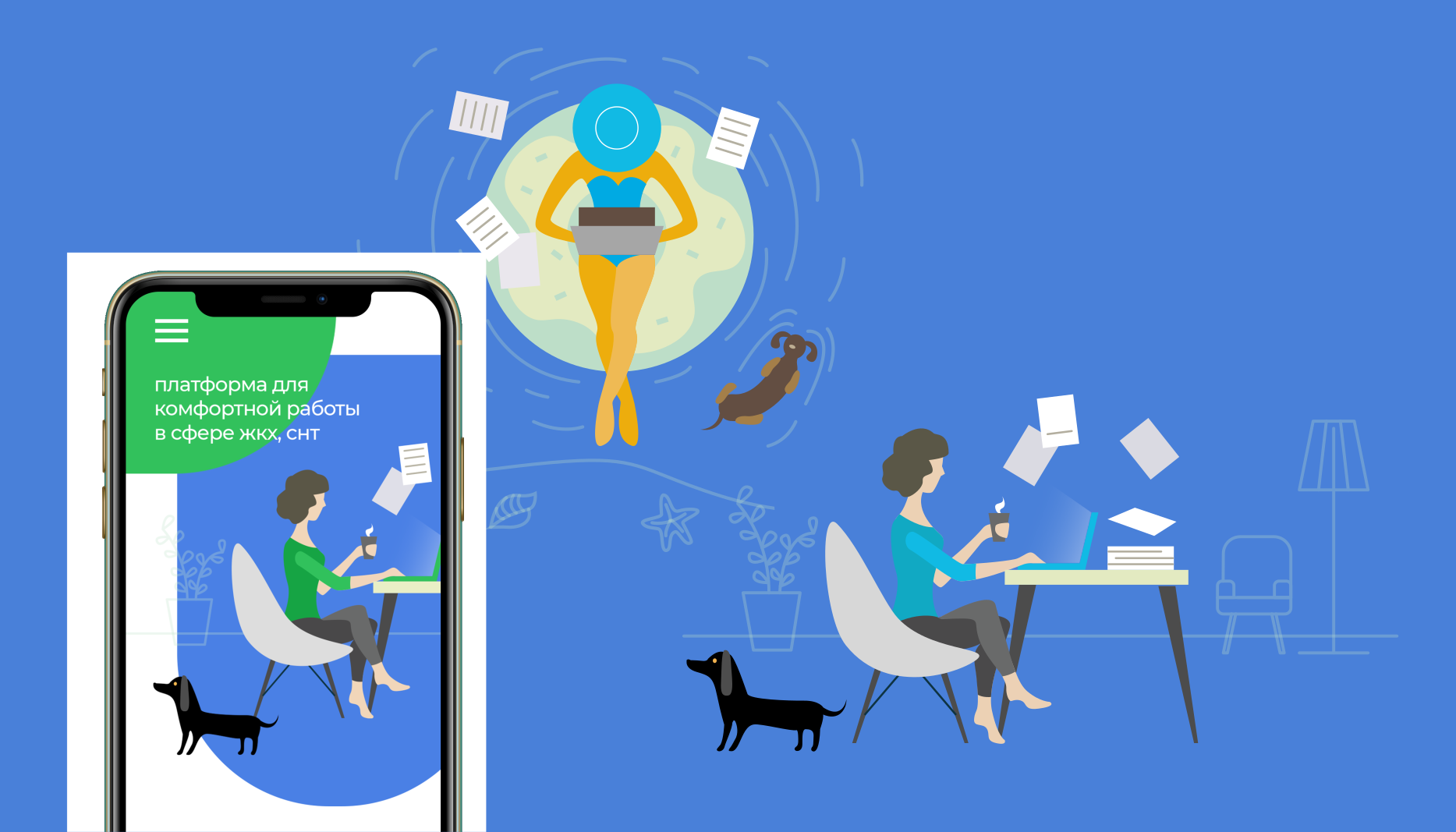
Human working situations soften the technical subject. The original illustrations bring people into the software story, while the graphic rules keep different formats connected.
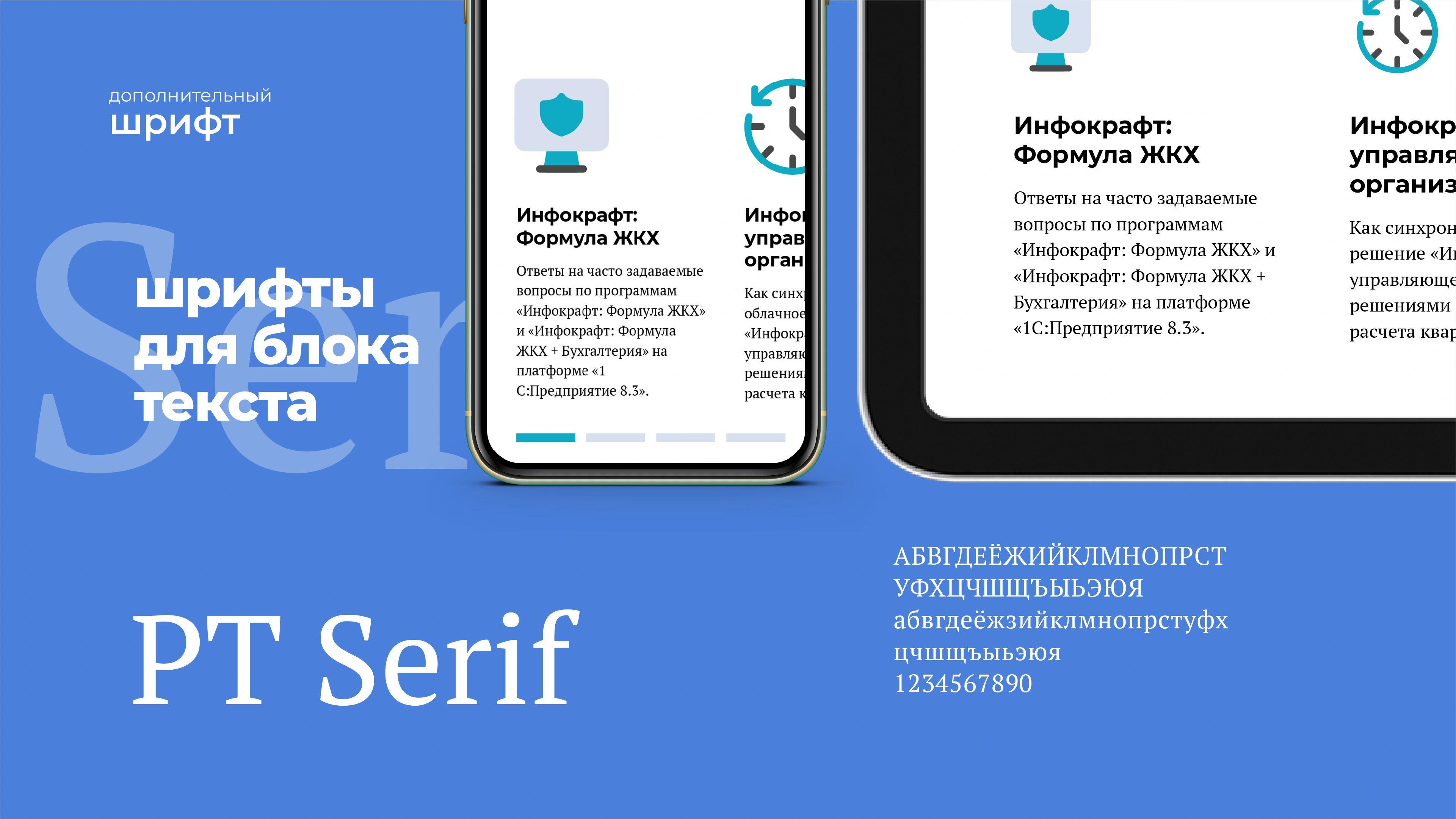
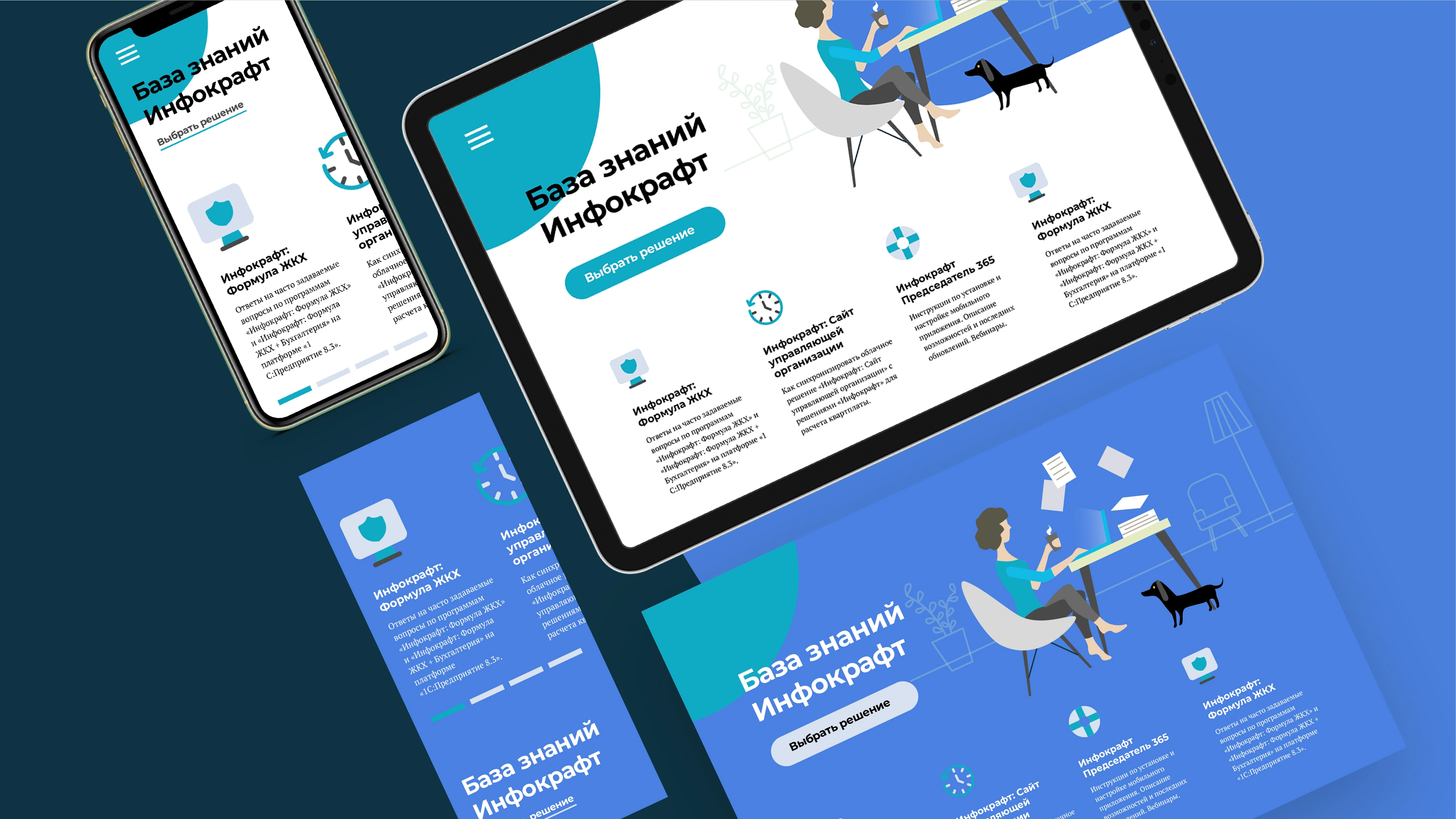
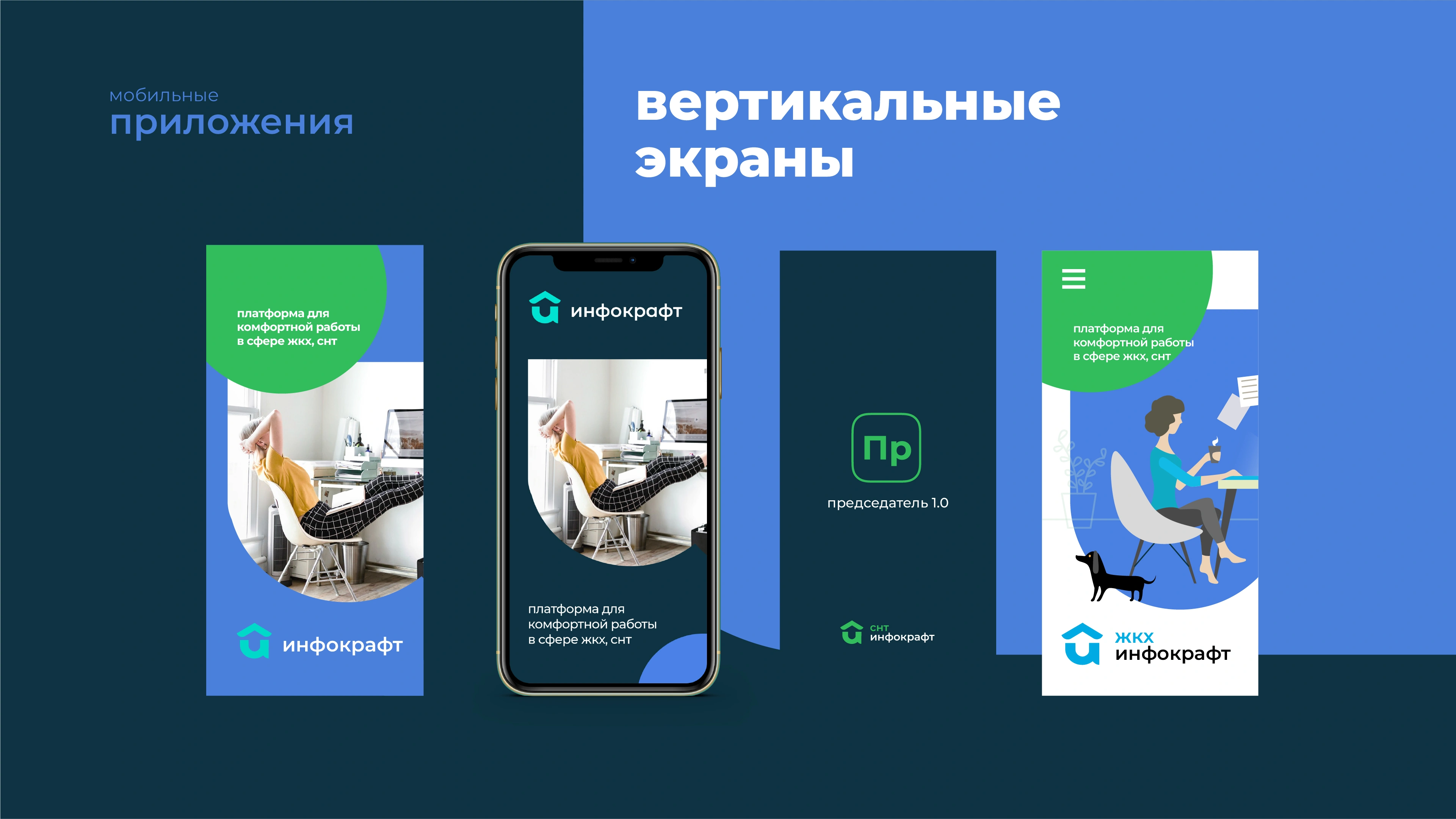
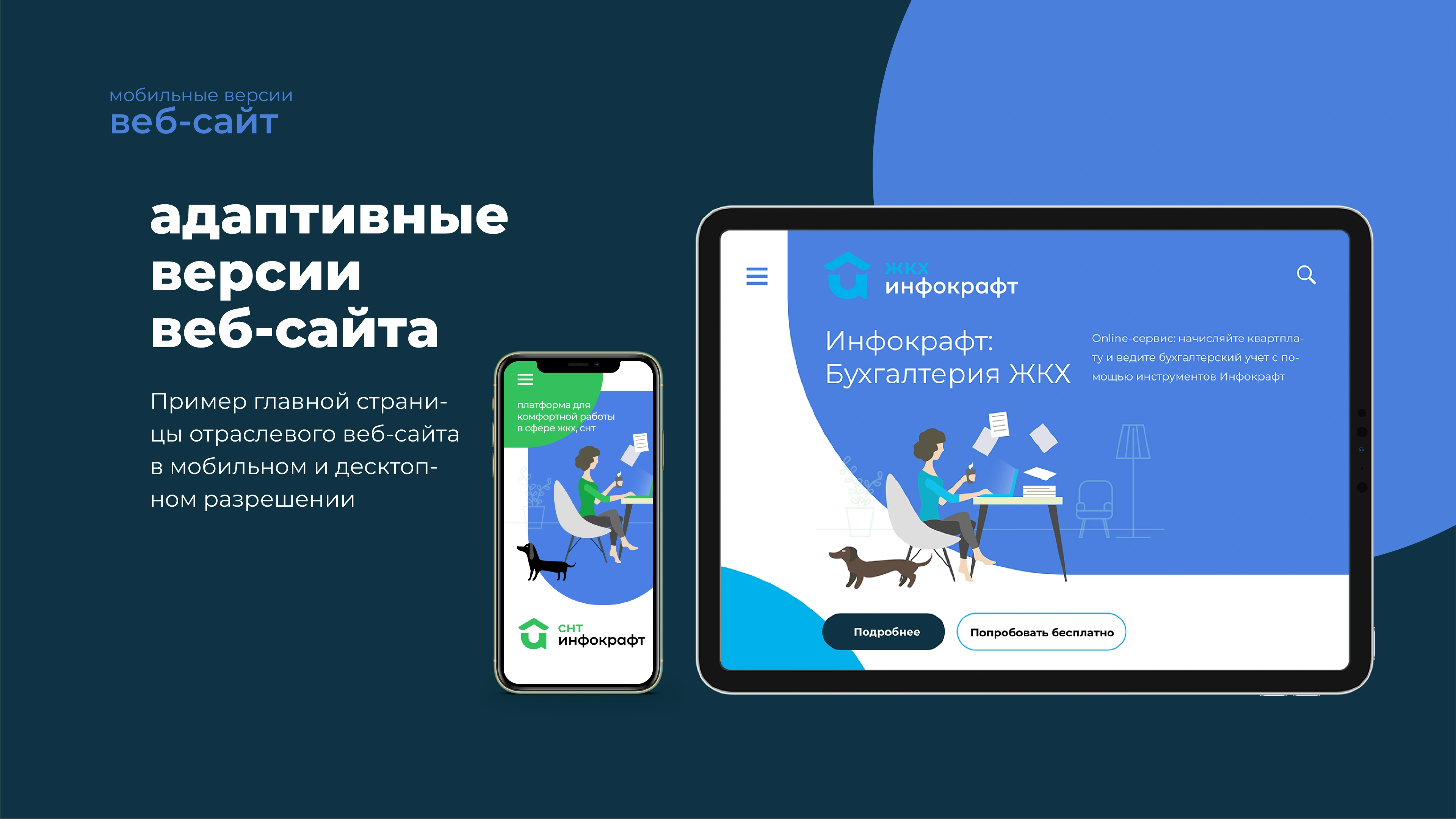
Corporate and product websites, with layouts adapted to desktop and mobile screens.
A related identity for mobile and desktop products, with platform icon configurations.
A human visual world, from the professional accountant to the dachshund companion.
Explore the complete working guide: logo rules, product architecture, illustration, typography, colour and layouts.
Logo and product architecture. Responsive websites, application icons, illustrations and practical design rules.
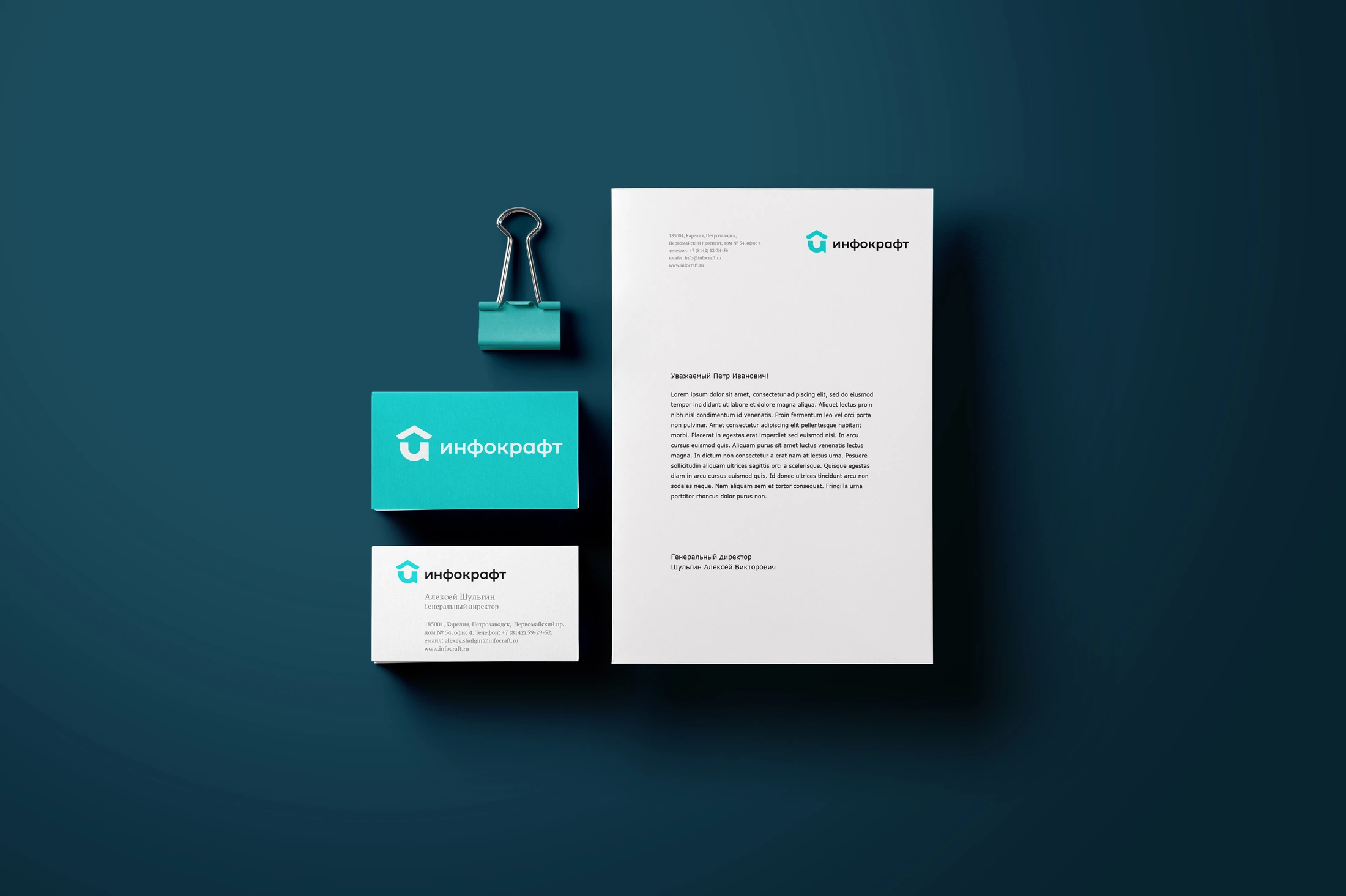
Explore the guideThe identity is presented across corporate stationery, product interfaces, websites and printed communication. The guide gives these different materials a shared point of reference.
The project connects a practical promise—making professional work simpler—to a visual system and a guide for applying it. That is the role of our method: give the visual decisions a clear foundation, then make them usable.
Project archive · 2019. Original artwork and the published guide are presented in Russian.