Brand
character.
Who are we?
What makes us different?
How should we feel?
We find the idea at the heart of your brand. Then give it a name, a form and a visual language of its own.
Explore our branding processOur in-house approach connects research and strategy with creative expression. Each stage gives the next one a foundation, from understanding the category to building the assets a brand needs.
At its centre is a brand metaphor: an idea that makes a brand’s character tangible. It gives us a direction for naming, symbols and the visual system that follows.
Who are we?
What makes us different?
How should we feel?
A clear creative idea that connects what the brand means with how it looks and speaks.
Symbol. Typography. Colour.
A connected system.
Recognisable applications.
Explore the thinking, the work and the outcome at each stage. The scope is shaped around your project; naming becomes part of the process when a new name is needed.
We study the business and the world around it. The product, the people it serves, the market and its competitors give us the context for meaningful design decisions.
A clear view of the category, its conventions and the opportunities to stand apart.
One stage informs the next.
A connected process, with room to revisit and refine as the idea develops.
For Tadiran, the “master of climate” metaphor connected the brand’s technical character with a visual language built around a T, a circle and flowing forms.
Explore the Tadiran case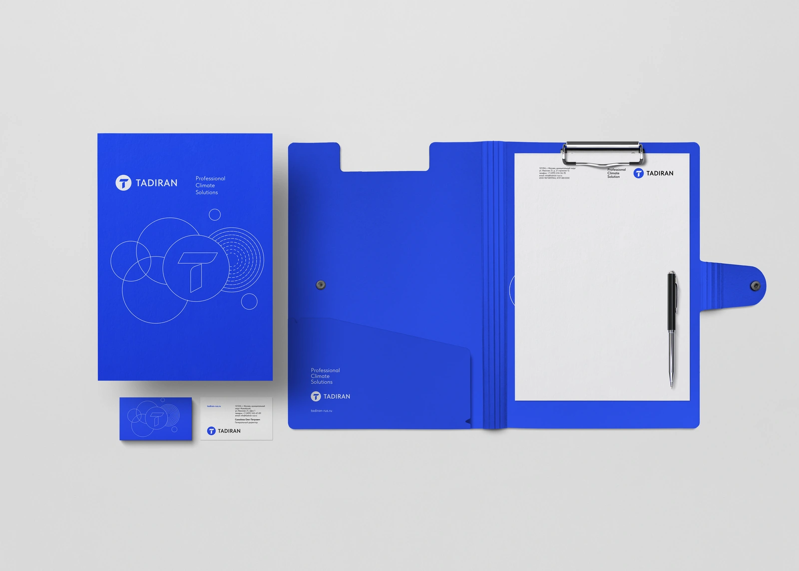 STRATEGY → SYMBOL → SYSTEM
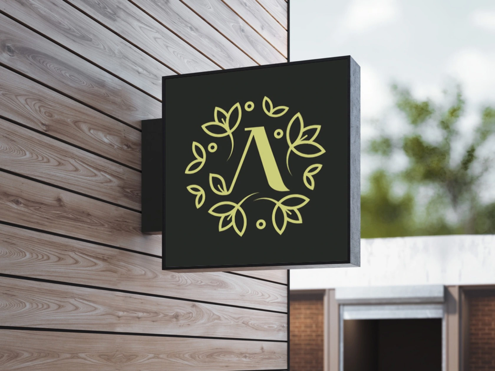
For APA, the sunflower metaphor transformed the idea of a professional community into a circular symbol and a connected visual language.
Explore the APA case COMMUNITY → METAPHOR → IDENTITY
A product concept becomes a visual system: expressive crop forms paired with a structured wordmark, developed through original sketches and practical application rules.
Explore the Croptainer case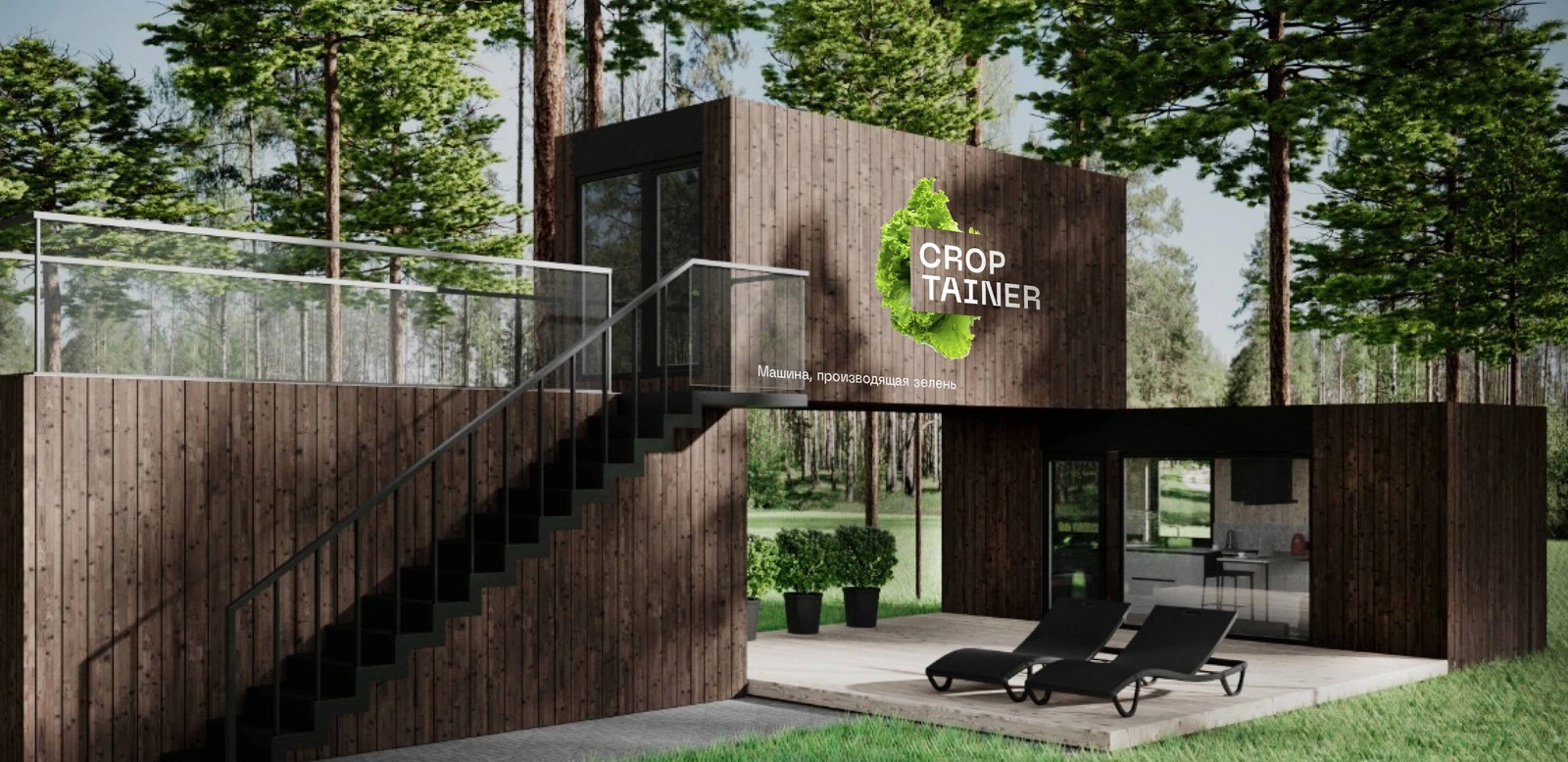 PRODUCT → IDEA → VISUAL SYSTEM
Research and a brand metaphor connect a software company’s identity, product family and illustrated world. An online guide brings the system together.
Explore the Infocraft case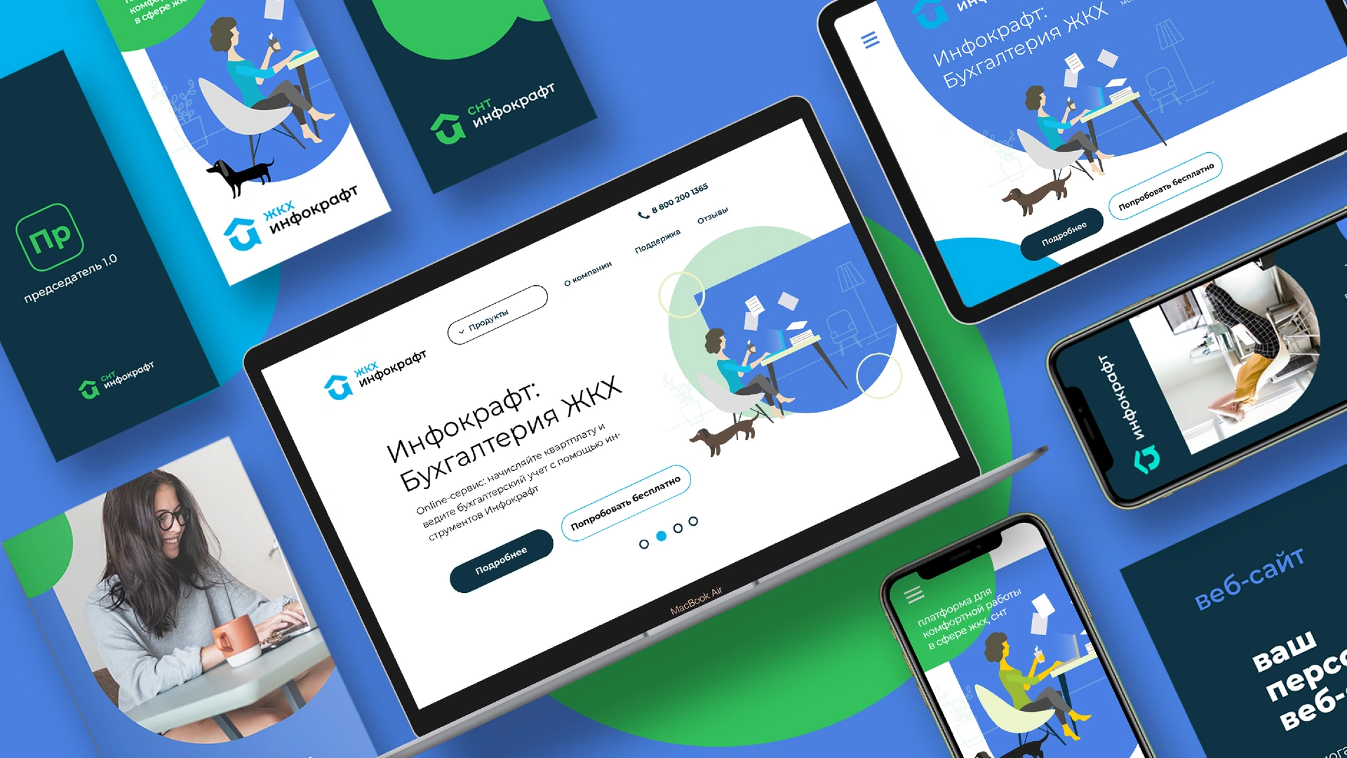 RESEARCH → METAPHOR → BRAND SYSTEM
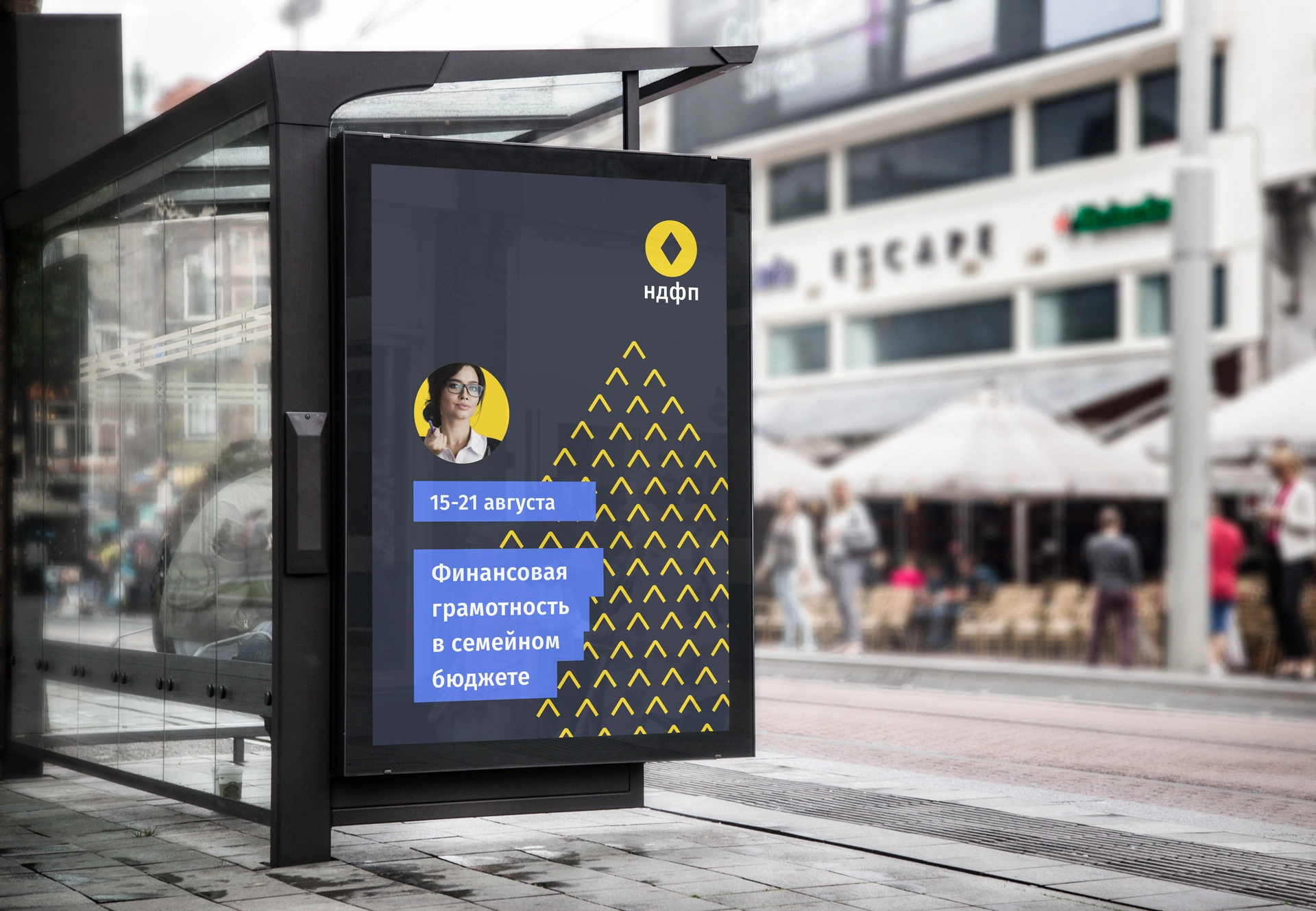
A guiding idea becomes a compact symbol, an arrow-based graphic language and practical brand guidelines for a financial education organisation.
Explore the NDFP case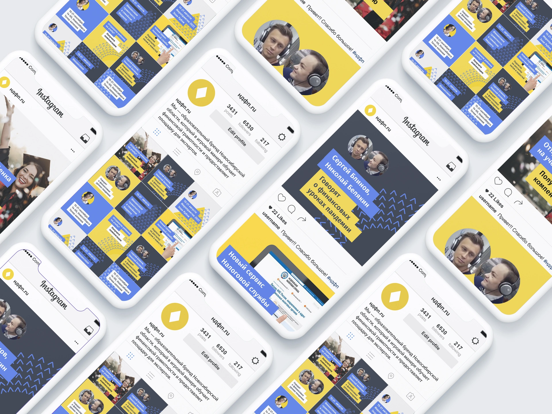 KNOWLEDGE → DIRECTION → IDENTITY
Yes. Research helps us understand what should be kept, what needs to change and where the identity can develop. The scope can be a focused evolution or a wider rebrand.
When a new name is needed, naming follows the strategic direction and brand metaphor. The name and the visual identity are developed around a shared idea.
The process is a framework, not a fixed package. We define the appropriate stages and deliverables around your starting point, priorities and project scope.
The agreed scope may include research and strategy presentations, a logo, a visual system, brand guidelines, packaging and digital design. We establish the deliverables together before the work begins.