Tadiran / Brand strategy & visual identity01 / The brief
Technical confidence. A recognisable character.
Tadiran develops air-conditioning and climate systems. The project set out to translate a character built around innovation, reliability and modernity into a clear brand identity.
The design brief called for a logo that expressed the brand metaphor, remained legible and stood apart in the competitive environment. The work then extended into the principles, elements and applications of a wider visual system.
02 / Design challenges
Three questions. One connected system.
01
Stand apart in a blue category.
Our category review found blue recurring across climate brands. The question was how to stay relevant to the category while building a recognisable expression of our own.
Our response
We connected electric blue with a distinctive T-in-a-circle symbol and a graphic language derived from that same form.
02
Make an invisible benefit visible.
Temperature, air quality and comfort are experienced rather than seen. The identity needed to give these ideas a clear visual expression.
Our response
The strategy’s “master of climate” metaphor informed a symbol with flowing lines and a circular system that suggests movement and control.
03
Keep the identity clear at every scale.
A mark on equipment has different demands from a presentation cover or a business card. Detail, colour and contrast needed to work across those contexts.
Our response
We developed direct, reversed and monochrome expressions, alongside flat and dimensional graphics, with simplicity as a shared principle.
03 / The strategic idea
Mastering indoor climate.
The strategy used the metaphor “master of climate”: the ability to manage temperature, humidity and air quality to support comfortable living and working environments.
That idea became the bridge between the brand’s character and its visual expression. Innovation. Reliability. Modernity.
04 / The symbol
A letter. A circle. An idea.
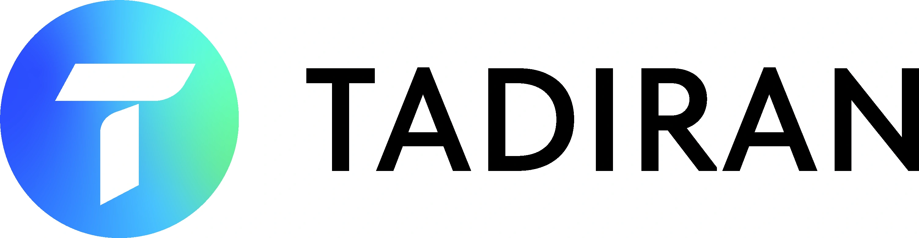
The symbol combines a T and a circle. Flowing lines suggest air movement; the compact letterform gives the brand a clear, modern signature.
The system includes colour and monochrome versions, so the mark can move between expressive communications and practical product applications.
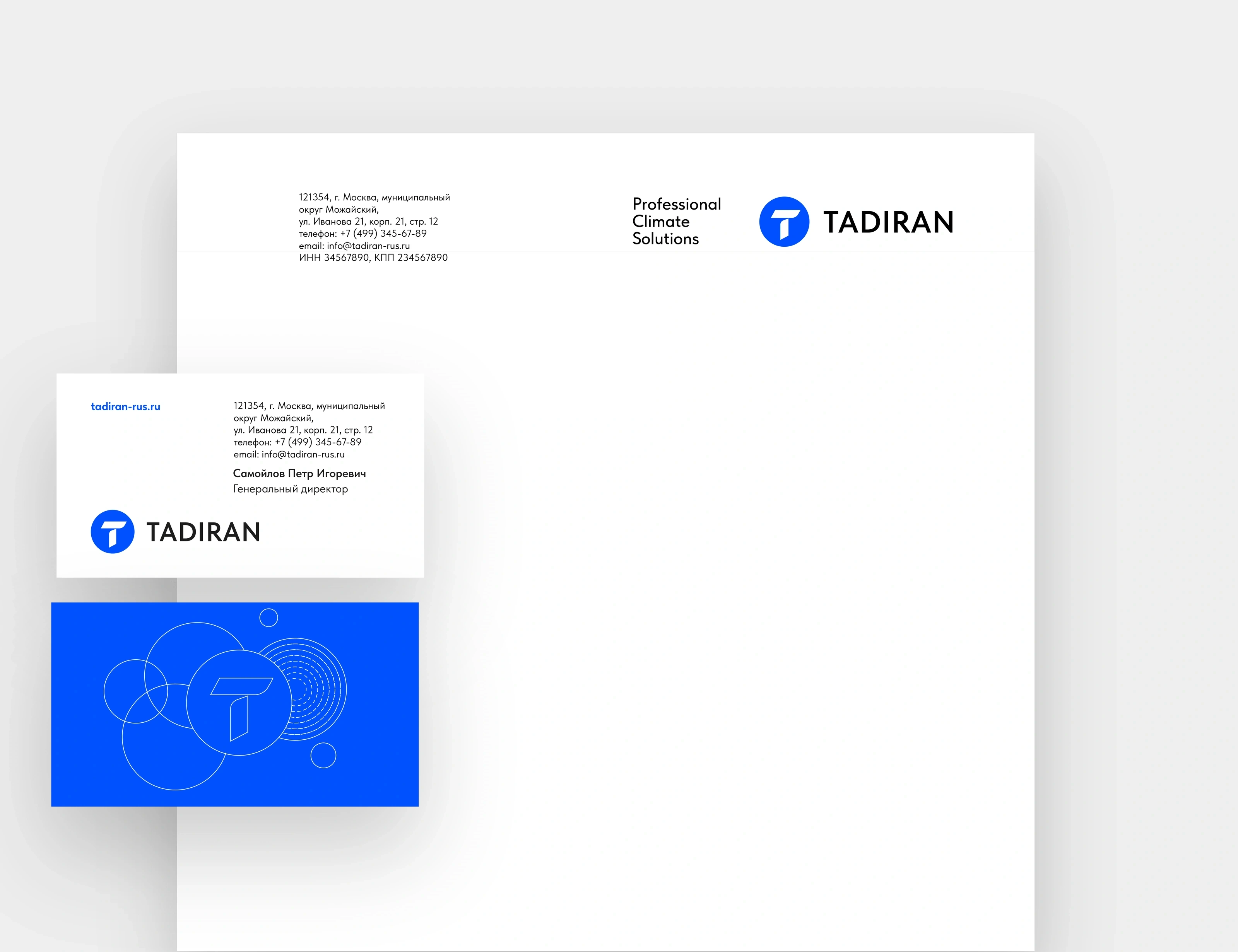
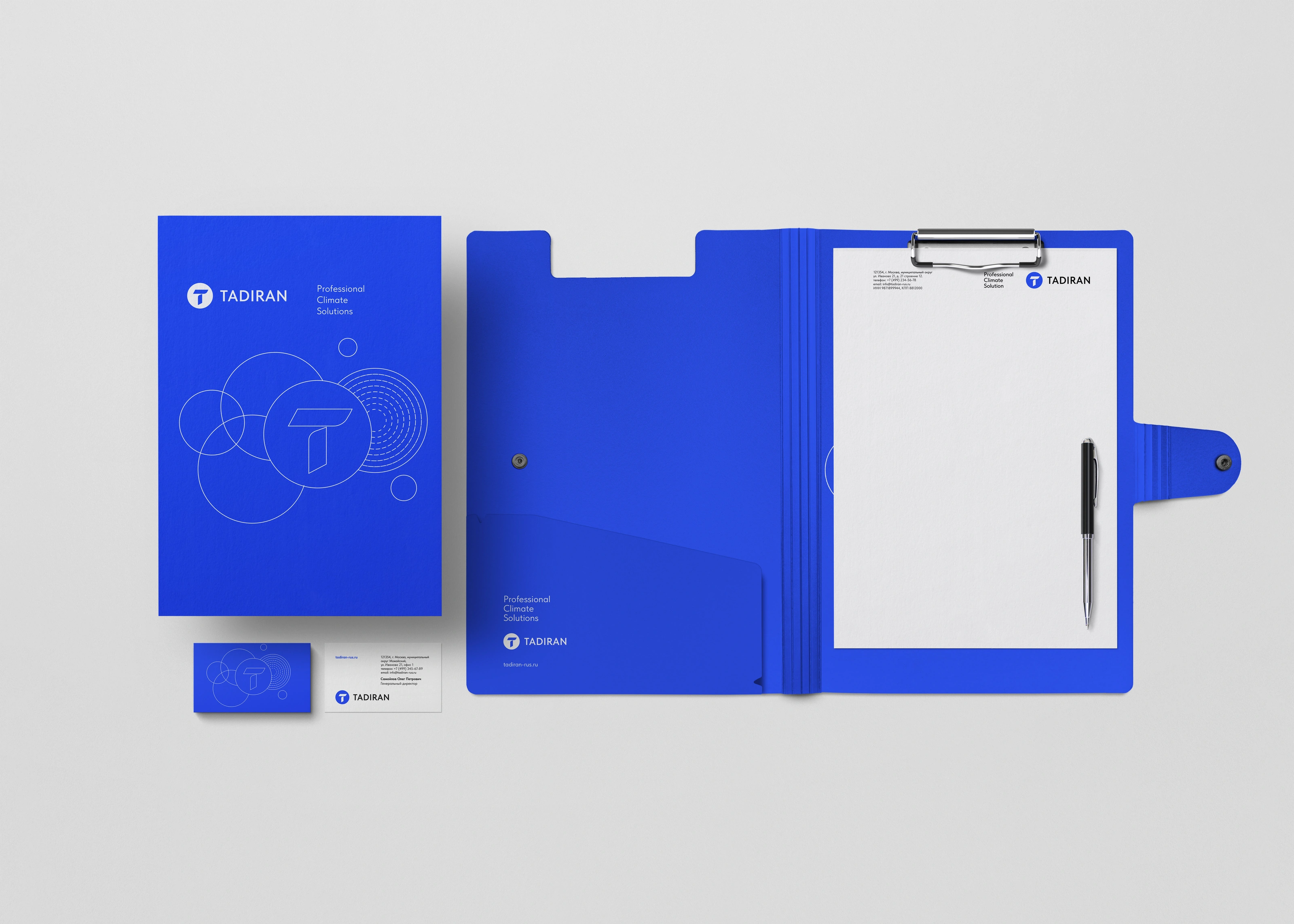
Stationery / Letterhead and business cards. Demonstration contact details.
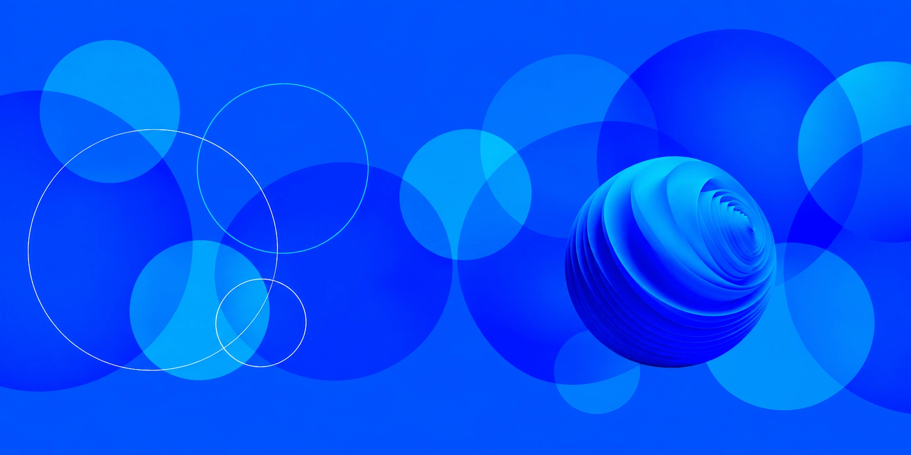
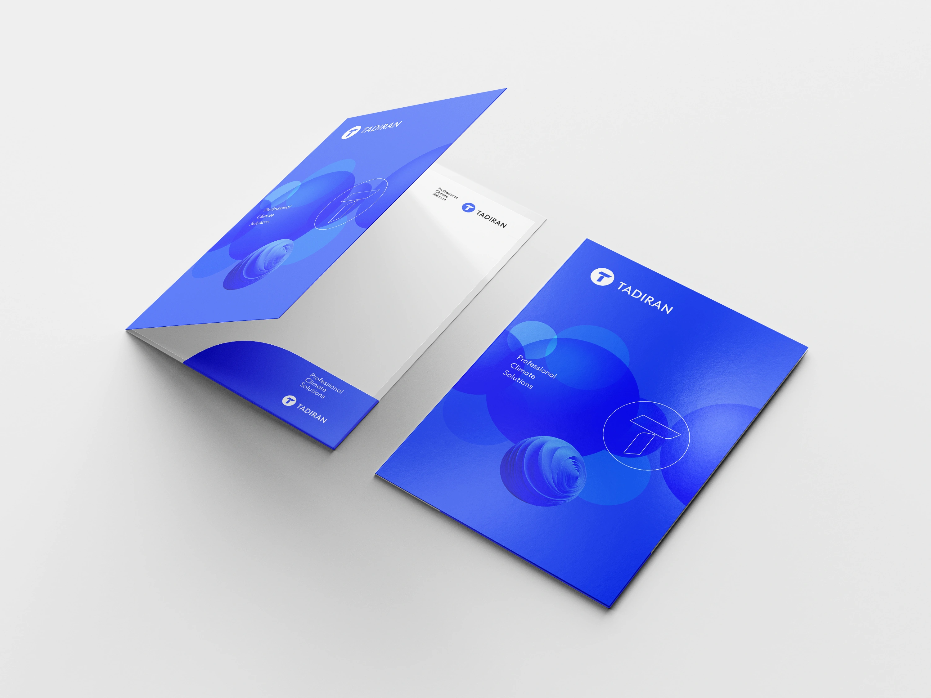
Brand graphics / From flat and linear to dimensional.
01 / 02
05 / The visual language
Built from the same core.
Electric Blue and Space Blue anchor the palette, balanced by light grey. Tilda Sans is the typeface specified for Tadiran’s identity. Circles, outlines and dimensional forms extend the logic of the symbol into a flexible graphic language.
The principles are clear: adaptability, colour and simplicity. Each application should feel related, without needing to repeat the same composition.
One recognisable symbol
A consistent blue palette
Clear typography
Flat and dimensional expressions
06 / Putting the identity to work
From a folder to the product itself.
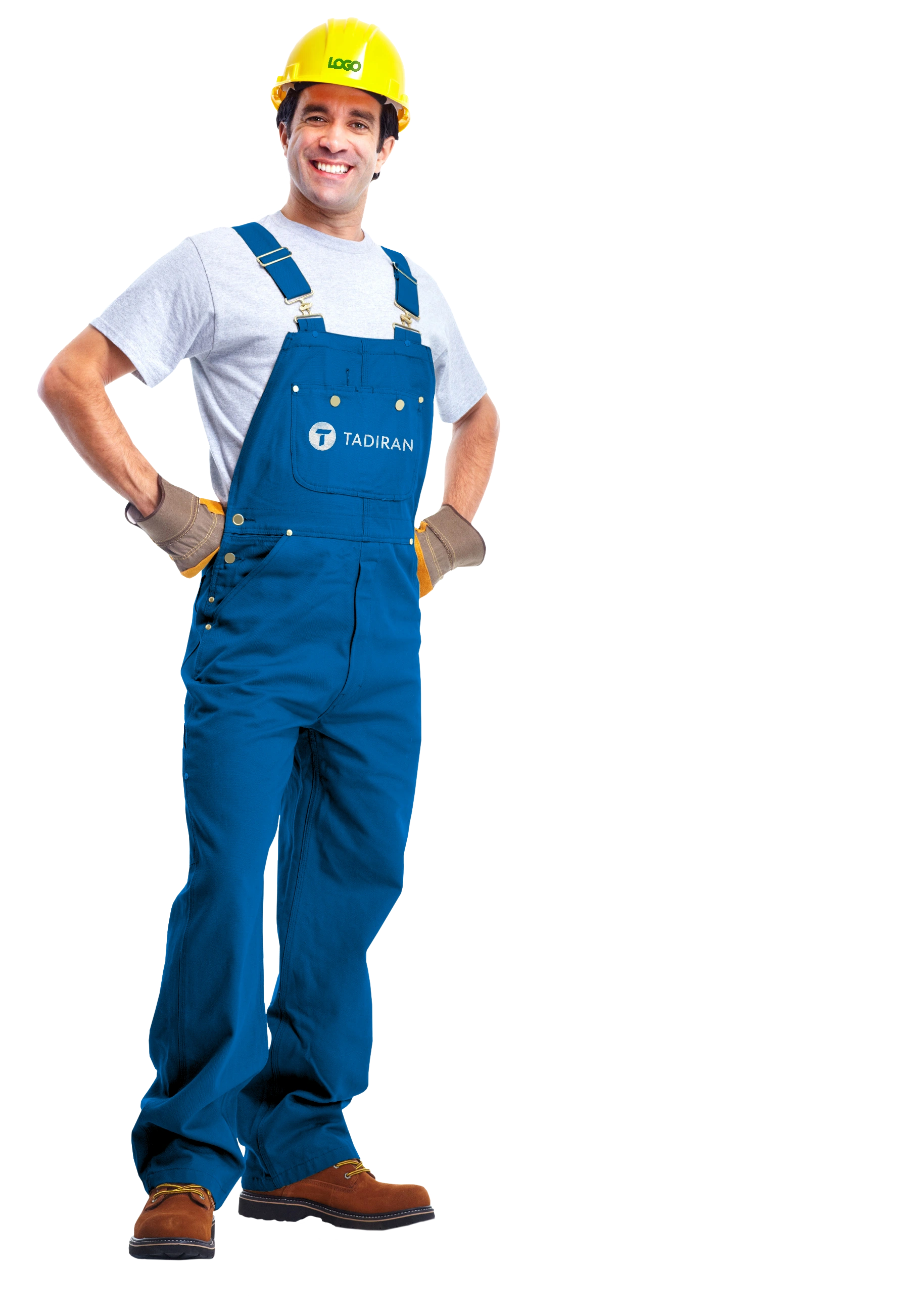
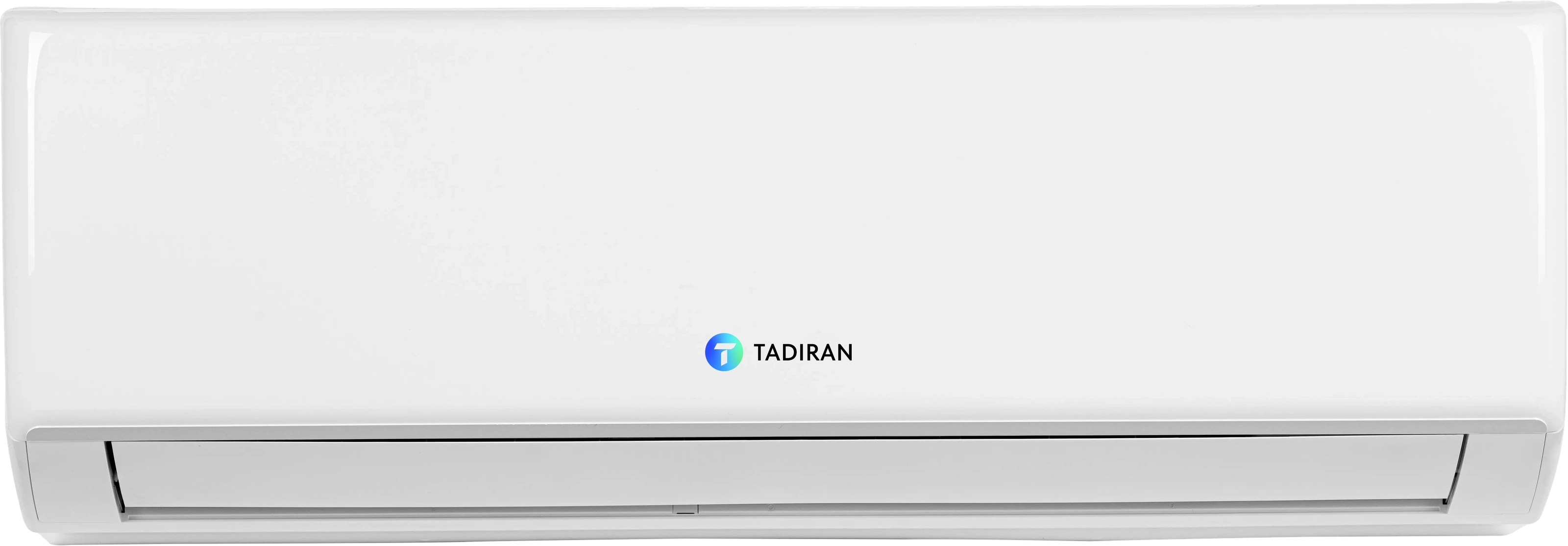
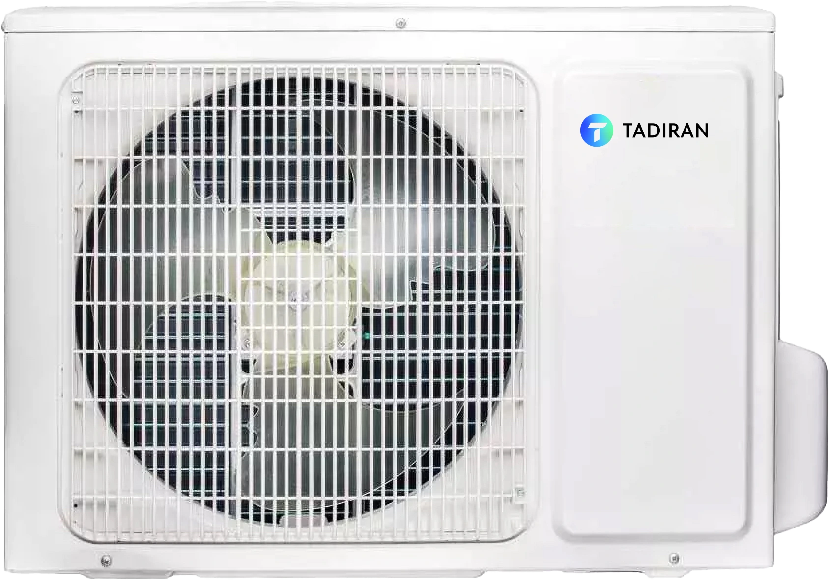
The project mockups explore how the identity can work across printed materials, professional clothing and climate equipment.
The stationery system / One identity across everyday materials. Demonstration contact details.
Folders / The graphic system in three dimensions.
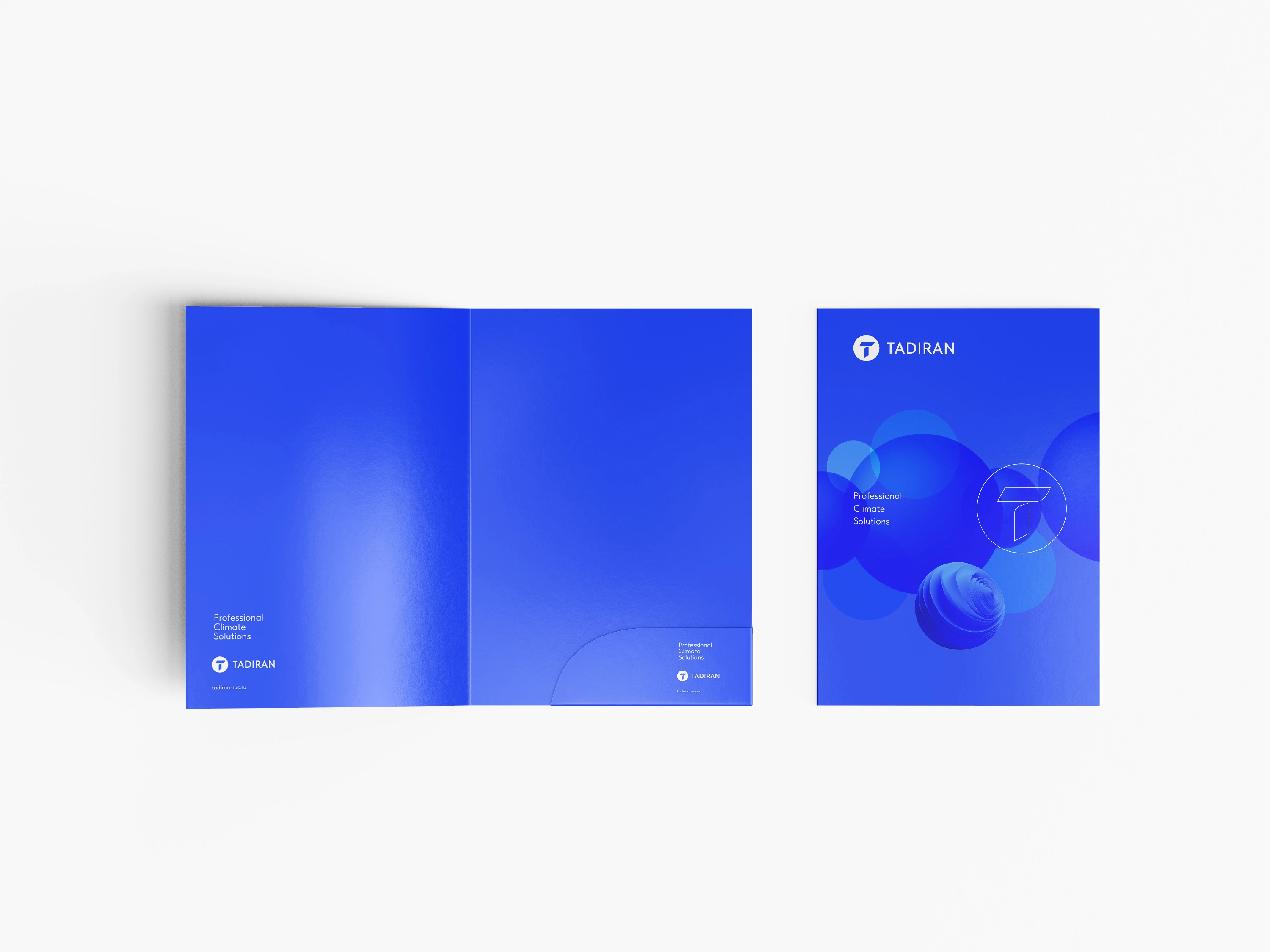
Folders / Inside and out.
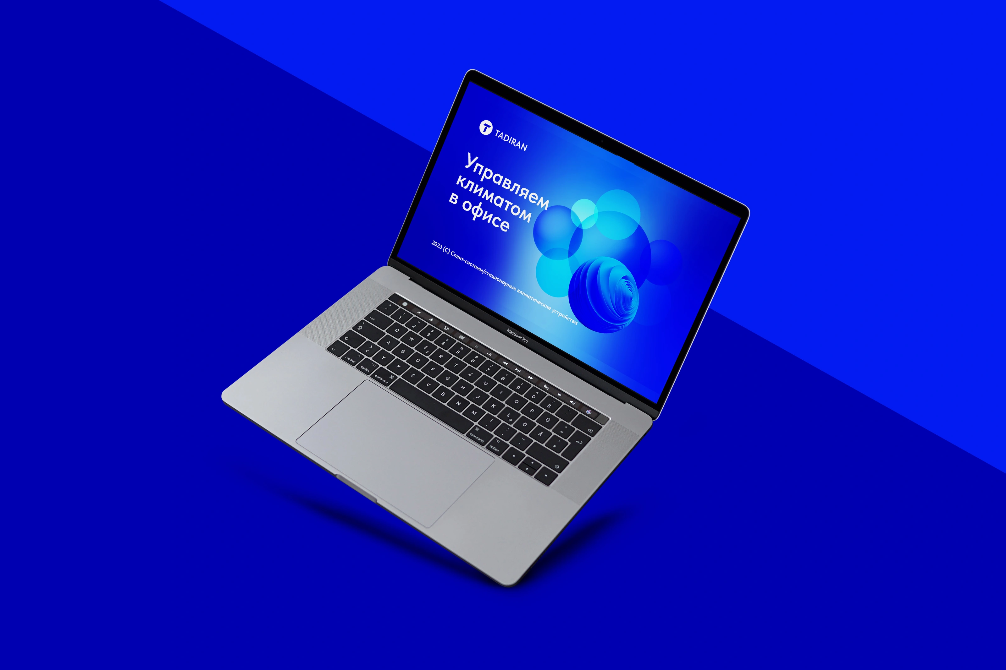
Digital / Original presentation concept.
Workwear / A recognisable signature in everyday use.
Equipment / A compact signature on technical products.
07 / How we got there
From research to a coherent identity.
01Research
Read the category.
We reviewed the competitive environment, looking at brand positioning, colour, symbols and visual identity. This established the context for the design.
02Strategy
Define the character.
Innovation, reliability and modernity became the strategic focus. The “master of climate” metaphor linked technical capability to comfortable indoor environments.
03Symbol
Give the idea a form.
Sketches and visual concepts explored the brief. A T inside a circle brought the brand initial and the idea of airflow into one compact mark.
04Visual system
Build beyond the logo.
We explored symbols, circles and semicircles as graphic directions. The identity presentation develops a circular language in both simple and more expressive forms.
05Applications
Test the system in context.
Stationery, folders, workwear, equipment and digital concepts demonstrate how the elements can remain coherent across different formats.
08 / The outcome
A system that connects meaning with expression.
The work brought the strategic metaphor, symbol, typography, colour and graphic principles into one coherent identity. Its application concepts show how that identity can carry across different physical and digital contexts.
Presented here through original project visuals and application mockups from the 2023 design work.