Selected work / Rush HourMountain bikes · 2022

Built around
the rush.

A bold identity direction that gives the energy of mountain biking a compact, recognisable signature.

Client
Rush Hour
Our role
Visual concept
Logo redesign
Product application studies
Explore the story
Rush Hour — hero original project artwork
Rush Hour / Original identity application concept.
01 / The design question

A clear idea
before a visual answer.

A bicycle identity has to work on narrow tubes and small head badges, as well as in a complete wordmark. The task was to find a forceful symbol that could hold its own in these constrained spaces.
02 / The strategic connection

Energy, made visible.

The lightning direction connects speed, power and movement with the initial of the name. It makes the brand’s energy visible in a small, direct mark.

  1. 01Movement
  2. 02Lightning
  3. 03A distinctive R
03 / Original sketches

Drawing the
feeling of movement.

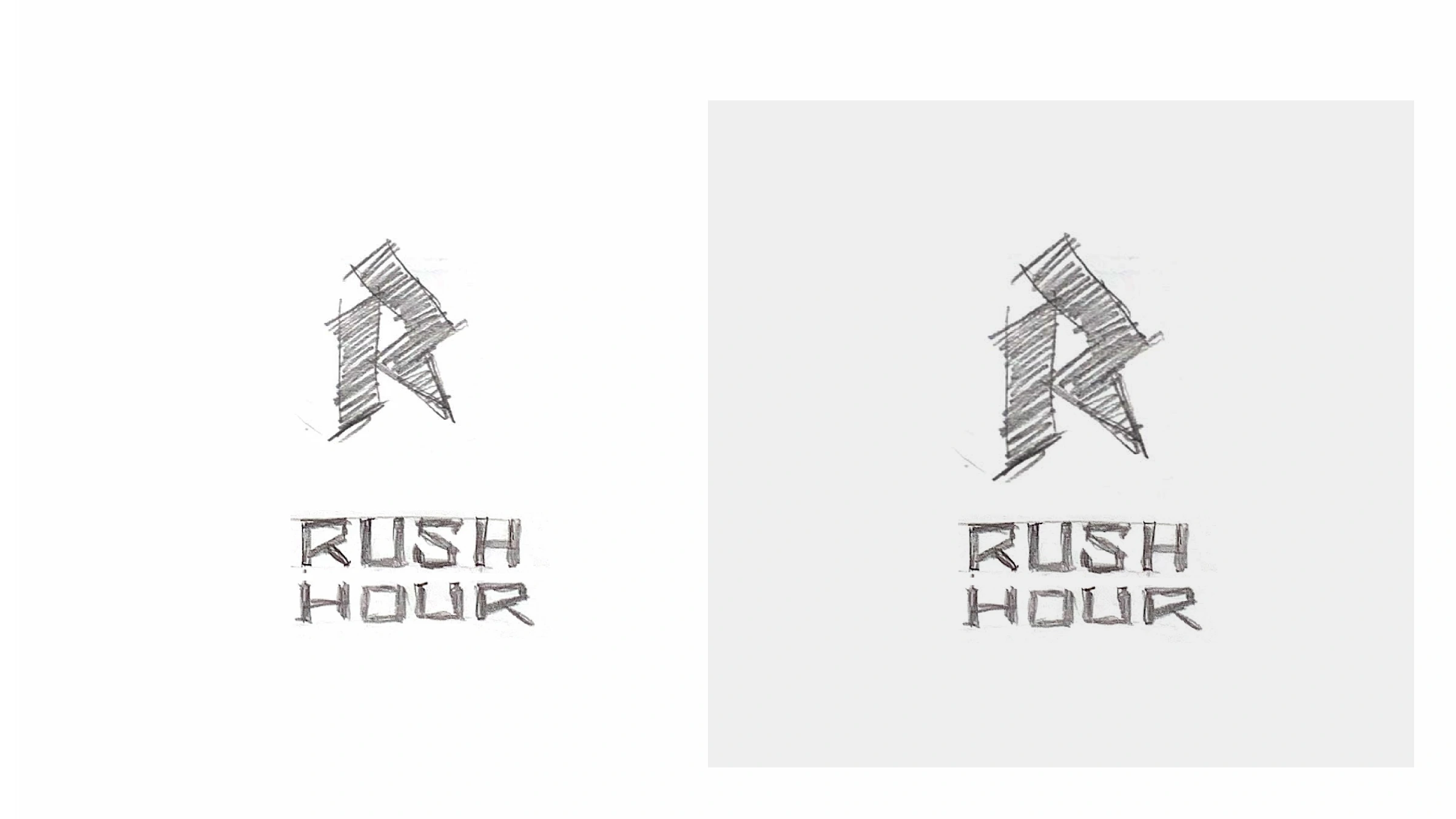
The project explored several directions, including a crest, a mountain goat, lightning and an eagle. The lightning studies focus on angular movement and the letter R. They reveal the link between the intended character and the form of the symbol.

Rush Hour — sketch original project artwork
Original lightning studies / Exploring energy through angular forms.
04 / The visual identity

One sharp
signature.

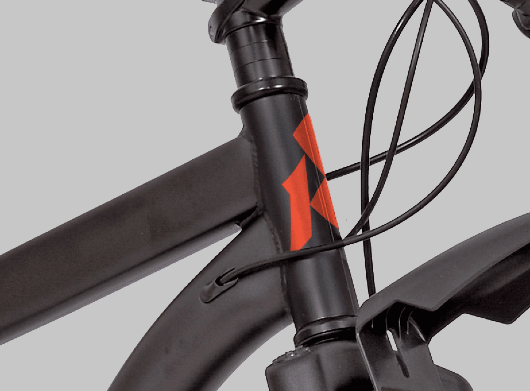
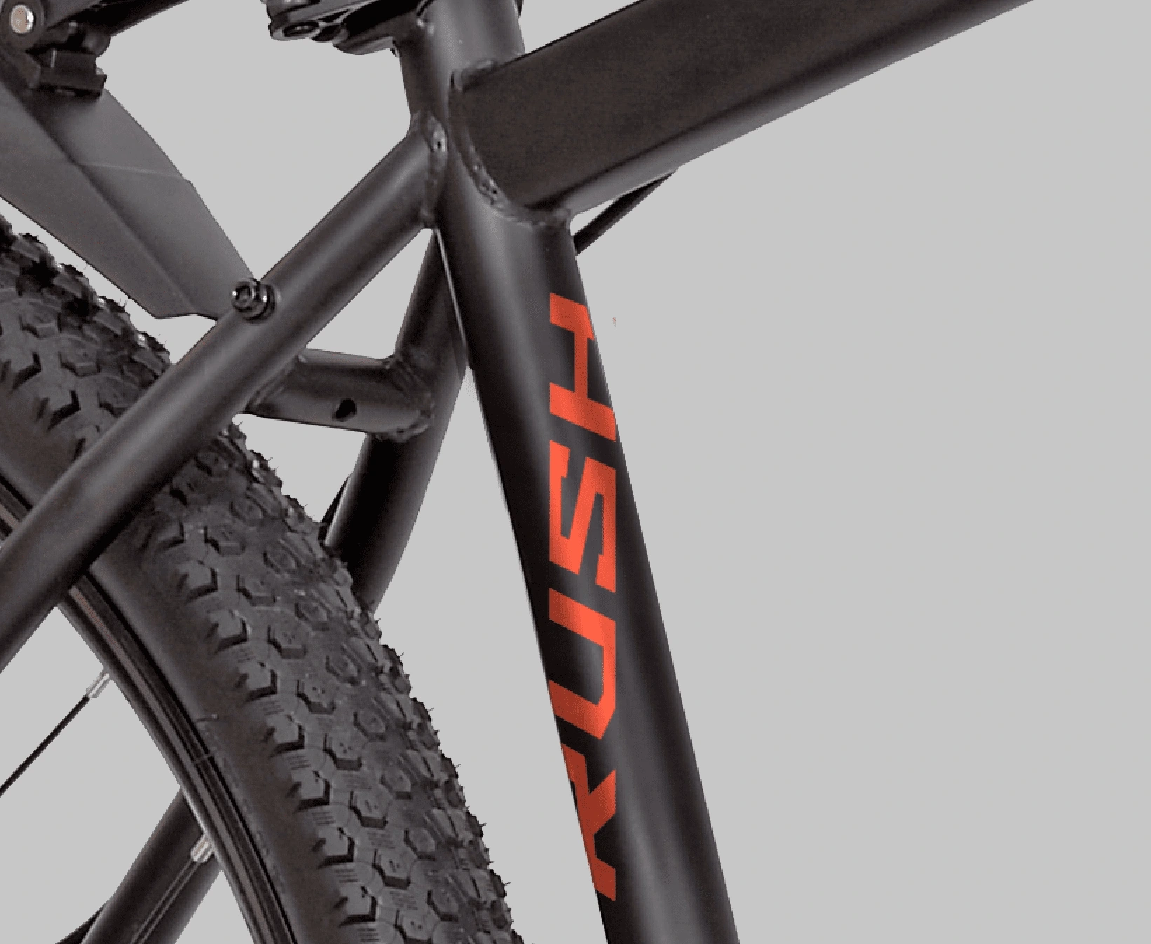
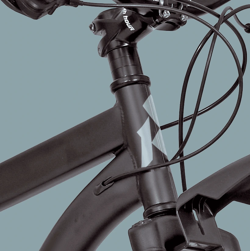
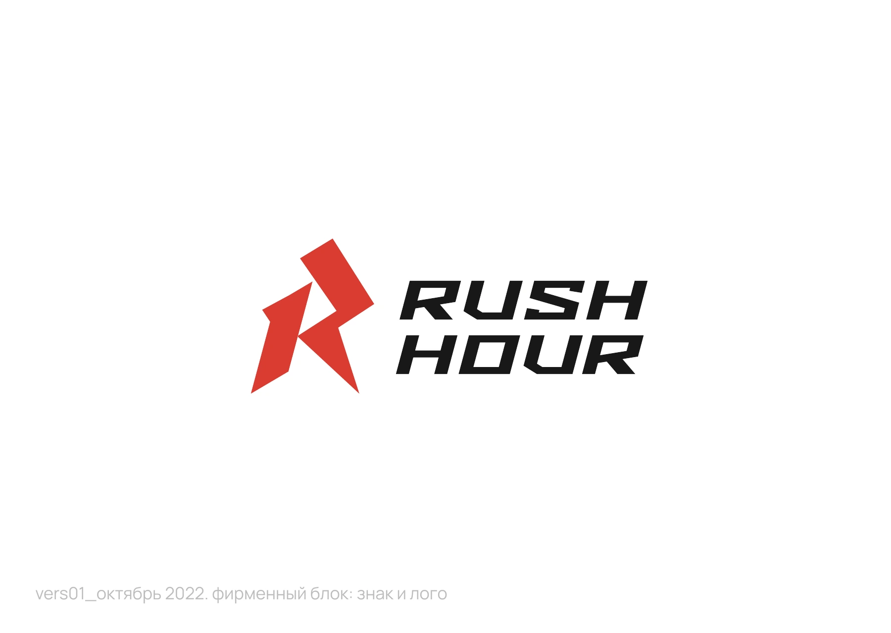
The October 2022 logo presentation pairs the angular R symbol with the Rush Hour name. Product studies also explore a shorter RUSH wordmark along the frame, while the compact symbol takes the head tube.

Rush Hour — logo original project artwork
Logo presentation / October 2022.
05 / The idea in context

Character, carried
into the everyday.

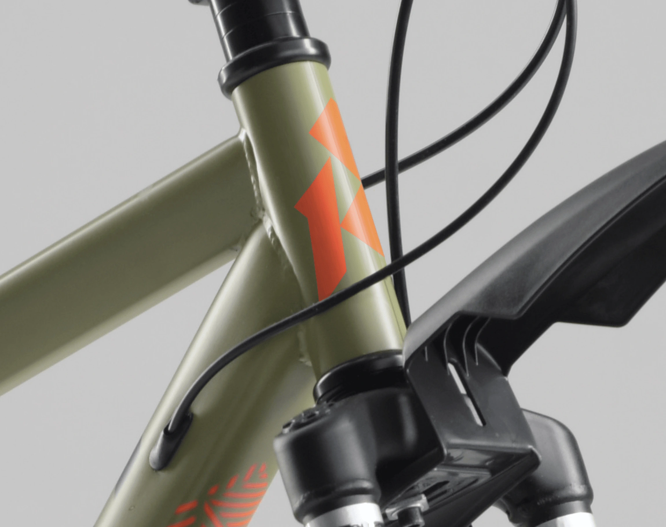
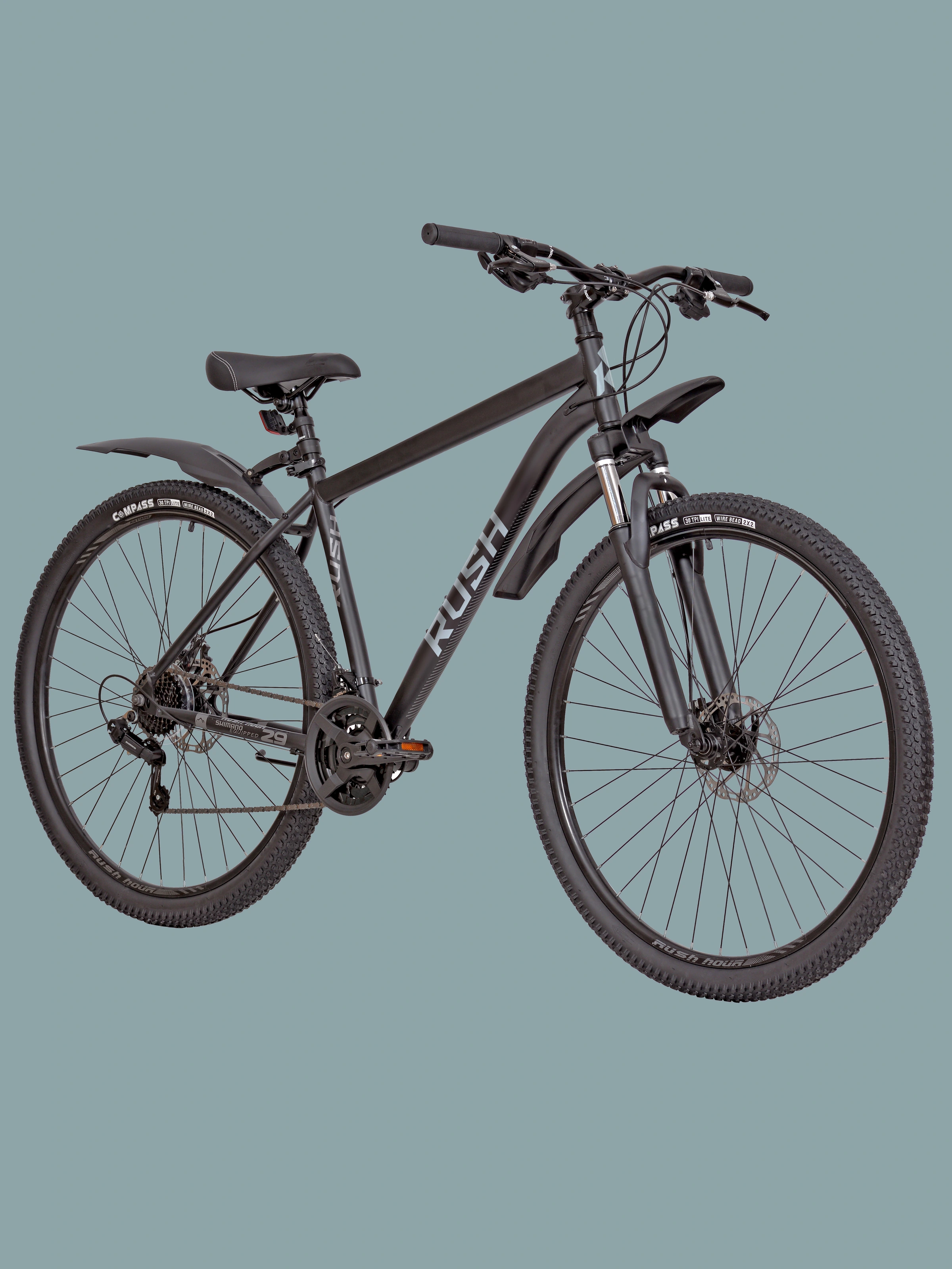
Original application studies show how the identity works across different scales, materials and situations.

Rush Hour — red original project artwork
Head-tube study / A high-contrast red signature.
Rush Hour — olive original project artwork
Alternative colour application / Orange against olive.
Rush Hour — frame original project artwork
Frame study / Lettering follows the product’s structure.
Rush Hour — bike original project artwork
Product mockup / The identity considered at the scale of the whole bike.
06 / Our method in practice

Trace the visual
back to the idea.

The exploration began with the character of riding. Alternative symbols tested that character; the lightning route translated it into a decisive shape. Product mockups then tested the relationship between symbol, lettering and bicycle geometry.

Explore our approach

Original logo development and product mockups from 2022. These images show design proposals and do not imply production or commercial results.

Your next chapter

Let’s give your
brand character.

Start a conversation