01 / The symbol — before & after
A more balanced snail.
The shell moves closer to the optical centre. A compact silhouette and stronger shapes keep the snail clear when the mark is reduced.

Before / Original symbolAfter / Redesigned symbol
A new identity and a distinctive mascot for a window-covering brand: familiar in spirit, more confident in expression.
Rolatex designs, manufactures and sells blinds and curtains, including printed window coverings. The brief began with a familiar asset: the snail already associated with the brand.
The redesign connected a simpler symbol and a rounded wordmark with a complete visual language. A confident mascot then carried that identity into advertising, printed materials and the brand’s everyday communication.
The snail remained the link with the original identity. Its silhouette became more compact and balanced, fitting a square rather than spreading sideways. Removing fragile details helped the symbol hold together at small screen sizes.
Positive and negative space form the spiral together. The rounded sans-serif wordmark echoes that movement through the letters o, a and e. A lowercase r makes the name feel more approachable.
How we build an identityThe shell moves closer to the optical centre. A compact silhouette and stronger shapes keep the snail clear when the mark is reduced.
Rounded o, a and e give the name a rolling rhythm. The deliberate lowercase r brings a warmer, more approachable expression.

Solid form and open space create the spiral together. The curved symbol and the circular letterforms give the complete signature a shared visual rhythm.


01 / Compact formA balanced silhouette that stays recognisable at a smaller scale.
02 / Two spaces, one spiralThe snail emerges from the relationship between figure and background.
03 / A rolling rhythmRounded letterforms connect the wordmark to the symbol.
The identity grew into a character with a playful, fashion-conscious attitude. Sunglasses give it confidence; the curved shell keeps its connection with home. Hands let the hero take part in everyday stories.
Another character-led identity
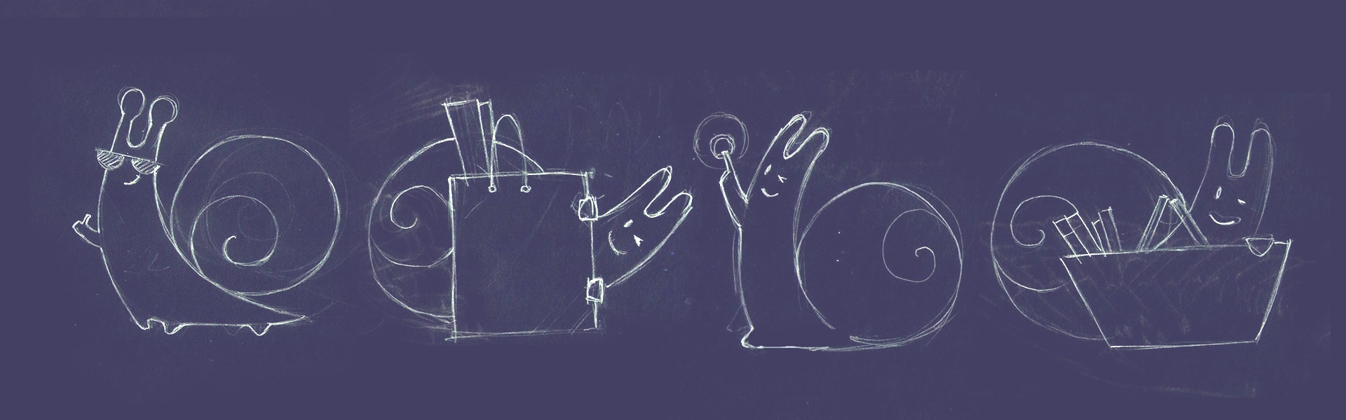
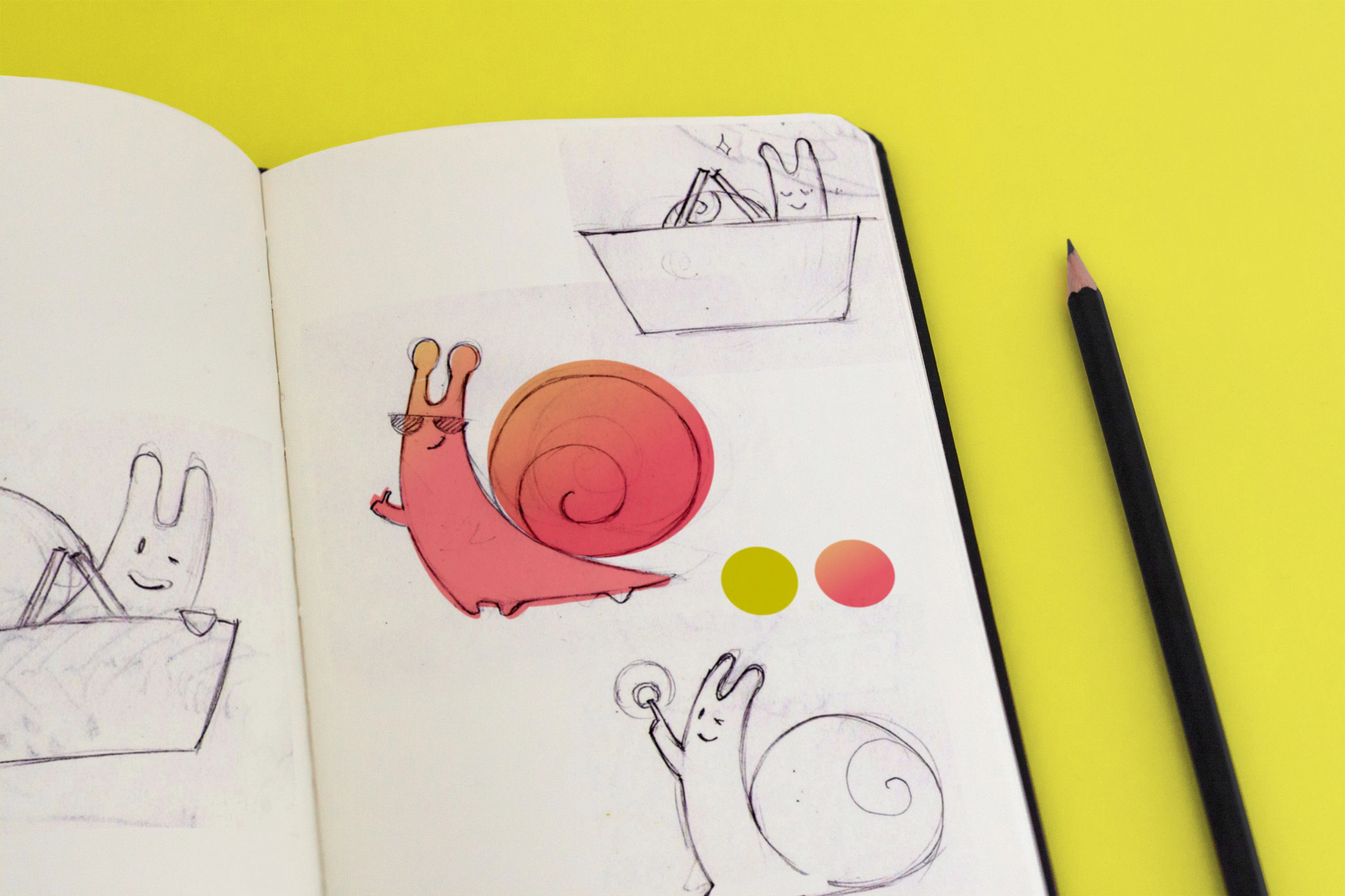
Three illustrators explored the hero’s style and possible stories. Antennae and a shell kept it recognisable as a snail, while hands and legs allowed it to shop, press buttons and guide visitors through a website.
The selected direction adds dark glasses, a half-smile and a playful spiral shell. Two legs replace the early four-footed silhouette: the raised shell suggests the character is about to roll forward, challenging the familiar association with slowness.
Explore another mascot’s evolution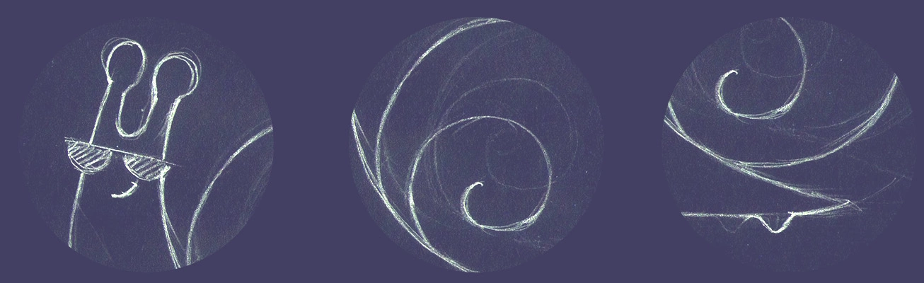
Dark glasses give the hero a playful, fashion-conscious expression.
The rounded shell holds the snail’s identity while suggesting a rolling movement.
Hands allow the mascot to greet, help and take part in the brand’s stories.
The chosen visual direction was tested through situations: shopping, offering help and interacting with the brand. These original studies show how the same recognisable hero could carry different messages.
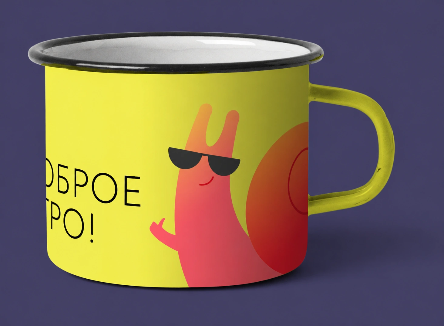
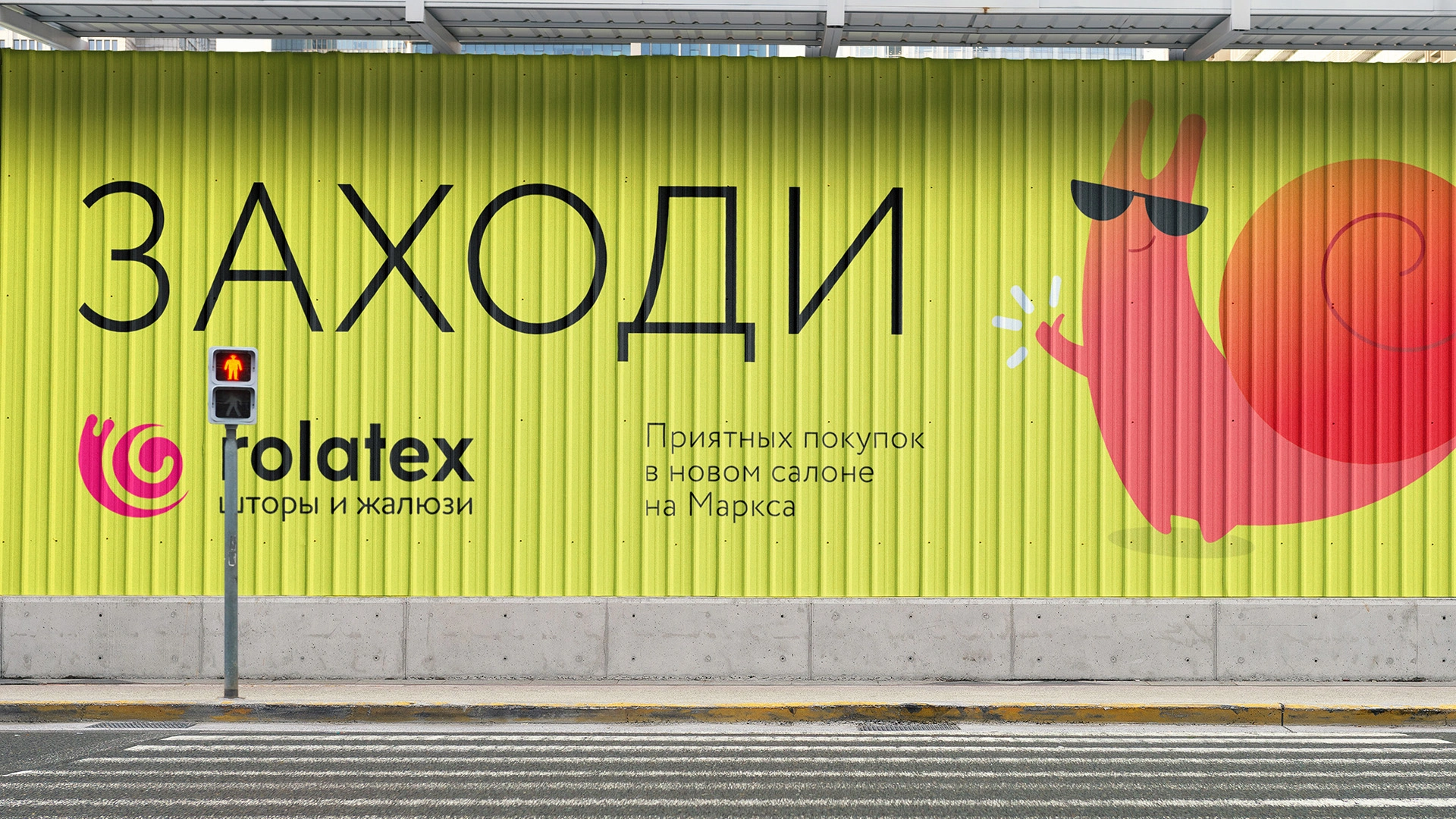
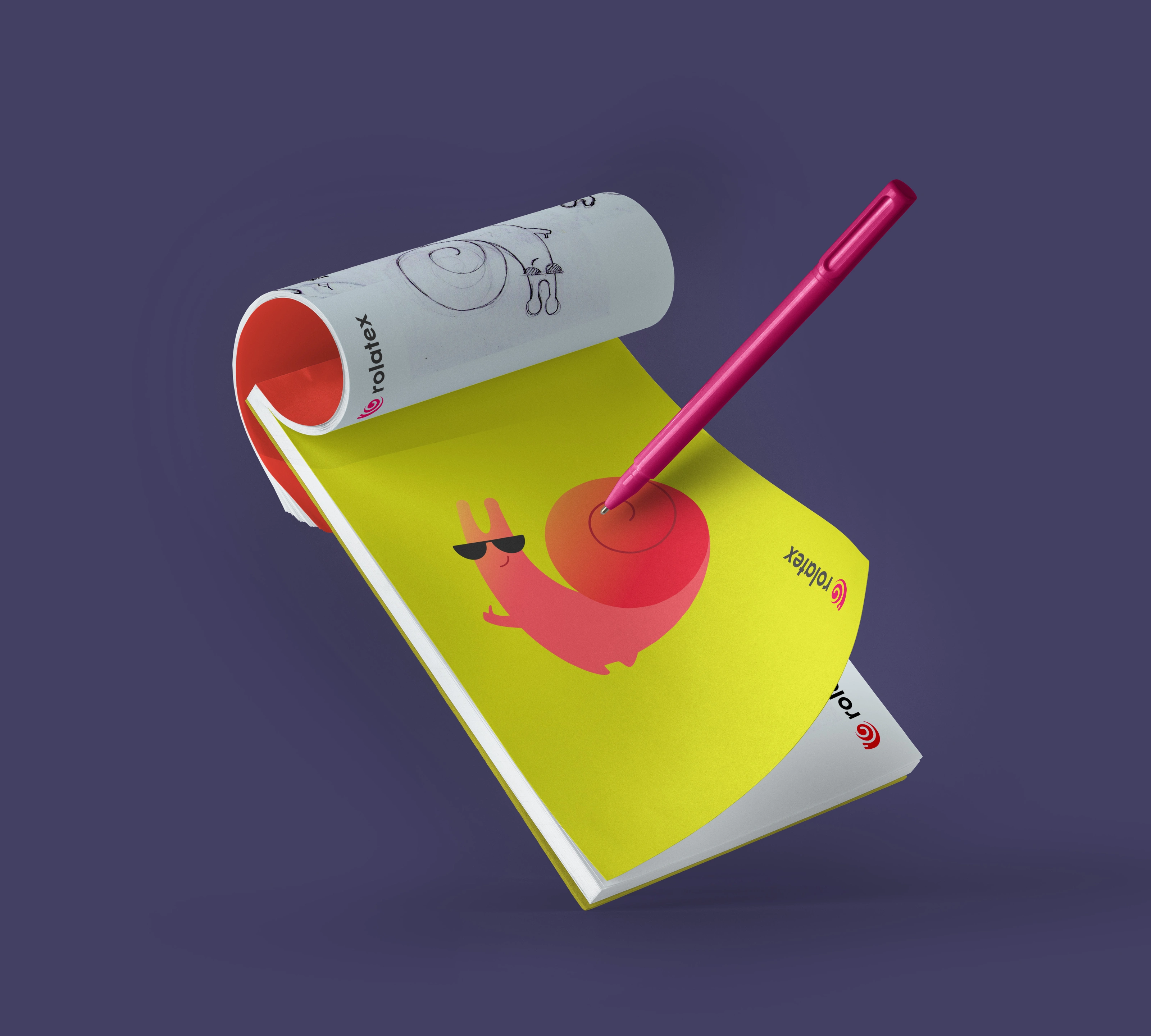
A curved shell, dark glasses and a half-smile give the mascot its attitude. It can greet people on a wall, brighten an everyday object and make the brand feel approachable.
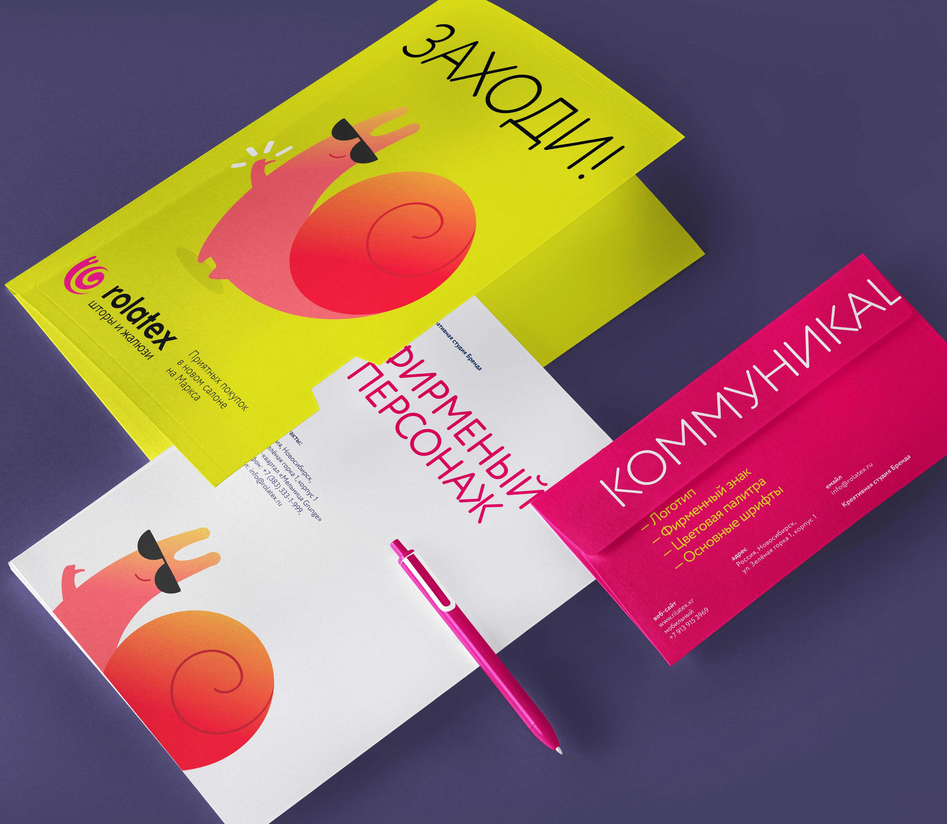
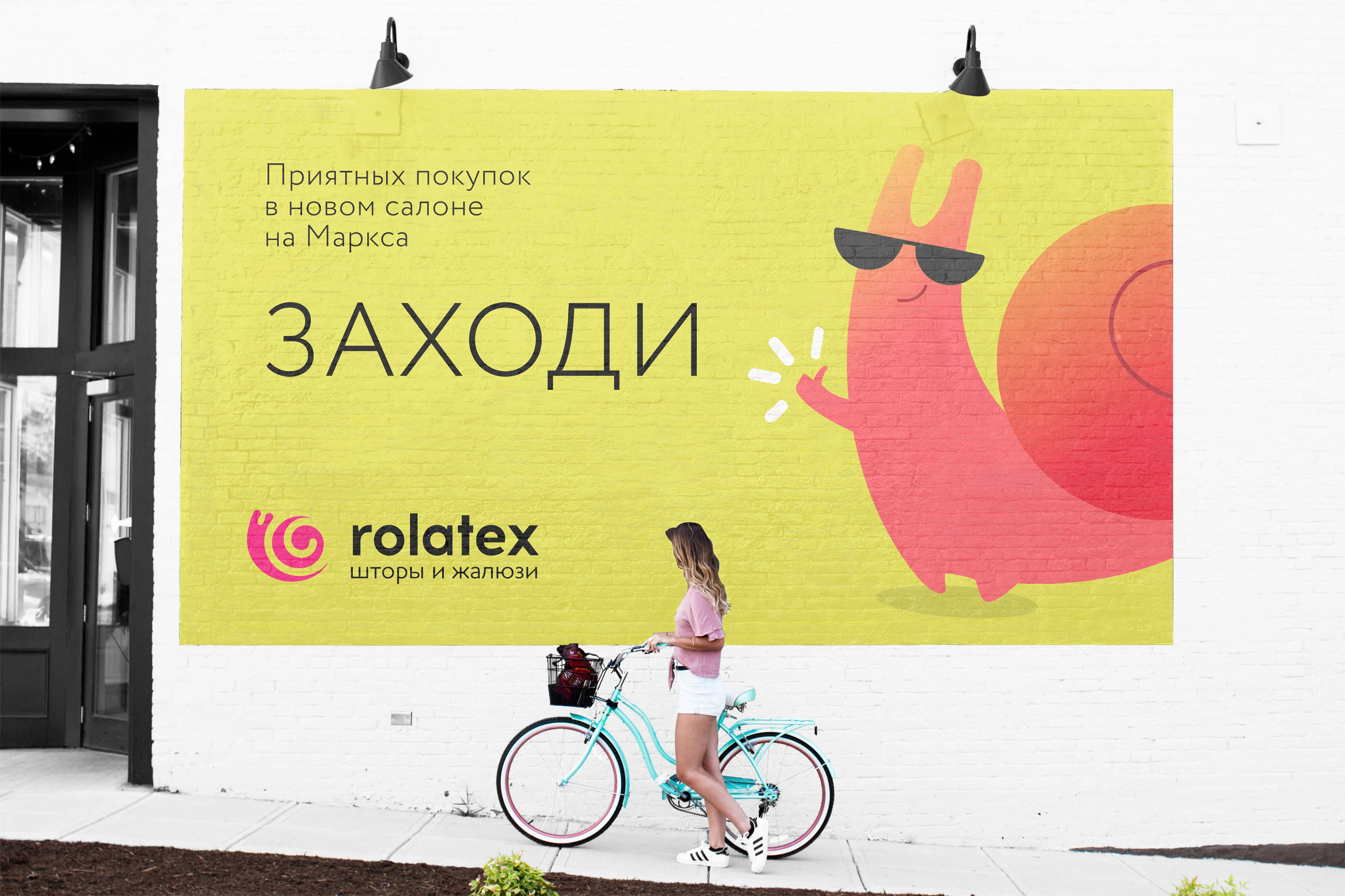
The final mascot welcomes visitors to the salon.
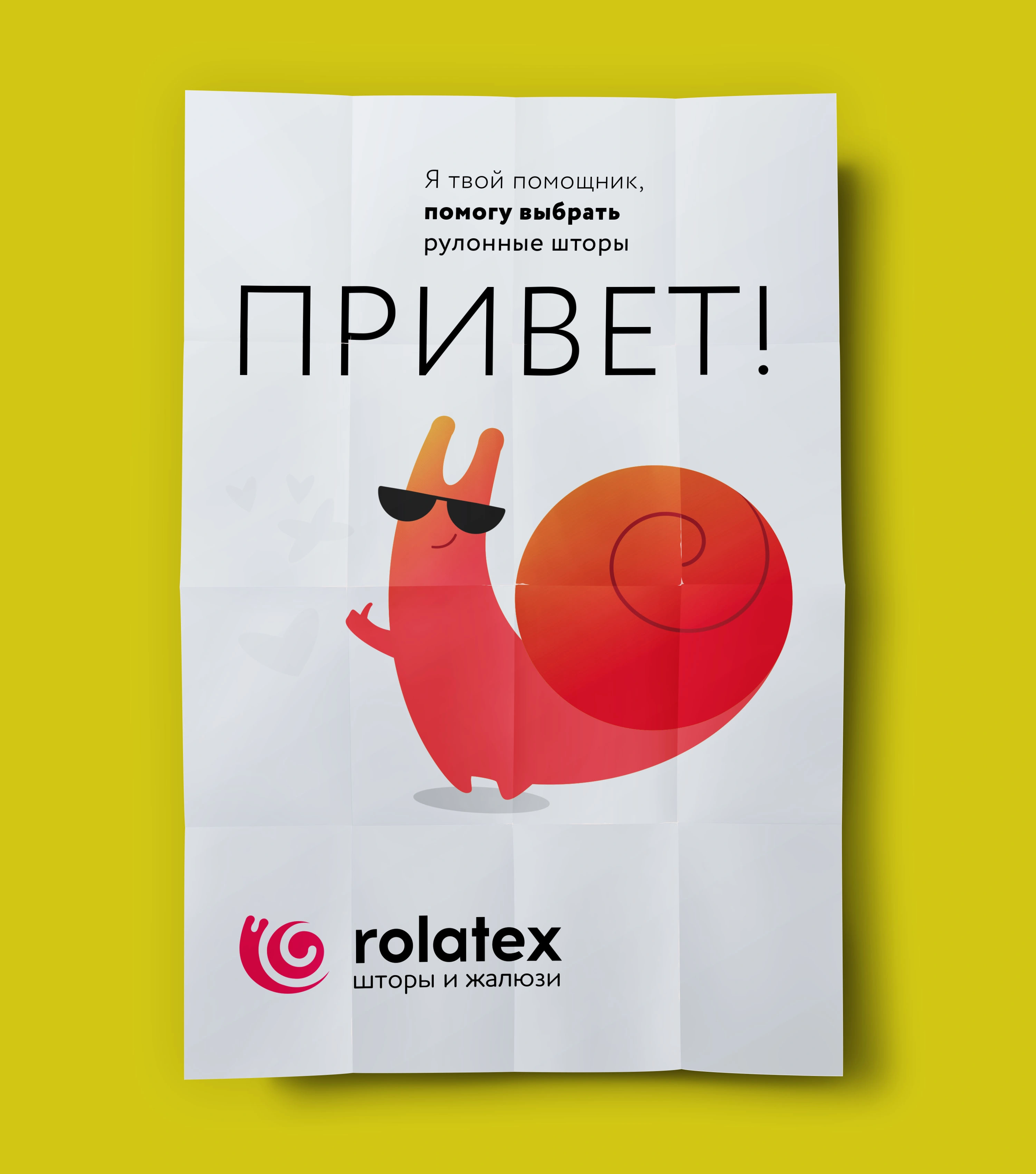
An approachable character introduces the brand.
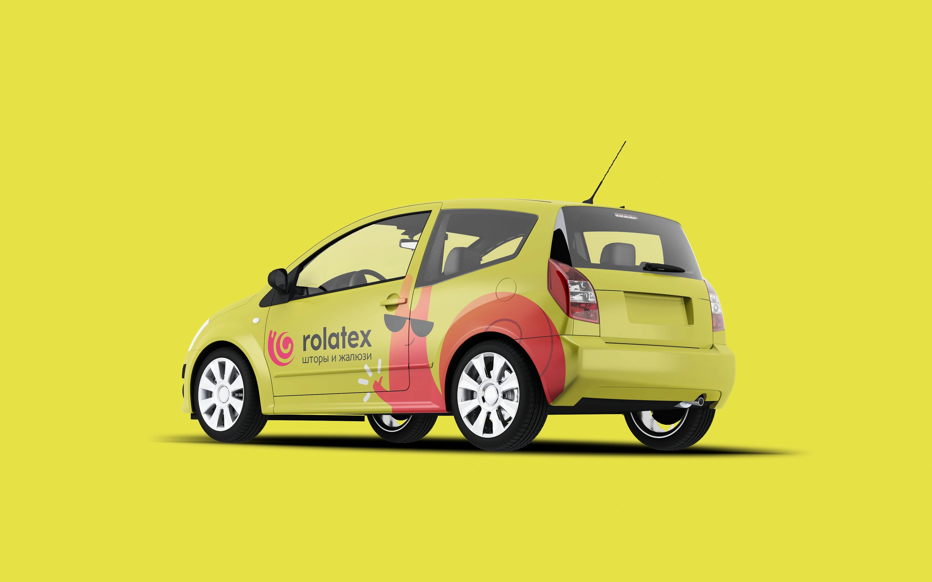
The identity becomes visible around the city.
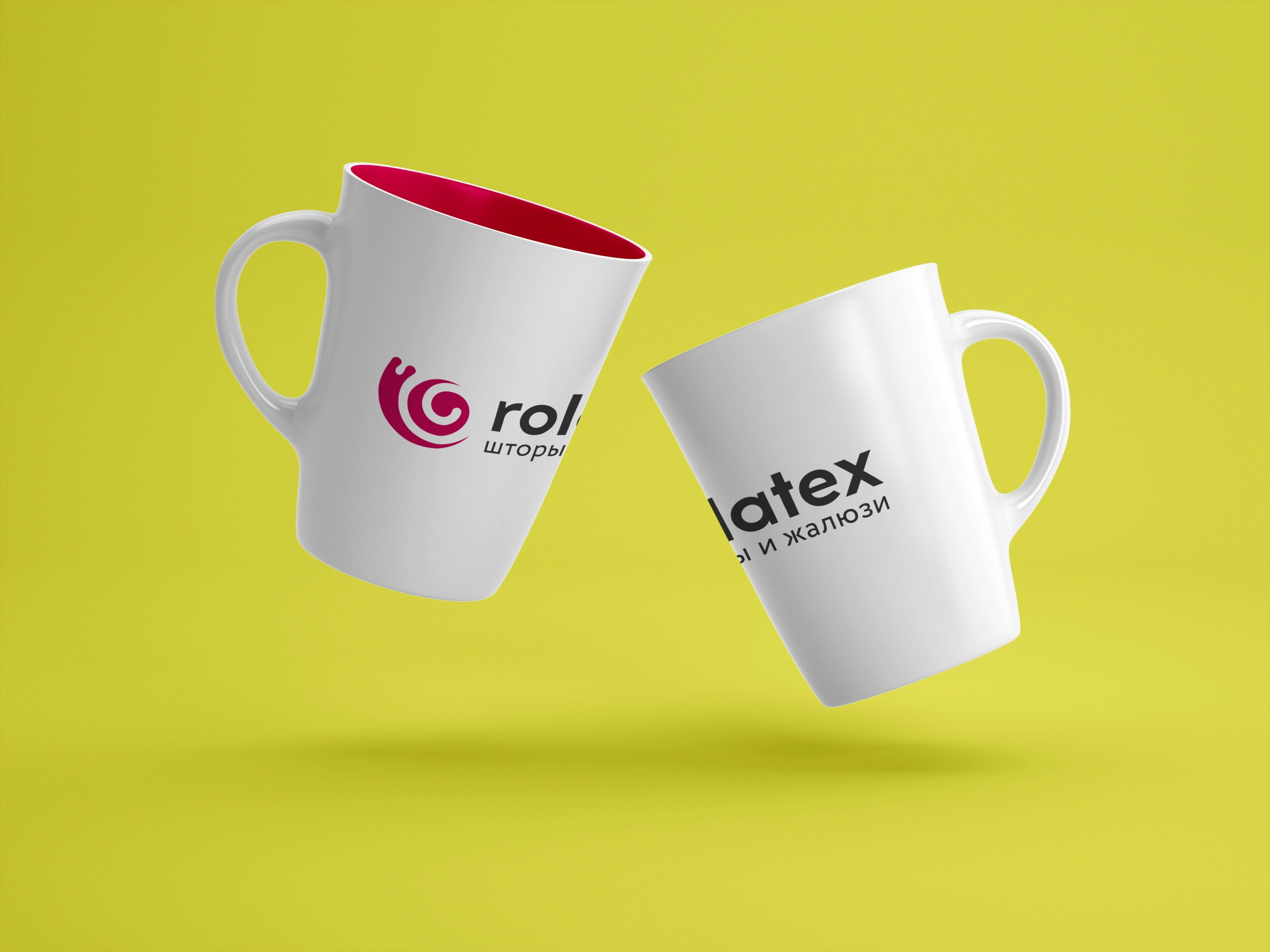
The redesigned symbol and wordmark on ceramic mugs.
The refreshed symbol and the final mascot work together: one gives the brand a compact signature, the other brings that identity into conversation. From a salon wall to a notebook, the same character connects the different expressions of Rolatex.
Project archive · 2019. Original artwork is presented in Russian. Applications are original design presentation mockups. Sketches shown here document the development of the selected mascot.