Selected work / ZSKSRailway wagon service · 2019

A simple mark.
A clear signal.

A compact identity for West Siberian Wheel Service, built around the essential geometry of its industry.

Client
ZSKS
Our role
Research & creative direction
Logo & visual identity
Brand guidelines
Explore the story
ZSKS — hero original project artwork
ZSKS / Original identity application concept.
01 / The design question

Modern service.
A distinct identity.

West Siberian Wheel Service needed an identity that expressed a modern approach to railway wagon maintenance. The original competitor study found red dominating the category, from bright scarlet to deep burgundy. Avoiding that familiar palette became a deliberate way to make ZSKS stand apart.
02 / The strategic connection

Start with the wheel.

Wheelsets supplied the starting point for the design search. The circle connects the company’s work with the idea of movement; the final identity reduces that geometry to a direct, compact signature.

  1. 01Wheel
  2. 02Circle
  3. 03Clear signature
03 / Original sketches

One circle.
Different directions.

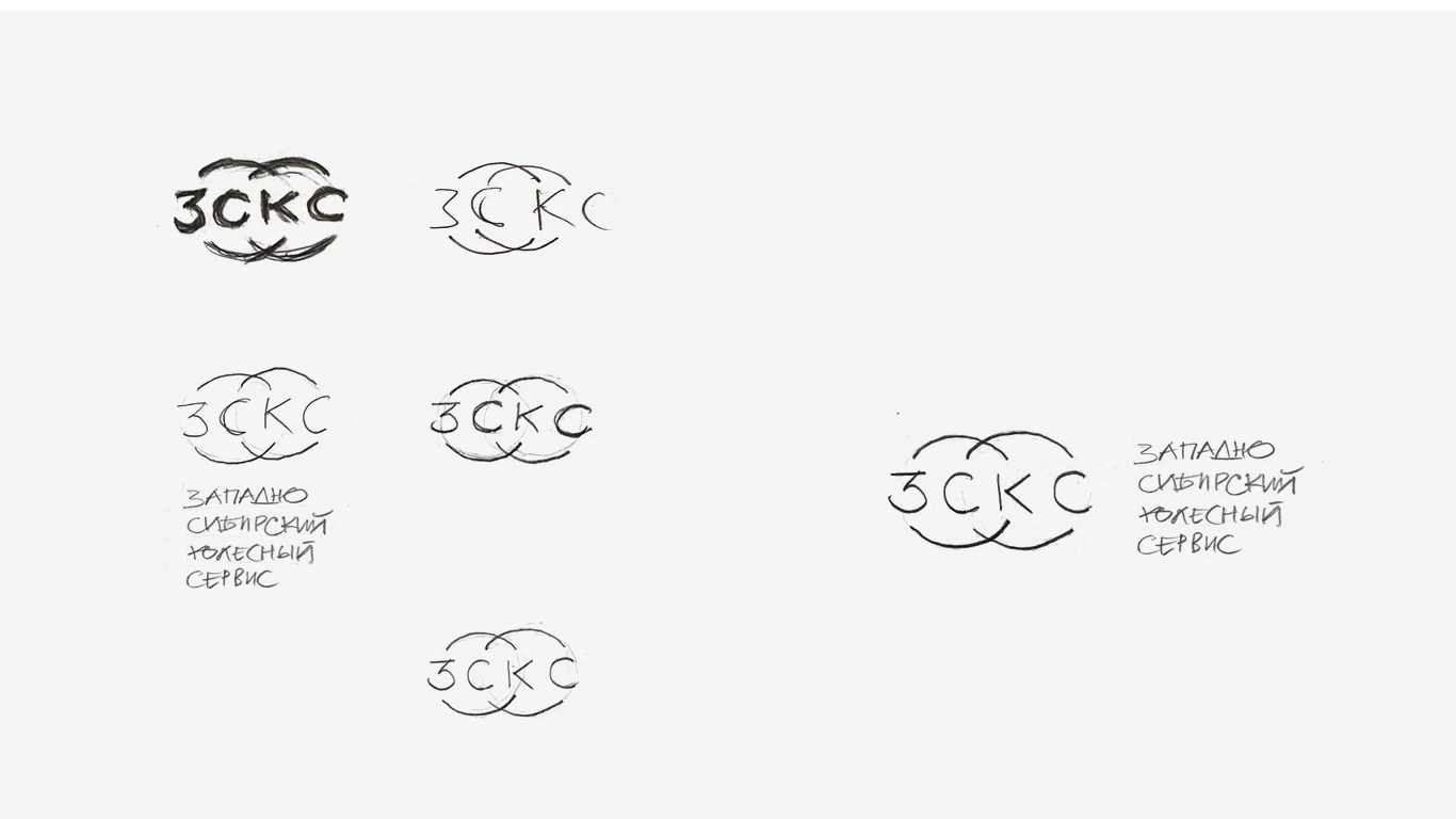
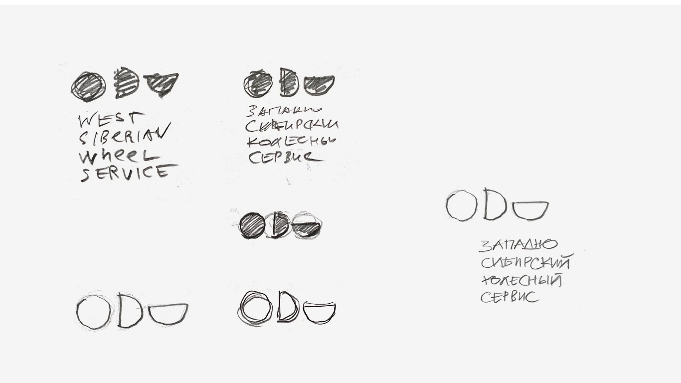
The original drawings test wheel-based lettering, repeated circles and service symbols. They show the alternatives considered before the final compact vertical signature.

ZSKS — sketch wheel original project artwork
Original sketches / Wheel geometry and Cyrillic initials.
ZSKS — sketch service original project artwork
Original sketches / Exploring service and movement.
04 / The visual identity

A strong vertical.
A single circle.

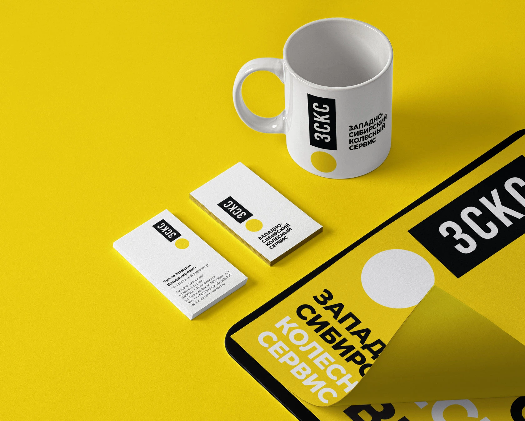
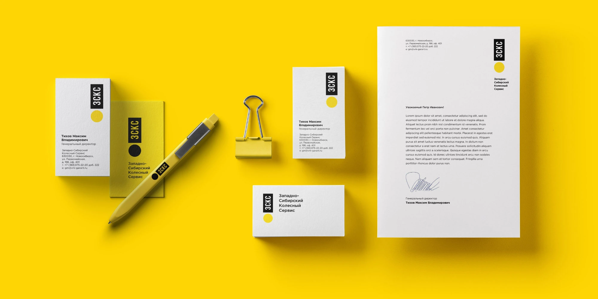
The Cyrillic initials sit in a black vertical block above a yellow circle. Yellow, black and white carry the identity across stationery, while the condensed lettering keeps the narrow format legible.

Final ZSKS signature: vertical Cyrillic initials over a yellow wheel circle
The final signature

Less detail.
More presence.

A circle, a vertical block and the company’s initials. Three elements hold the identity together.

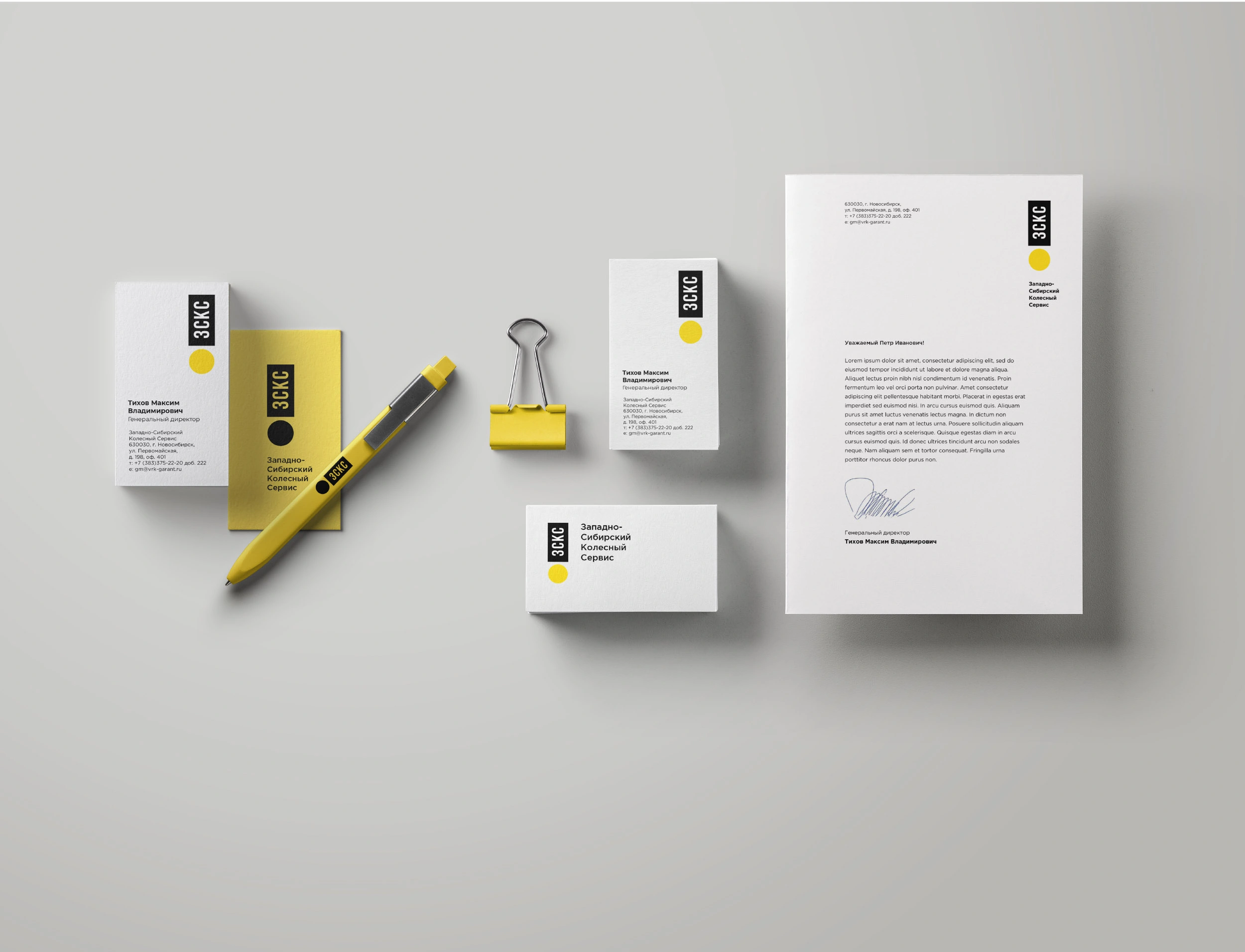
ZSKS — isometric original project artwork
ZSKS / The signature across a connected set of printed materials.
05 / The idea in context

Built for the
working day.

Original application studies show how the identity works across different scales, materials and situations.

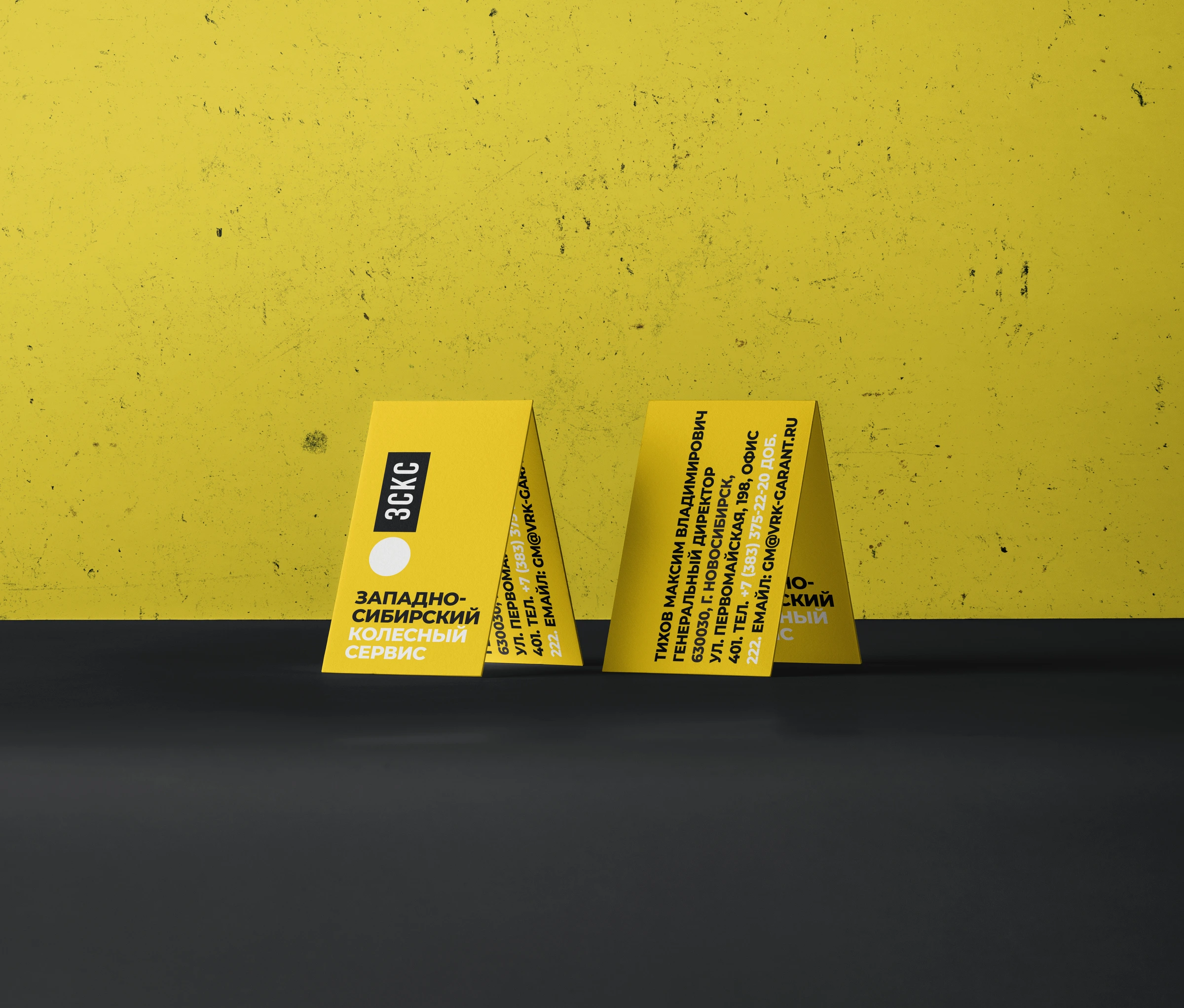
ZSKS — business cards original project artwork
Business cards / A bold yellow field and vertical signature.
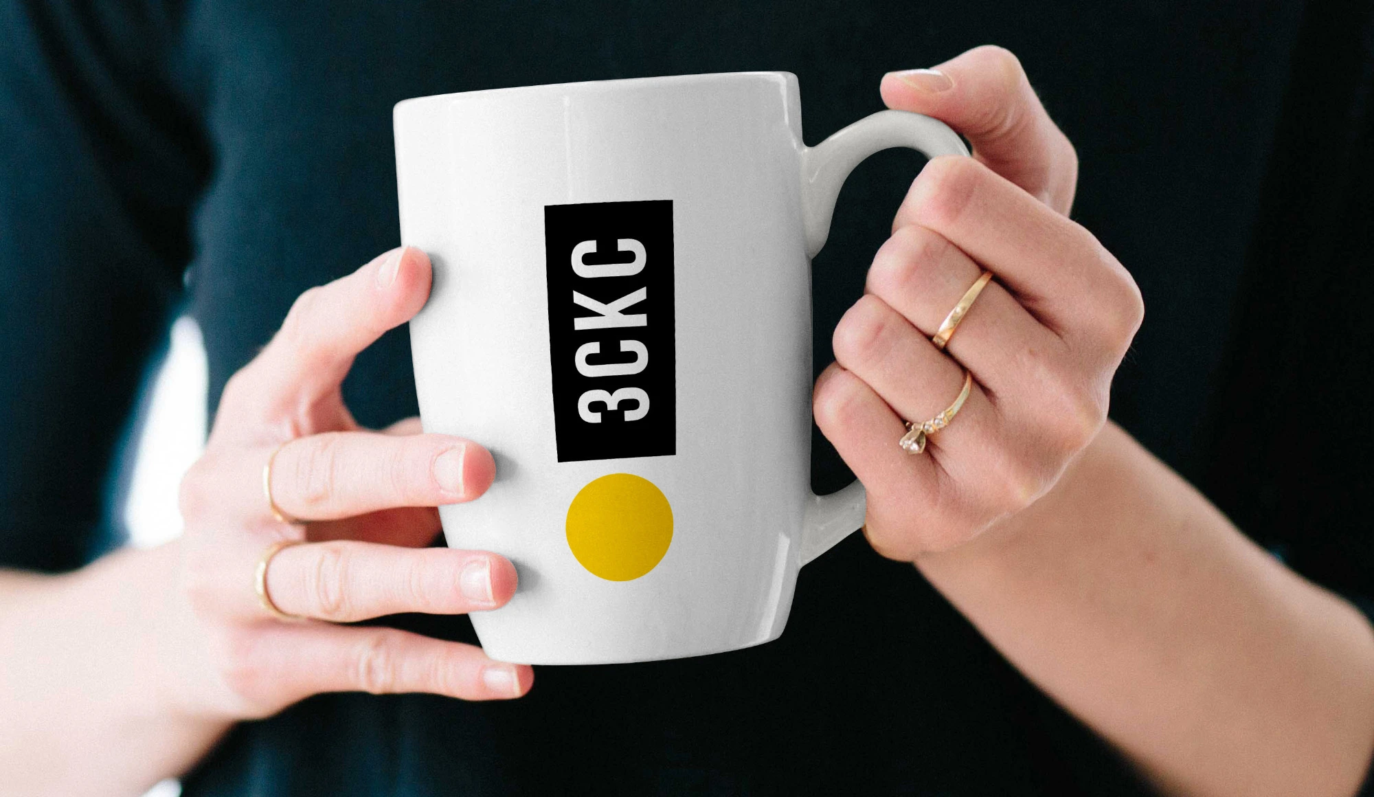
ZSKS — mug original project artwork
Everyday objects / The same compact signature on a ceramic mug.
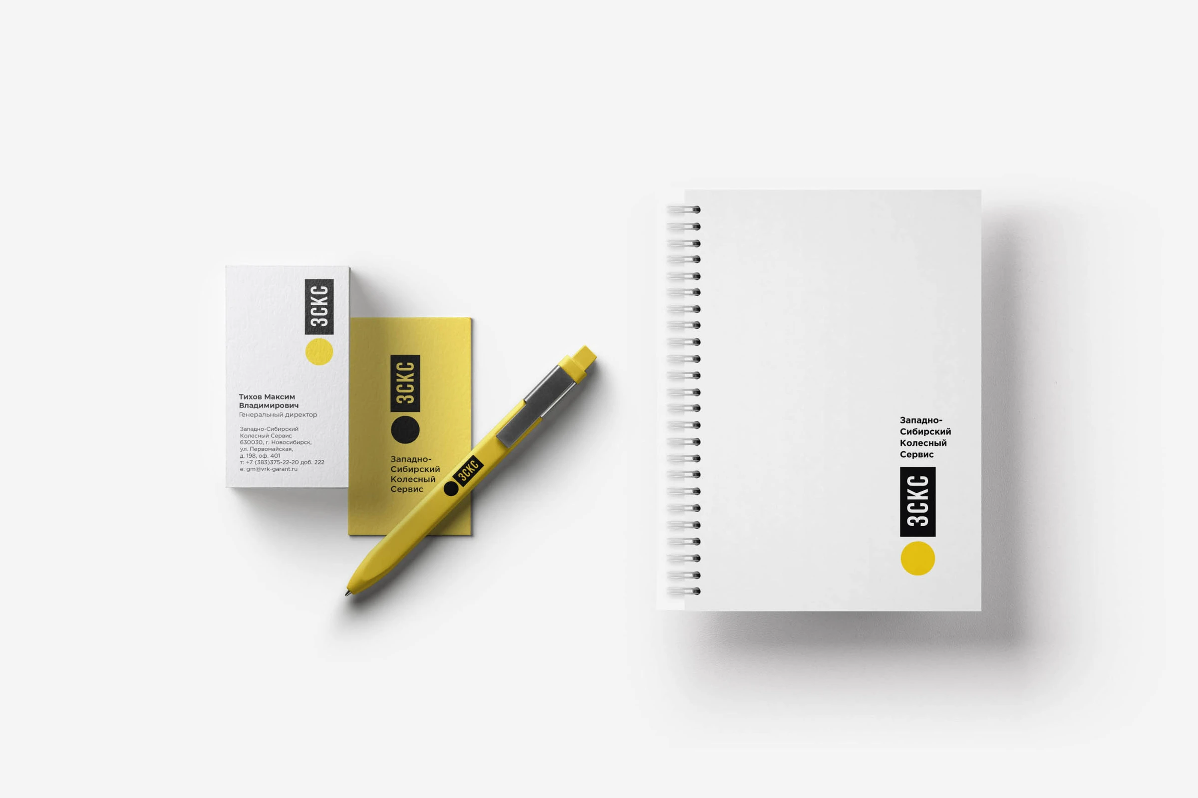
ZSKS — notebook original project artwork
Stationery / A consistent system for cards and notebooks.
ZSKS — stationery original project artwork
Brand assets / Original print and merchandise presentation.
06 / Our method in practice

Trace the visual
back to the idea.

Research informed the colour direction. The wheel guided the sketching. The final signature brought the circle and initials into one simple device, supported by rules for colour, typography and application.

Explore our approach

Project archive · 2019. ZSKS is the transliteration of ЗСКС, West Siberian Wheel Service. Original Cyrillic artwork is retained. Application images are original presentation mockups.

Your next chapter

Let’s give your
brand character.

Start a conversation