Meet Slivka.
A relaxed, pleasure-loving cow brings warmth and understated humour to the dairy brand.
- Client
- Novosibirsk Dairy Company
- Our role
- Brand positioning
Naming — Slivka
Logo & visual identity
Original mascot
Packaging design
A little pleasure.
A lot of personality.
Slivka is a grown-up cow with a relaxed, almost philosophical attitude to life. A green meadow is her sun lounger, rather than her buffet. The character gives the positioning a face: everyday dairy products become a source of small pleasures.
The character starts
with a gesture.
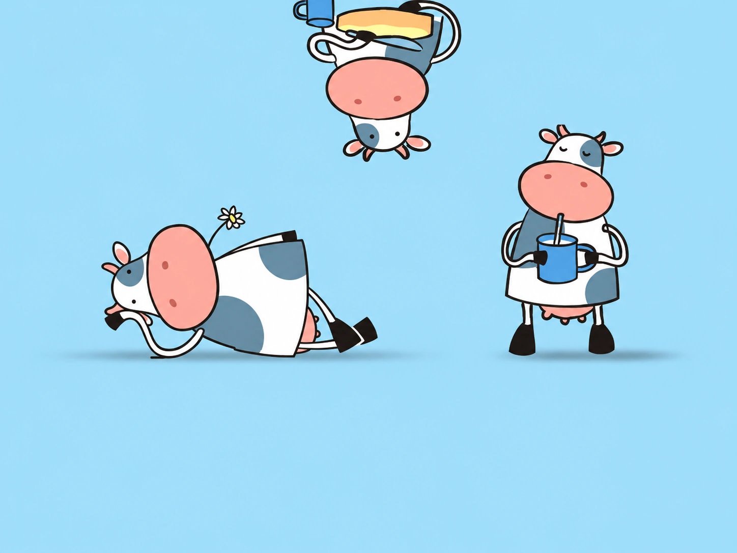
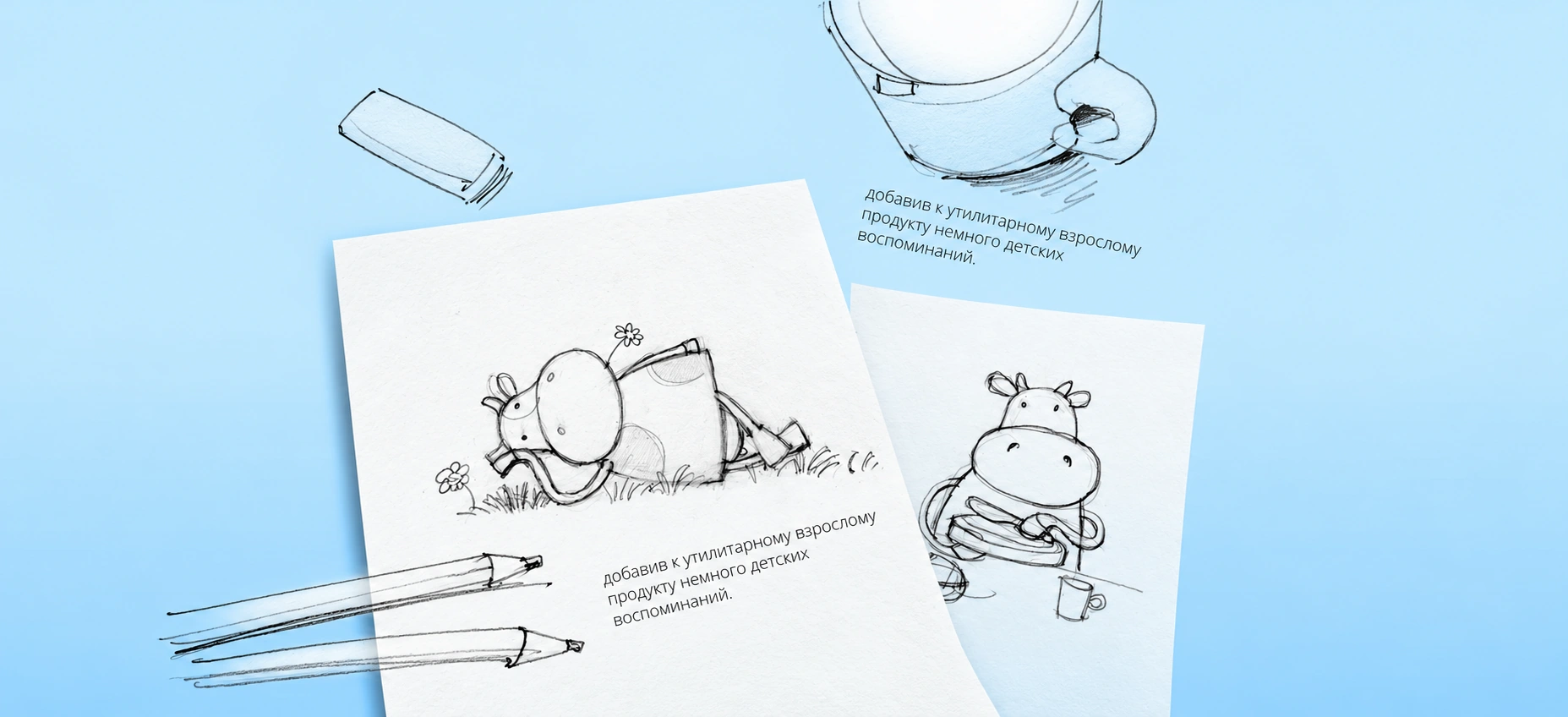
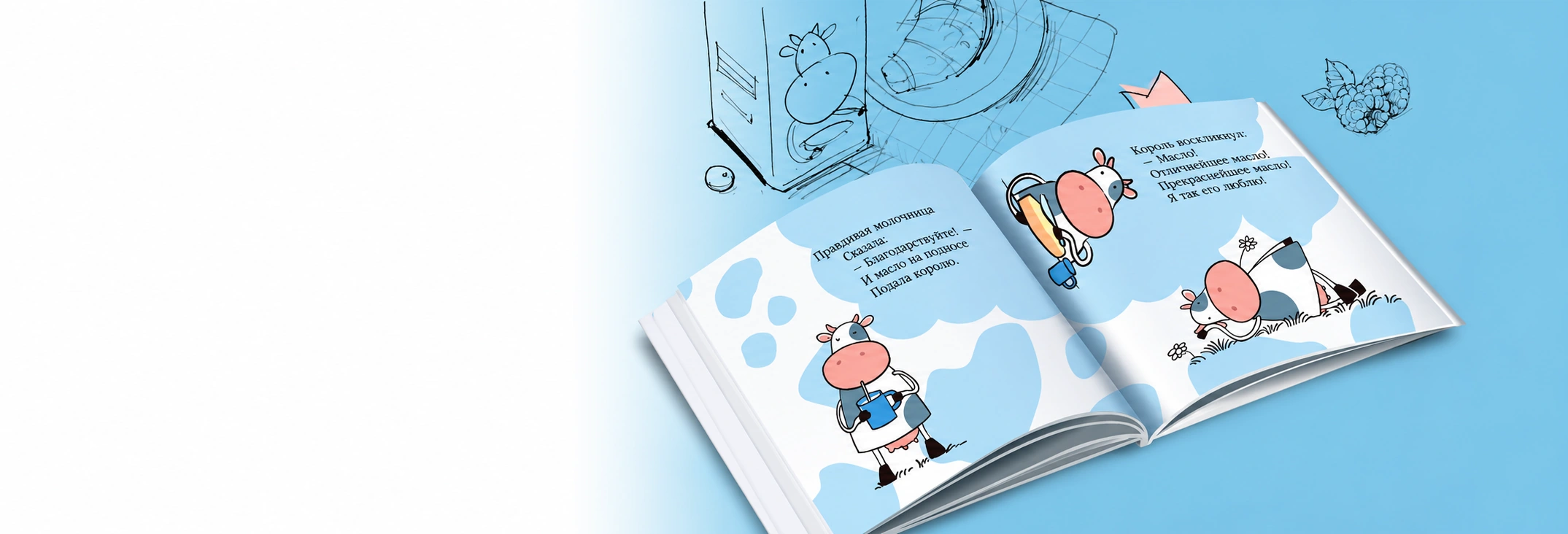
Resting on the grass. Enjoying a drink. Taking her time. The original pencil drawings explore the gestures that make Slivka feel familiar. We kept the informal drawing style: the humour lives in the pose, the expression and the little details.
A character you
want to spend time with.
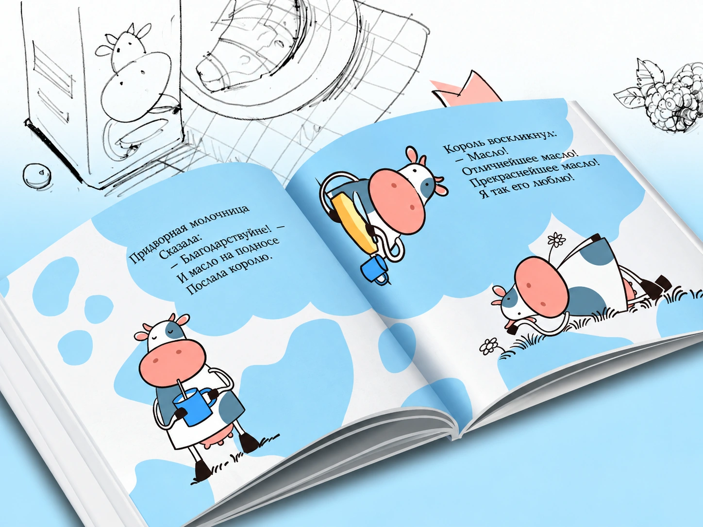
Slivka’s world continues beyond the label. An illustrated book brings her poses together with playful verse and drawings of everyday objects. The blue palette and expressive line connect the finished illustrations with the sketches that started them.
From the pack
into everyday life.
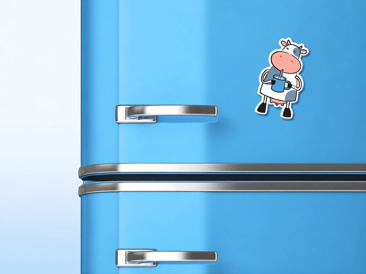
A glass of milk. A magnet on the fridge. The promotional objects bring Slivka into the moments the brand is about. The same recognisable character works at the small scale of a magnet and on a glass, with no need to explain the joke.

Easy to recognise.
Hard to walk past.
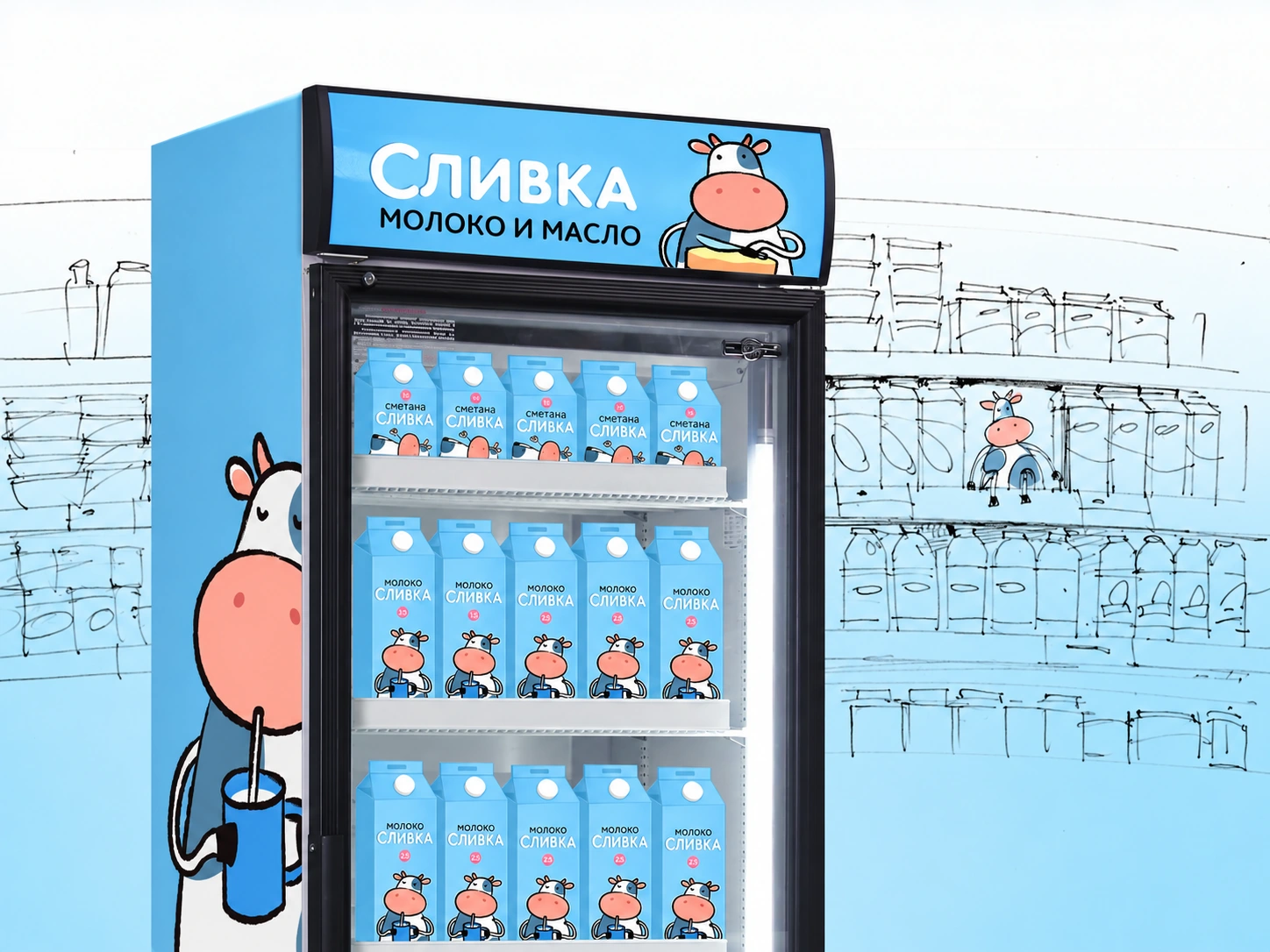
The character also works at retail scale. On the branded refrigerator, Slivka links the packaging, the display and the store environment. One personality holds the different applications together.