
A taste for life.
We created Slivka from the name up: brand positioning, naming, logo design, an original cow mascot and the packaging range.
- Client
- Novosibirsk Dairy Company
- Our role
- Brand positioning
Naming — Slivka
Logo & visual identity
Original mascot
Packaging design
Everyday pleasure.
A friendly character.
Brenda created the name Slivka and the connected dairy brand: positioning, logo, character and packaging. The positioning centres on accessible everyday pleasure.
The name echoes the Russian word for cream and becomes the name of the cow who speaks for the brand.
We named her Slivka.
Then gave her character.
Brenda created the name «Сливка» (Slivka). It echoes «сливки» — cream — and sounds like the name of a friendly character. The name connects creamy taste with the brand’s idea of everyday pleasure.
We also designed the lettering: soft, rounded forms give the name its creamy visual character. The logo, the cow called Slivka and the packaging all grow from the same positioning.
Explore the naming →Explore the logo design →
A familiar blue.
A clear family.
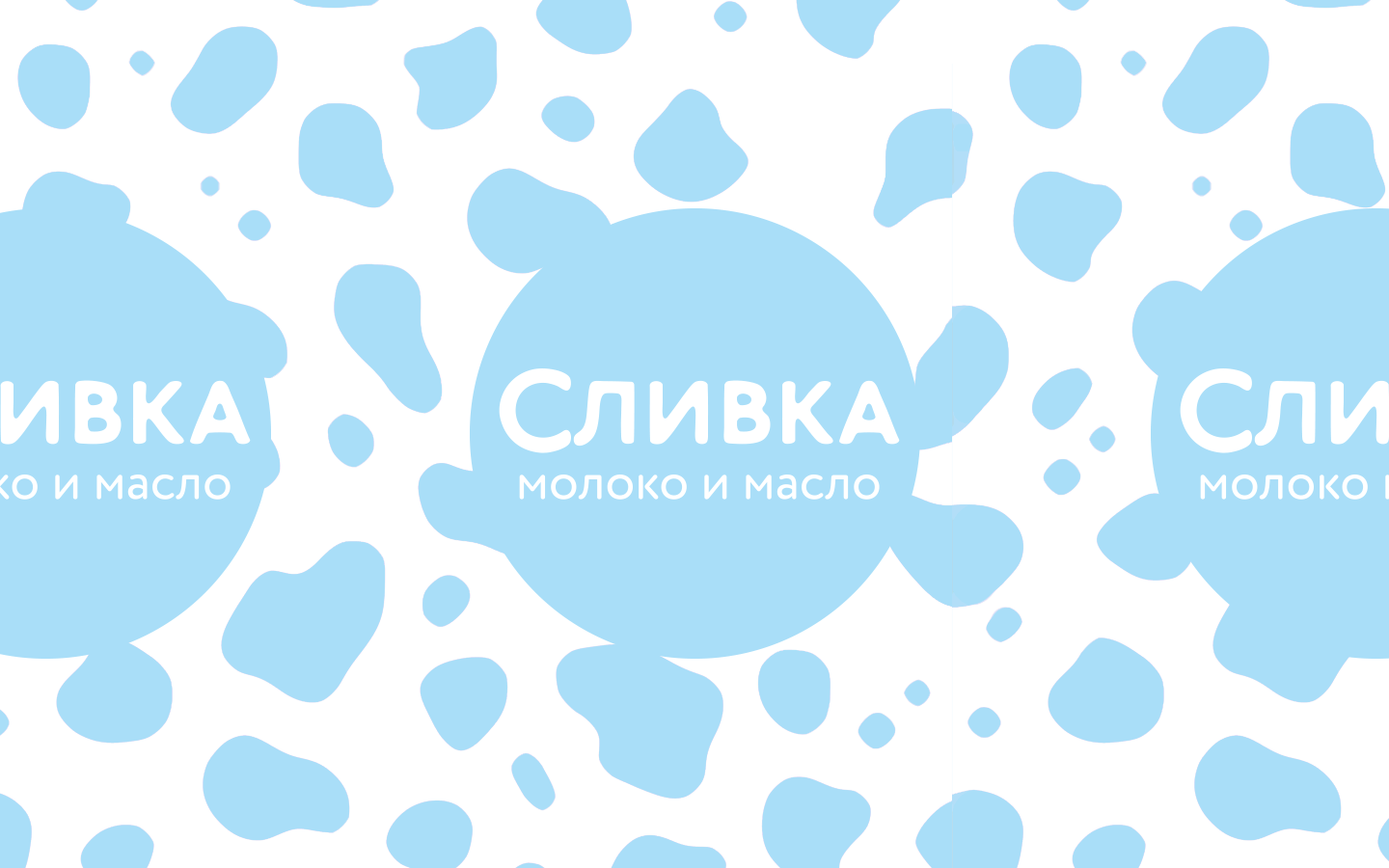
Soft blue connects the range. The rounded signature and a relaxed cow give the packs a recognisable character.
Product names, fat content and colour accents help distinguish the products while keeping the family together.
More than
a decoration.
The cow turns an emotional idea into an everyday companion. Her expressions and gestures bring warmth and understated humour to the pack.
Fine line drawings extend her world beyond the label, connecting the product with familiar moments of enjoyment.
One character.
Different products.
A consistent composition brings milk, sour cream, butter and spreads into one system.
Colour-coded product badges create variation without changing the central blue identity.
A name, a character,
a whole brand.
Strategy, naming, lettering, illustration and packaging develop the same idea: a friendly dairy brand with a taste for life.
Explore the naming, logo and character through the project navigation above.