
Brenda StudioStart a project
Selected work / ArtaFamily dentistry · 2024

Care for every
generation.

A thoughtful rebrand for a dental clinic with a twenty-year history, built around the families who return across generations.

Client
Arta
Our role
Research & brand strategy
Logo & visual identity
Website design
Wayfinding & communication
Explore the story
01 / The brief

A familiar clinic.
A clearer family brand.

Renewing an established brand calls for care, research and a clear process. The task was to make the clinic feel current while respecting the trust it had already earned.

The project

In September 2024, Brenda Studio renewed Arta’s visual identity and communication strategy around family values, trust and care.

The starting point

“We need a fresh, contemporary image. Our previous attempts with designers were disappointing,” clinic director Tatiana Saloshenko told us. Arta has been treating patients since 2003. Its familiar flower symbol no longer expressed the clinic’s ambitions, but its accumulated recognition was worth keeping.
02 / Research

Whole families.
Across generations.
Listen to the people who return

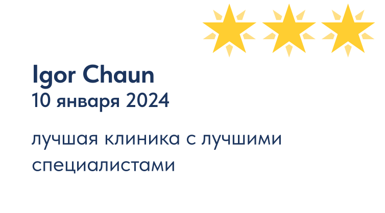
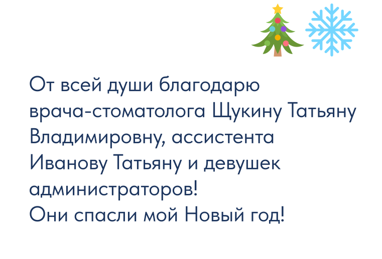
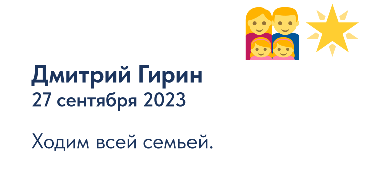
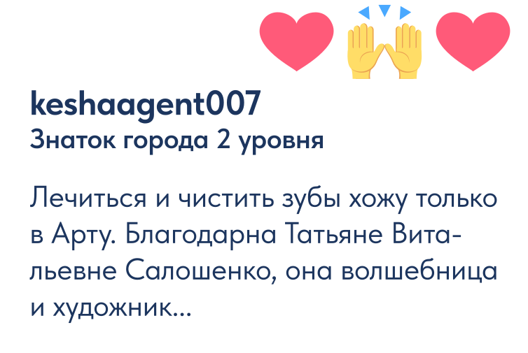
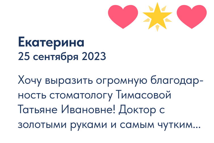
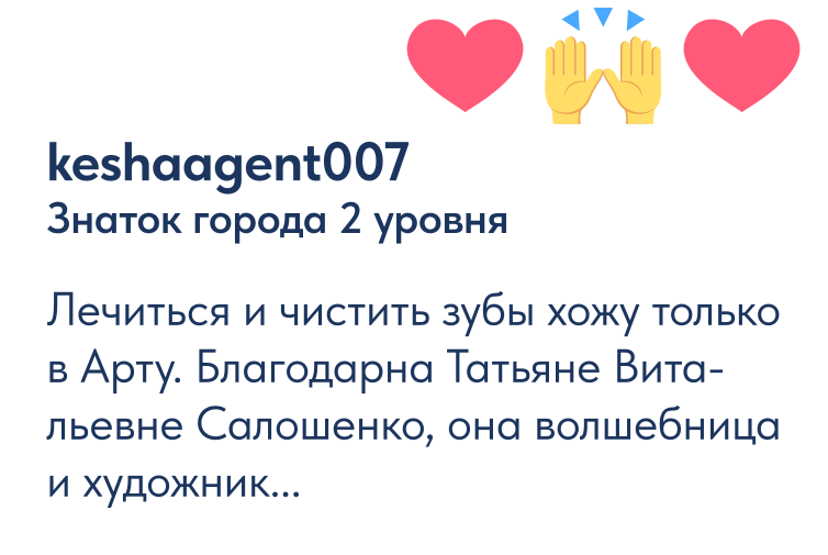
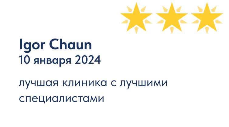
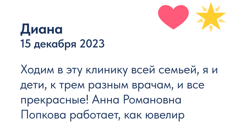
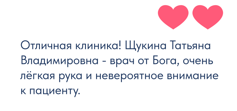
We reviewed patient feedback on 2GIS and Yandex Maps. One pattern kept appearing: people visited with their whole families, often across generations, from grandparents to grandchildren. That became the key to the new positioning.
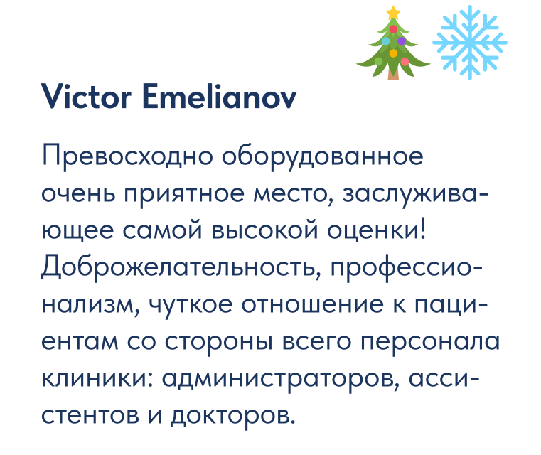
My children and I visit three different doctors here — and they are all wonderful!
— a recurring theme in patient reviews.
03 / Key insights

Three insights

The research revealed three connected opportunities: move beyond generic claims of professionalism, recognise an established family tradition, and give the clinic a warmer, more human voice.
Beyond the stereotype
1
2
3
Formal claims of professionalism made the clinic sound like every competitor.
A family tradition
Twenty years of families returning together.
A human connection
Patients value personal care as well as clinical expertise.
04 / Positioning

A family tradition,
made visible.

Find what is already distinctive

Earlier design proposals focused on appearances. They did not explore the clinic’s context or the relationships behind its reputation. For twenty years, Arta had attracted families, but that strength had not become part of its positioning.

From a clinic to family dentistry

Patient feedback provided the foundation: Arta is a dental clinic for the whole family, combining professional treatment with personal care. Recommendations pass from one generation to the next.

A line rooted in real behaviour

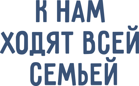
The new line translates as “Whole families come to us.” It describes an existing relationship rather than inventing a promise. “It reflects our clinic perfectly. People really do come here across generations,” said director Tatiana Saloshenko.
— Tatiana Saloshenko, clinic director.
“I like the line. Our patients really do come as families.”
— Tatiana Saloshenko, clinic director.
“I like the line. Our patients really do come as families.”
05 / The symbol

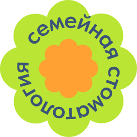
From flower
to cloud.

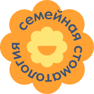
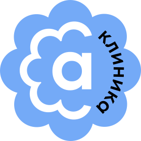
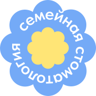
We reinterpreted the existing symbol rather than starting from zero. The flower evolved into a cloud: a softer, more open form that retains a connection with the familiar mark while expressing the clinic’s care for patients.
Turning the flower into a cloud let us preserve recognition while expressing the care and range of treatment at the heart of family dentistry.
— Evgeny Borodin, art director
06 / Symbol meaning

One symbol.
Several meanings.

The cloud combines protection, contemporary treatment and continuity with the clinic’s history.

Protection & care

Soft, rounded contours suggest shelter and reassurance. The intention is to make the identity feel comfortable and approachable, particularly for people who feel anxious about a dental visit.

Contemporary treatment

The abstract geometry gives the mark a contemporary character. Its open meaning allows the identity to represent a broad range of treatments, rather than illustrating a single dental procedure.

Continuity & trust

Recognisable features of the historical symbol remain within the new shape. That visual continuity respects the trust of patients who have visited Arta for many years.
07 / Logo system

A logo for different situations

The cloud and the Arta name form the core signature. Different versions adapt the identity to signs, print and small digital spaces.

Before & after

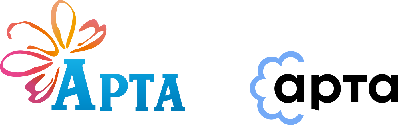
The new signature gives the family clinic a clearer contemporary expression. Compare the original and renewed logos.
The original flower mark had become disconnected from the clinic’s contemporary character. Its colourful styling and lettering were reconsidered as part of a clearer family dental identity.
Before
After
08 / Contrast

Light & dark versions

The positive logo works on light surfaces; the reversed version provides contrast on dark ones. The cloud retains its cornflower-blue colour in both.
09 / Scale

From a facade to an icon

The identity needs to remain recognisable across very different scales. A clear cloud silhouette gives the mark presence on a building and keeps it distinct in a small digital application.

Small-scale recognition

A website icon must stay clear at a small size. The simplified cloud provides a compact signature without the full lettering.
Website icon
The simplified cloud is designed to remain distinct in a compact digital application, where the full signature would be too small.
10 / Digital signature

A compact digital signature

For social profiles and digital applications, a compact cloud version carries the clinic descriptor. It keeps the identity recognisable where a full horizontal signature would be too small.
11 / Visual identity

A cloud becomes
a visual language.

The cloud as a visual language

The cloud offers a broader visual language than the original flower. Its shape can become a frame, a graphic surface or a character, while retaining the same familiar silhouette.
A flower is a positive metaphor, but for this clinic it did not express the desired sense of protection and care. The cloud allowed those qualities to become part of the identity.
The cloud expresses shelter and care. Its soft shape and cornflower-blue colour support the reassuring character of a family clinic.
A cloud as a symbol of care

A cloud as a symbol of care

The cloud expresses shelter and care. Its soft shape and cornflower-blue colour support the reassuring character of a family clinic.

12 / Brand applications

A shape with many roles

The cloud extends beyond the logo. It can frame information, organise communication and bring a consistent character to different applications.
Patient portraits. Advertising messages. Clinic identity. Motivational communication.
13 / Colour palette

The Arta colour palette

The cloud works across scales and colours, from large portrait frames to small signatures, cornflower-blue information panels and orange accents.
The clinic’s existing interior palette had worked well for twenty years. We kept that continuity while refreshing the green and orange accents.

Cornflower blue at the core

Cornflower blue connects the identity with the clinic interior. It provides the main colour for the cloud, information and wayfinding.
Orange and bright spring green bring energy to accents and shared spaces.

Core colours

Three blues form the palette: cornflower #6495ED for the main identity, pale #E9F0FB for backgrounds, and dark #3A5377 for contrast and formal communication.
14 / Colour & typography

Warm & neutral supporting colours

Warm and neutral shades complement the cooler blues and support the human character of the patient portraits.

Typography for family dentistry

Clear communication about treatments, prices and practical details matters. The typographic system combines an approachable voice with a readable information hierarchy.
15 / Typography

Sans serifs with complementary roles

The system uses freely available typefaces. Informal Prinbambas and more structured Akrobat shape the headings; regular text styles support longer reading.
Contrasting typefaces establish a clear hierarchy. Prinbambas gives campaign headlines a friendly character; Tilda Bold keeps information and badges direct and readable.
  1. Tilda Bold
  2. Prinbambas
1.
2.

Typography in advertising

16 / Communication

Typography in communication

Prinbambas and Akrobat bring character to headings. Tilda Regular and Akrobat support longer reading. The combination balances a friendly tone with a clear information hierarchy.
Explore 4 examples
Staff badge / Arta identity
01 / Staff badge

A familiar identity, worn with care.

The cloud signature on a cornflower-blue staff badge.

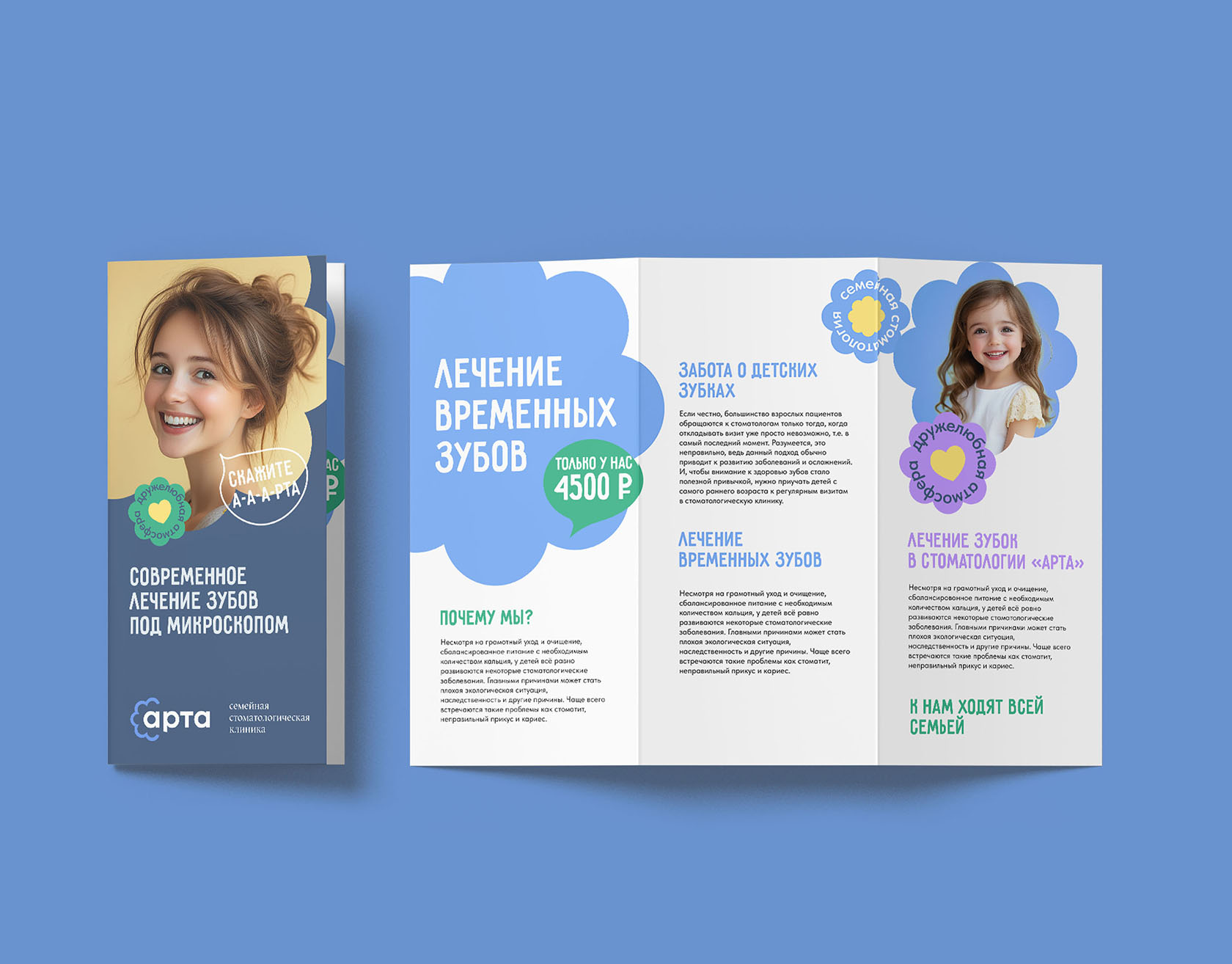
Patient leaflet / Arta identity
02 / Patient leaflet

Clear information. A reassuring character.

The cover and spread bring treatment information into the same visual family.

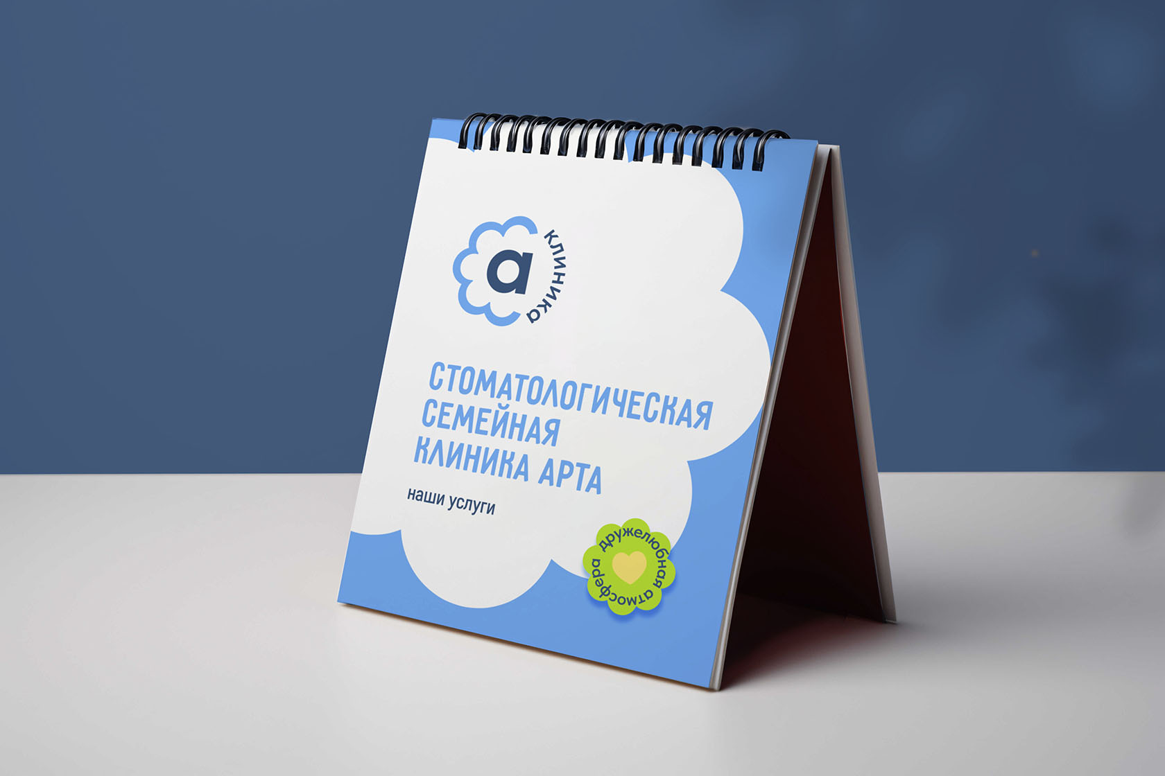
Desk calendar / Arta identity
03 / Desk calendar

Care throughout the year.

Clinic services presented through the cloud graphic system.

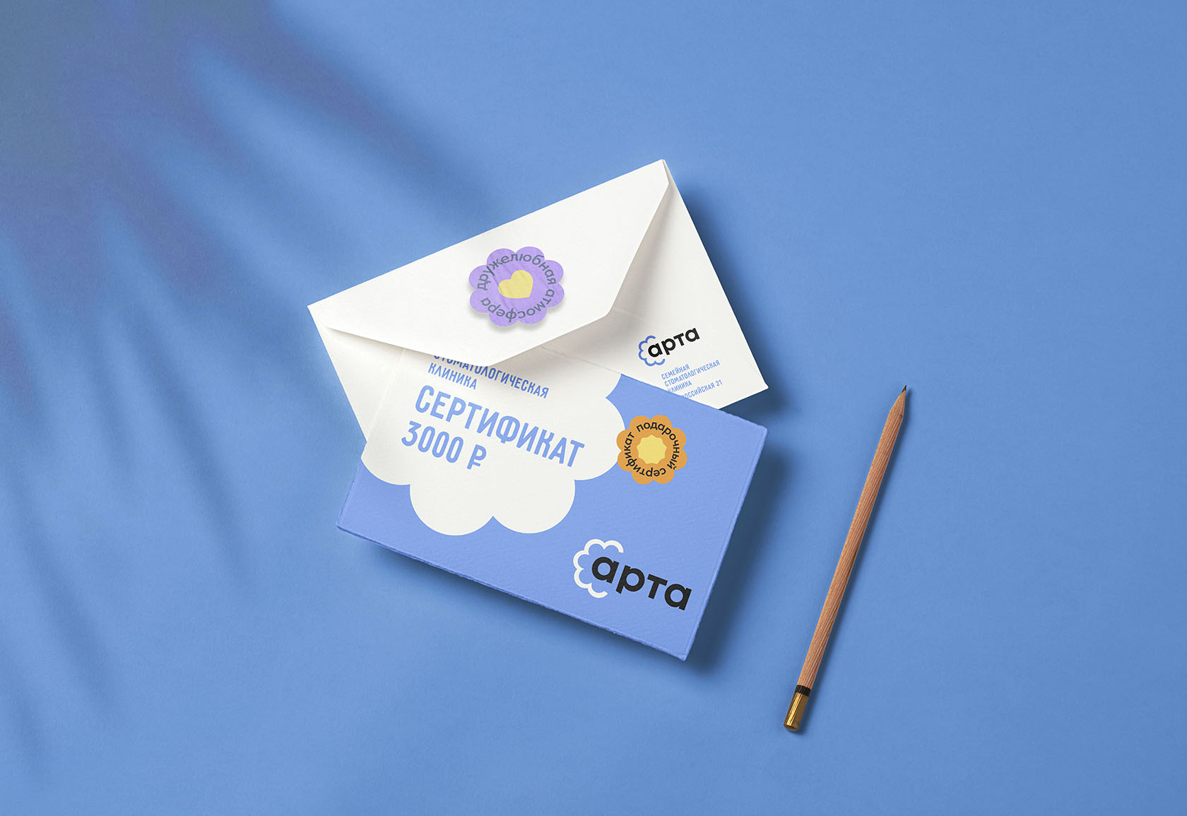
Gift certificate / Arta identity
04 / Gift certificate

A thoughtful gift.

A coordinated certificate and envelope.

17 / Website design

A familiar identity.
A useful website.

The clinic offers a wide range of treatments. Its website needs to communicate services, prices and practical information clearly while supporting a continuing relationship with patients.

The first screen

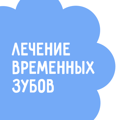
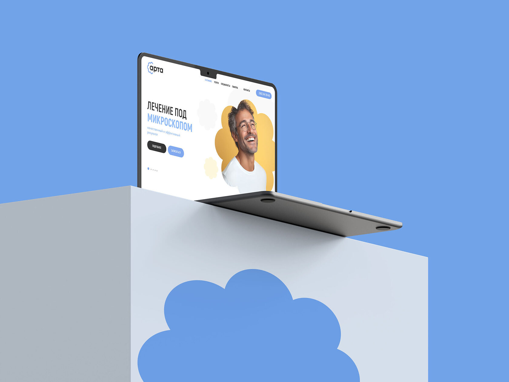
The opening screen introduces the clinic and its main services. Cloud-shaped service cards carry the identity into navigation and connect the information with the visual system.
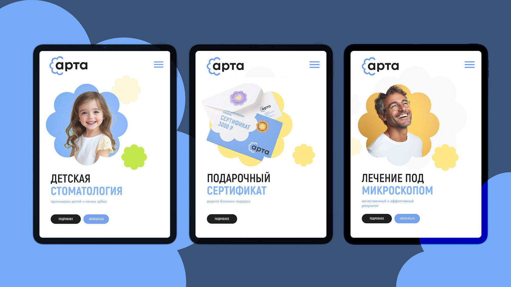
The homepage slider presents core services: children’s dentistry, microscope treatment and gift certificates. It introduces each offer within the same cloud-based visual system.
  1. Akrobat Extrabold
  2. Tilda Regular
  3. Akrobat Bold
3.
1.
2.

A slider for the main services

18 / Responsive design

Responsive & easy to navigate

Desktop and mobile layouts share the same visual language. Clear navigation and a structured page hierarchy help visitors find the information relevant to their visit.
Explore 3 examples
Desktop / Arta identity
01 / Desktop

A clear first impression.

The main services introduced through the cloud-shaped visual language.

Service pages / Arta identity
02 / Service pages

One system. Different treatments.

Children’s dentistry, gift certificates and microscope treatment.

Tablet / Arta identity
03 / Tablet

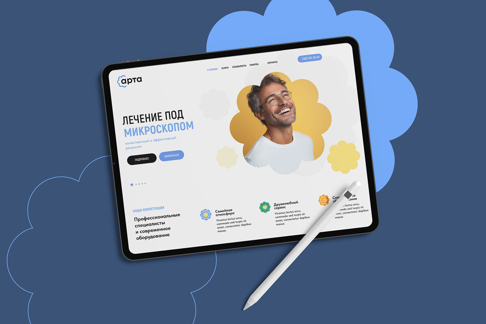
A familiar identity on every screen.

The homepage and clinic information adapted to a tablet layout.

19 / Information & wayfinding

Clear information.
Confident navigation.

The website design brings together the clinic, specialists, treatments, pricing and contact information, with an appointment-booking journey as part of the experience.

Wayfinding with care

A new department made it necessary to distinguish adult and children’s routes. We developed a wayfinding system that helps patients orient themselves while keeping the clinic’s family character visible.

The first impression

Entrance information & identity

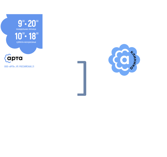
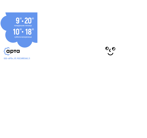
The entrance introduces the renewed identity through the opening-hours sign, door graphics and a consistent approach to practical information.
Opening hours are presented in the new identity. Door graphics use the cloud and clinic lettering to help patients recognise the entrance.
The shared opening-hours sign and the clinic entrance, shown in context and in detail.
20 / Reception

A welcoming reception

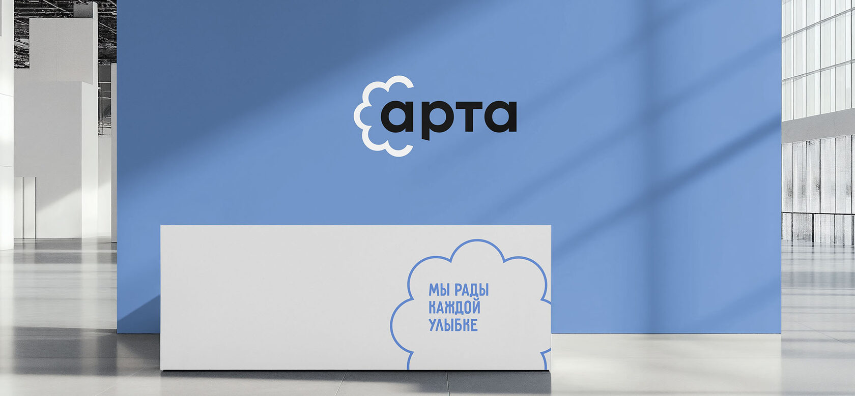
Instead of a conventional welcome, patients encounter “We are happy to see every smile.” The reception brings a warm voice and consistent identity into the physical experience.
A dimensional logo behind the reception desk makes the clinic immediately recognisable. Clear information and navigation support the patient’s first steps inside.
Arta reception with dimensional logo and cloud-shaped welcome message

The main reception

The reception is the first space patients encounter. A minimal desk and the message “We welcome every smile” set a friendly tone from the moment they arrive.

The dimensional logo, cloud graphics and blue palette bring the clinic’s identity into the interior, creating a welcoming space with a clear, recognisable character.
21 / Children’s department

A space for younger patients

Friendly cloud characters introduce the children’s department. Different expressions, playful messages and colourful wayfinding make the environment feel approachable.
Cloud mascots speak through short, playful phrases. Door graphics and signs help children and their parents understand where to go.
22 / The mascots

Friendly clouds.
A reassuring presence.

The characters combine orientation with play. They bring a friendly voice to the clinic and offer children a point of connection before an appointment.
Cloud characters help children find their way around the clinic. “Say A-a-a-rta” and other playful phrases bring a friendly voice to the experience.

The cloud mascot

23 / Interior wayfinding

A connected interior

A shared system of graphic elements links room numbers, information signs and messages across the clinic.
Large cornflower-blue room numbers provide a clear reference. The cloud shape connects functional wayfinding with the wider identity.
24 / Brand voice

One family brand.
Different generations.

The aim was a space in which patients could feel comfortable and understand their route without unnecessary effort.
Communication changes with the audience. The identity gives children, teenagers and adults a shared family setting while allowing messages to respond to their different needs.

For teenagers: confidence & independence

Messages for teenagers acknowledge independence and responsibility. The tone encourages care for their health without speaking to them as small children.
  • «Эксперт зубной щётки»
  • «Было легко и круто»
  • «Доктор меня похвалил»

Эти фразы не только информируют, но и мотивируют подростков следить за своим здоровьем, формируя позитивное отношение к стоматологическим процедурам.
Playful messages for children aged three to seven include “I am the bravest!”, “A beautiful smile!” and “Say A-a-a-rta”. Simple language makes the setting more approachable.

For ages 3–7: play & encouragement

25 / The outcome

Friendly expertise

Professional information is delivered with warmth. “We are happy to see every smile” captures the balance: confident care and a personal welcome.

A contemporary family dental brand

The three-month project connected positioning, visual identity, website design, wayfinding and communication around the clinic’s existing family relationships.

What the project brought together

Family positioning and a new line. A renewed cloud symbol and adaptable signatures. A connected visual system, website designs, entrance and interior wayfinding, and messages for different generations.
Our clinic has been working for twenty years. Brenda helped renew the identity, turning the old flower logo into a contemporary brand symbol.

— Tatiana Saloshenko, clinic director.
26 / The project

A connected brand.
Built around people.

The project shows how listening to an organisation’s audience can reveal the foundation for its identity. Arta’s new expression builds on the family relationships that were already there.
Your next chapter

Let’s give your
brand character.

Start a conversation ↗