A clear guide.
A consistent brand.
We brought Progenessi’s visual identity into a practical guide, connecting the core rules with the everyday materials of a beauty salon.
- The deliverable
- Brand guidelines
April 2026 edition - Our work
- Identity standards
Graphic & layout principles
Application specifications

Give the identity
room to work.
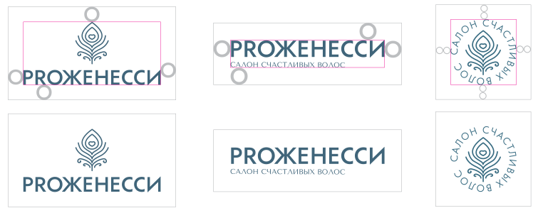
The logo rules define signature versions, clear space and minimum sizes. Clear space uses the O from the wordmark as its reference, making the principle easy to repeat across formats.
The guide also shows what to avoid: changing proportions, rearranging the elements and introducing unsuitable effects or colour combinations.
Different elements.
The same character.
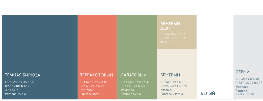
Tenor Sans and Tilda Sans establish the typographic hierarchy. The palette balances deep teal, terracotta, green and warm neutrals.
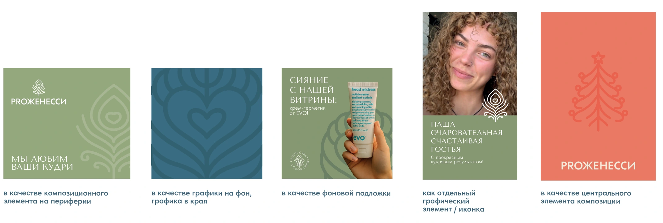
The feather’s flowing line extends into a family of graphic elements. The guide shows how these can become a background, an accent at the edge or the main focus of a composition.

Useful in the studio.
Useful in the salon.
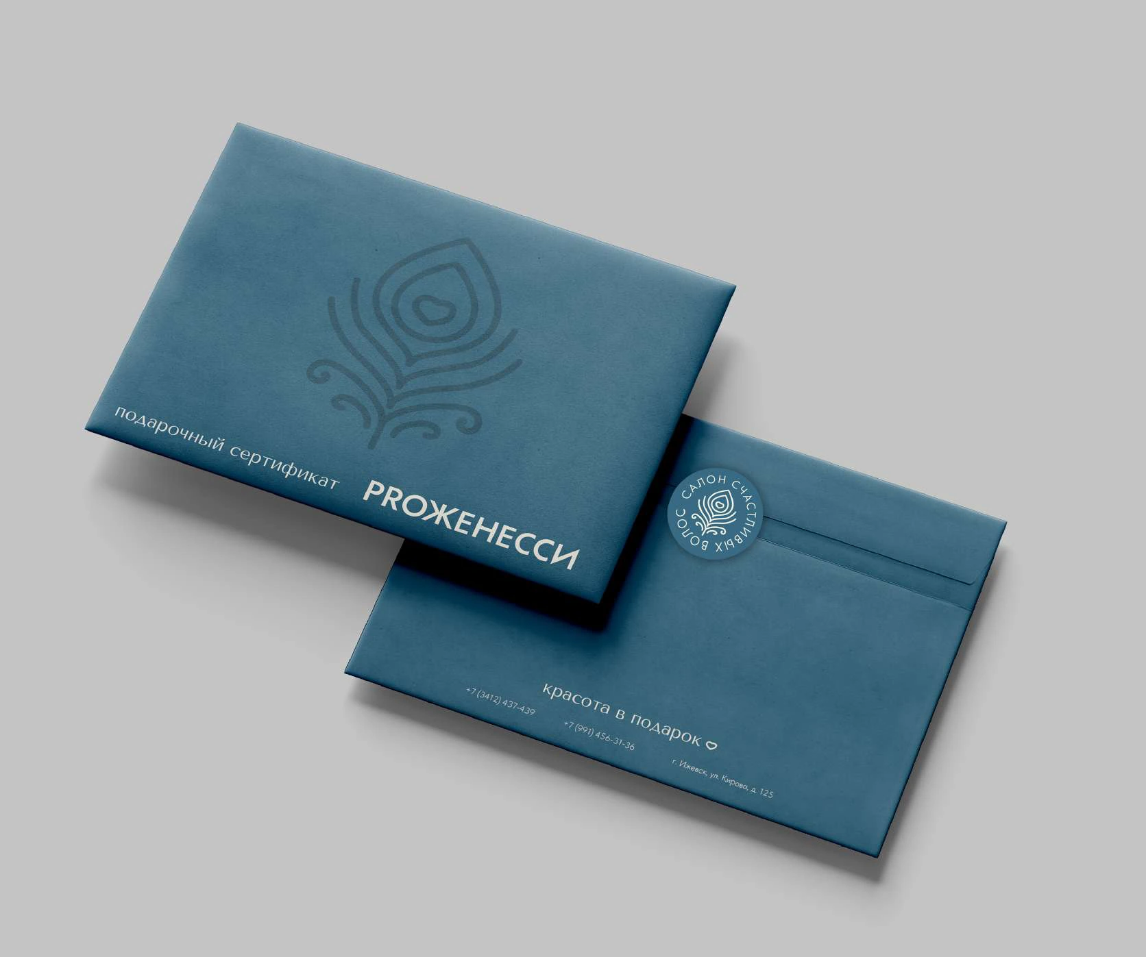
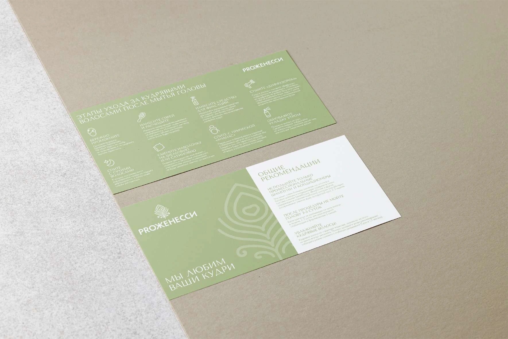
Application specifications translate the system into real design tasks: gift certificates and their wrapping, client care sheets, salon objects, signage and digital templates.
Artwork, production notes and examples sit within one consistent framework. The guide makes the connection between the identity and its everyday use visible.