
A salon for
happy hair.
An expressive identity for a salon that puts individuality, care and the pleasure of being yourself at its heart.
- Client
- Progenessi
Beauty salon - Our work
- Logo & visual identity
Graphic language & icons
Print, gifting & signage
Digital templates & brand guidelines
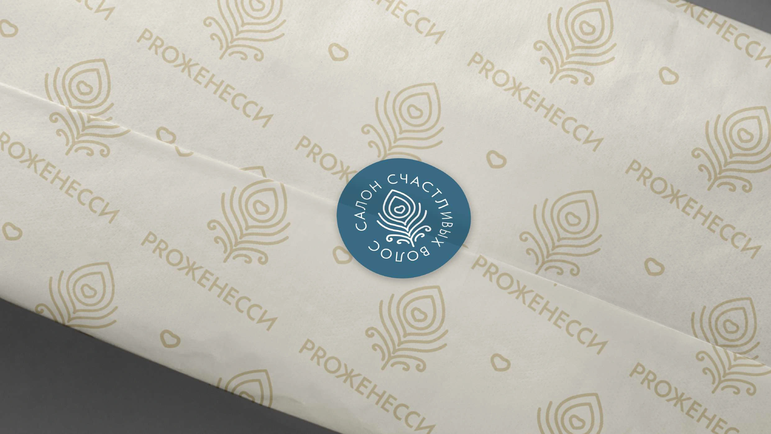
Care for the hair.
Joy for the person.
The salon’s positioning centres on healthy-looking hair, individual care and everyday natural luxury. Its line, “A salon for happy hair”, puts an emotional idea behind a professional service.
Our visual identity brings that idea into the things people see, touch and take away. We worked with the existing Progenessi name, giving it a coherent and expressive visual world.
A feather.
A curl.
A heart.
The original mark brings flowing curls and a heart together in a feather: a compact expression of “happy hair”.

A gentle line.
A clear signature.
The feather’s rounded line gives the identity a soft, distinctive character. At its centre, the heart connects the salon’s service with warmth and personal attention.
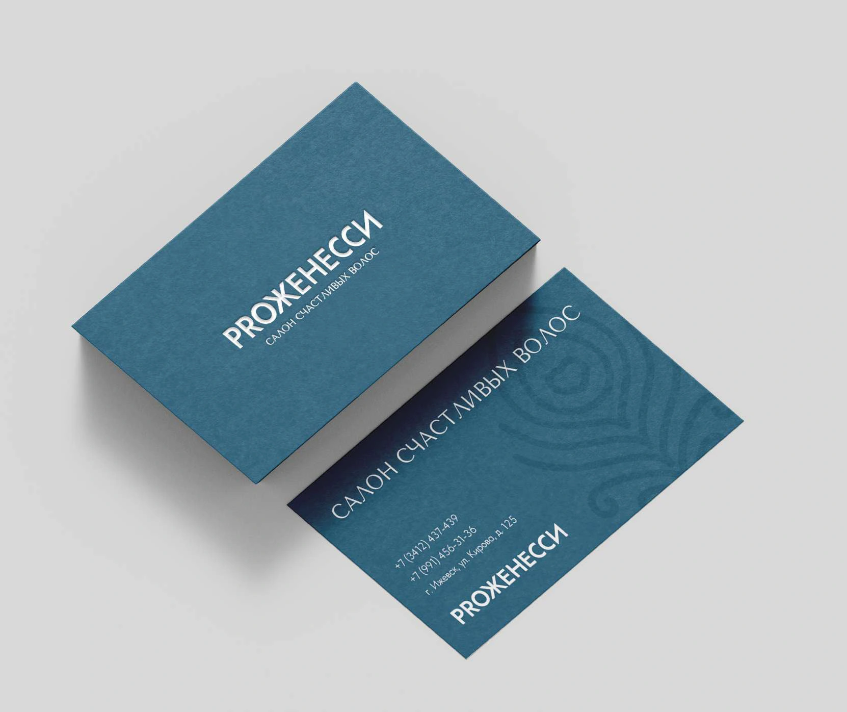
The wordmark anchors the more expressive symbol. Separate and combined versions allow the identity to work across a small seal, a gift, a salon cape and a storefront.

One line.
A whole language.
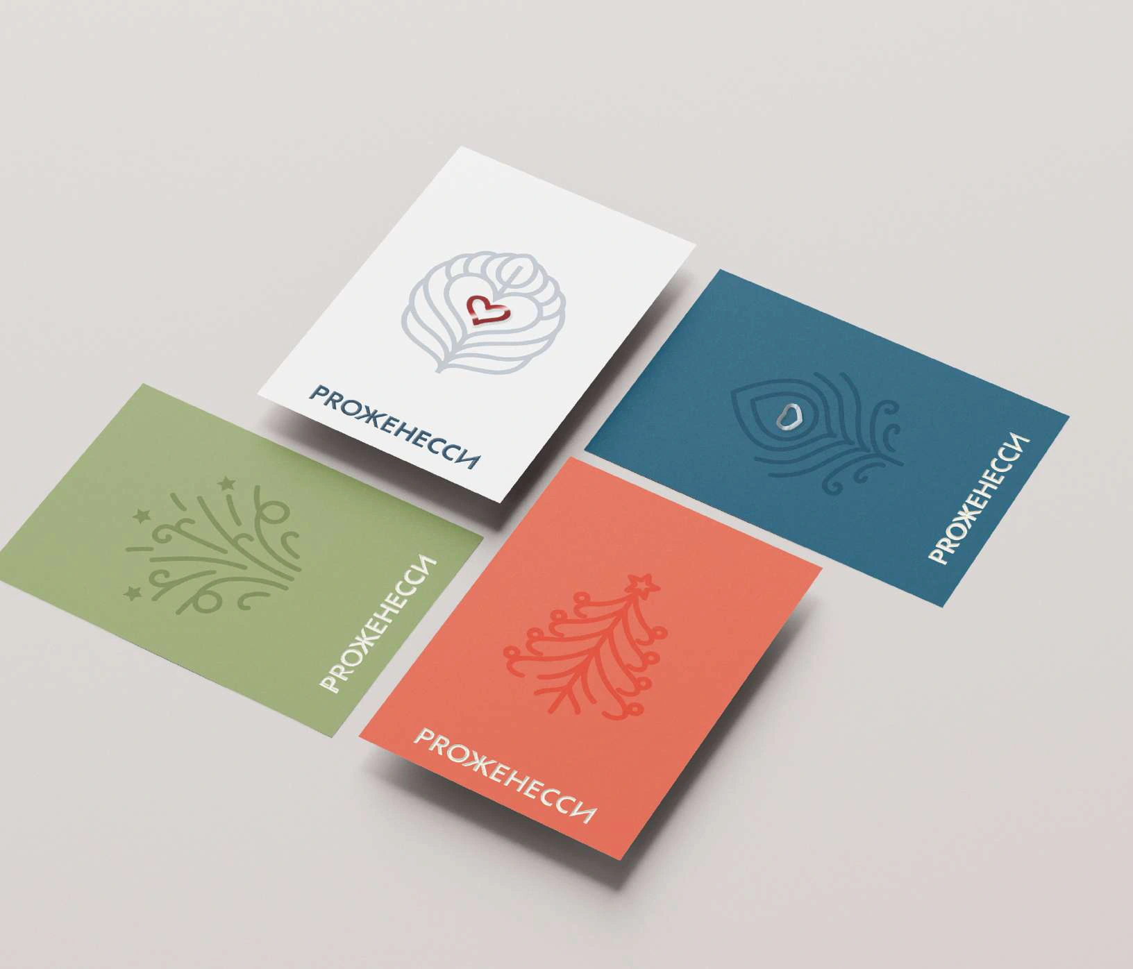
The symbol grows into a family of graphic elements: a celebratory burst, a layered heart and a seasonal tree. They share the same curved line, allowing different occasions to feel part of one brand.
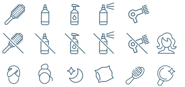
Practical hair-care icons extend the system into client information. An elegant Tenor Sans headline pairs with readable Tilda Sans body copy, while a measured palette balances calm and energy.

Deep teal#44657b
Terracotta#e87560
Leaf green#9dad7a
Cream#f5f1e5
Warm beige#dccdab
A little ceremony.
Before the appointment.
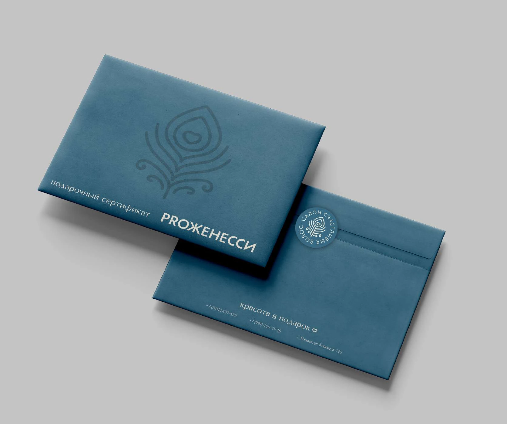
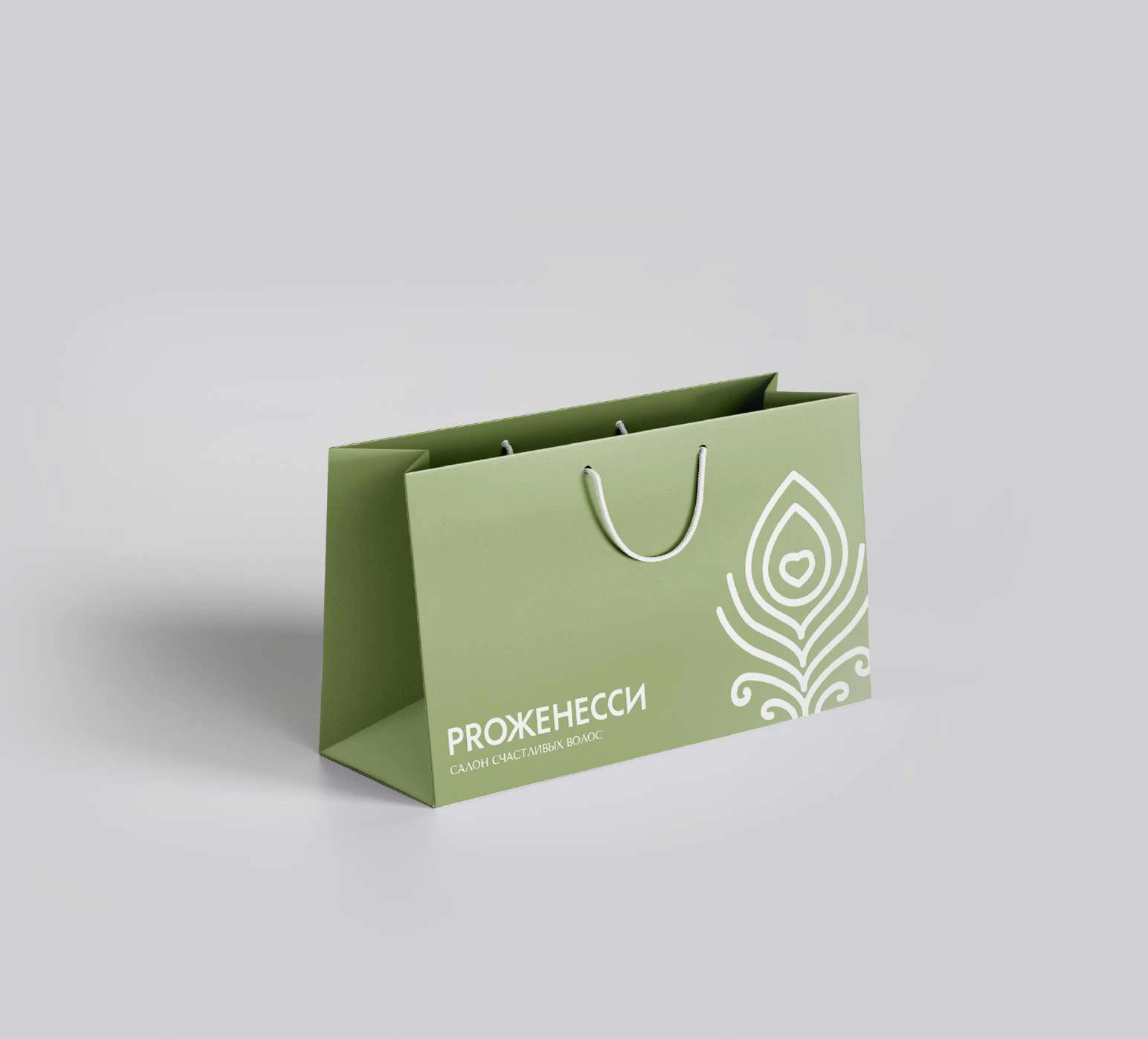
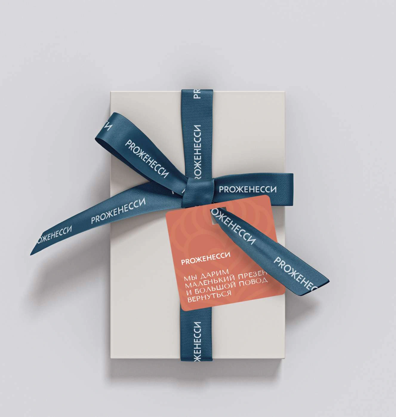
The gift certificate is treated as a complete experience: card, envelope, seal and bag. Blue, terracotta, green and light neutral versions give different occasions their own expression.
The same graphics carry through the wrapping. A ribbon, a feather or a heart makes the gift feel connected to the salon before the recipient walks through the door.
The details
make it personal.
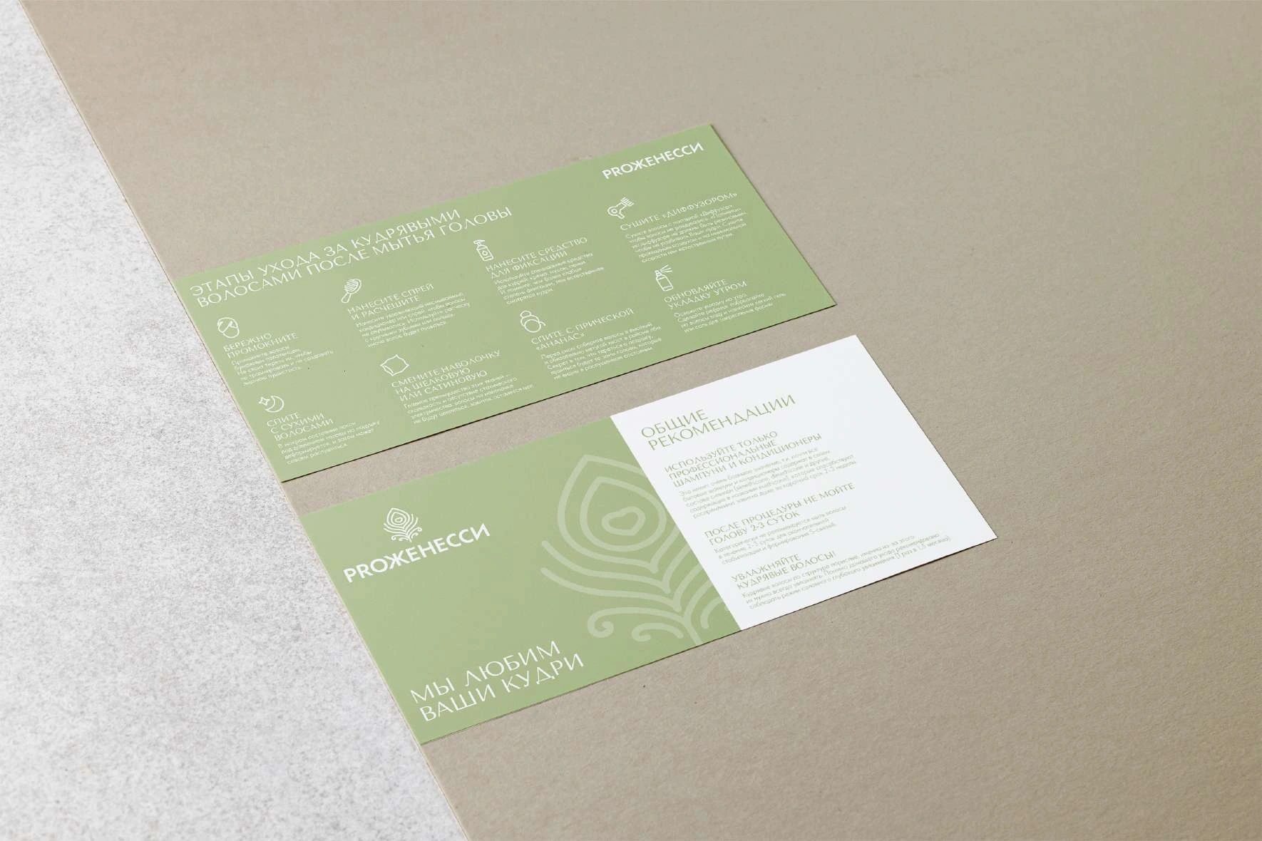
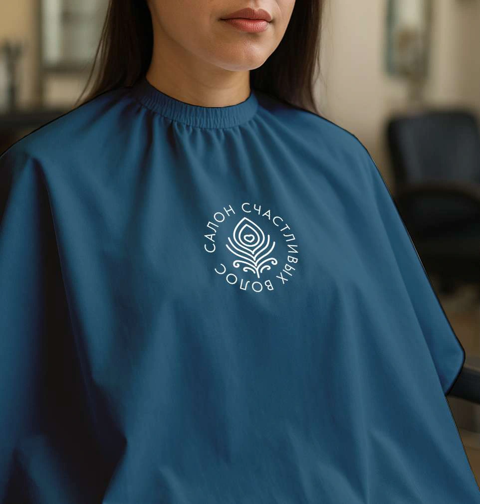
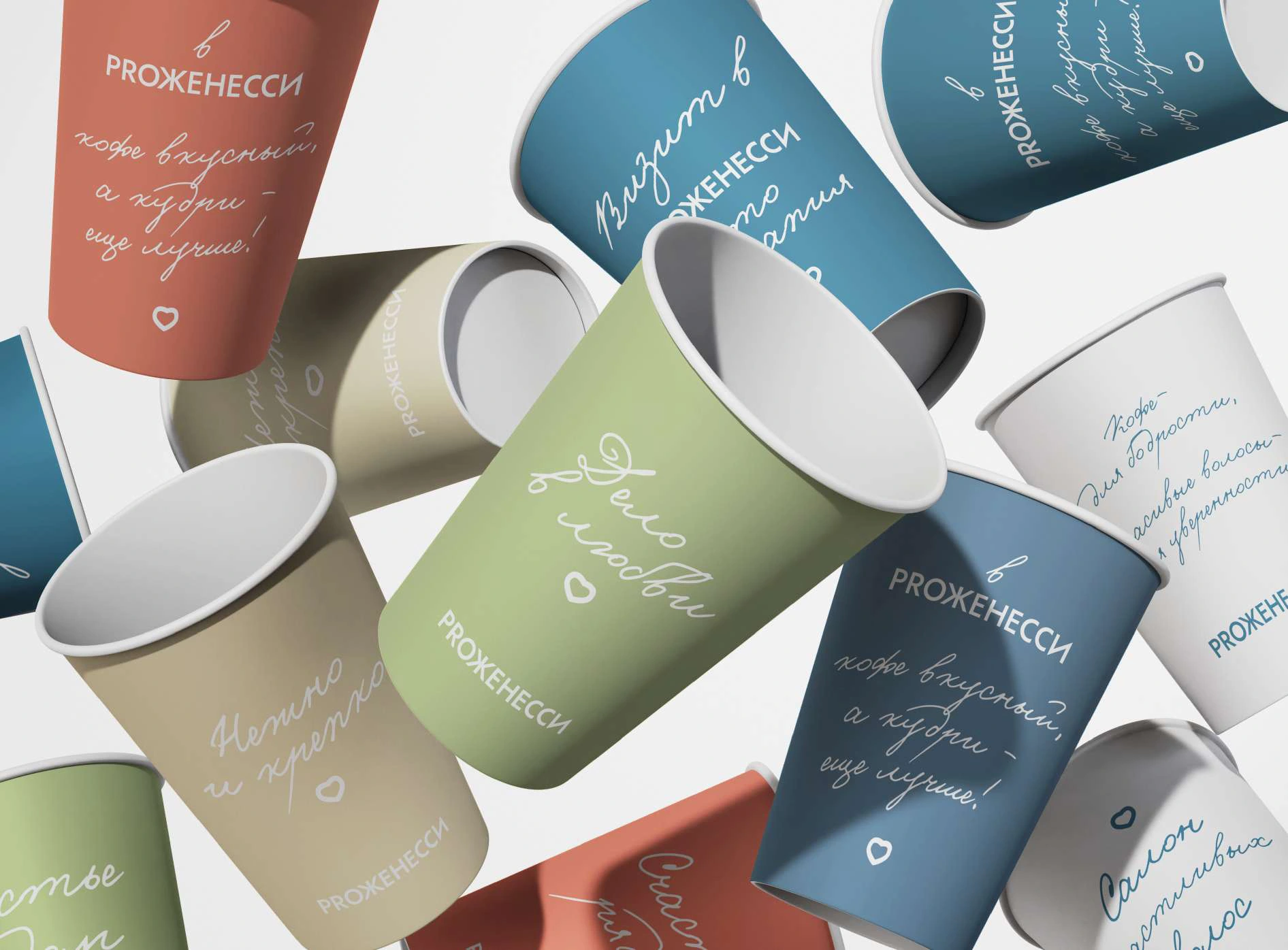
The identity continues into everyday salon objects: care instructions, a cape, cups and printed reminders. These are useful parts of the visit, each carrying the same visual character.
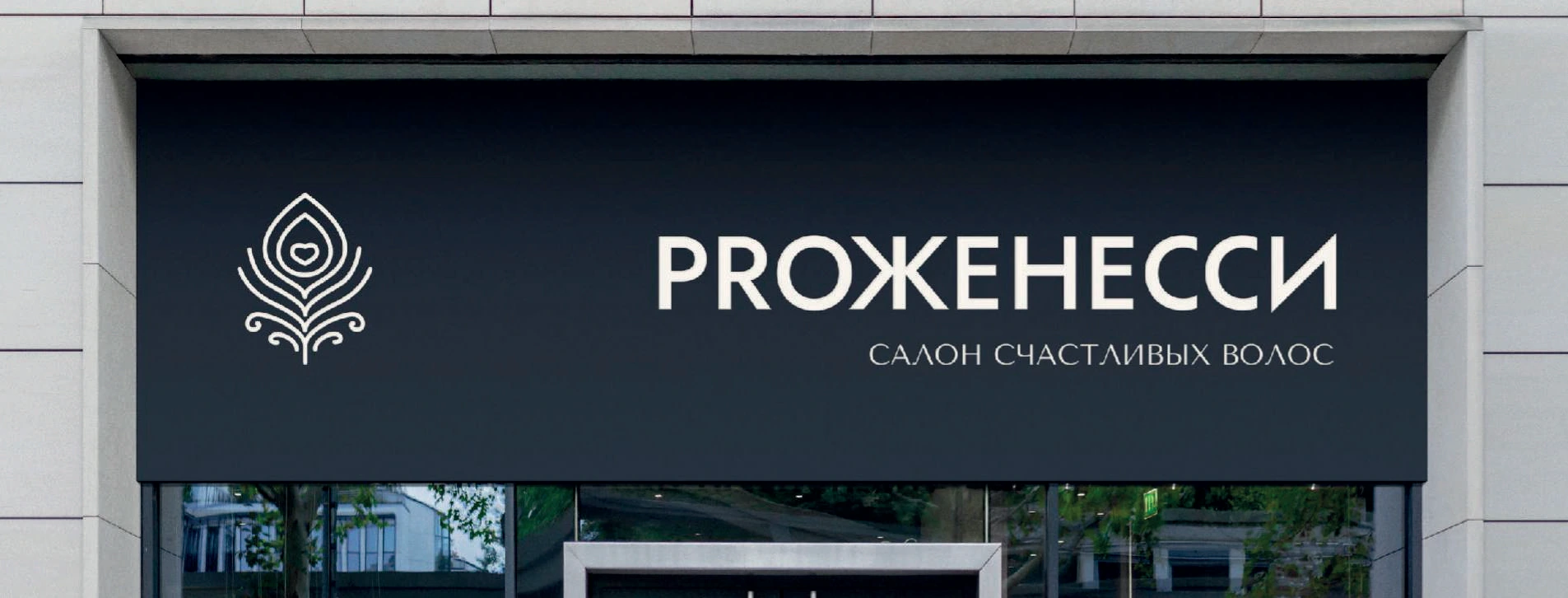
Outside, the signature identifies the salon. On the door, practical information follows the same typographic and colour system, linking the welcome with the experience inside.
The same warmth.
On a smaller screen.
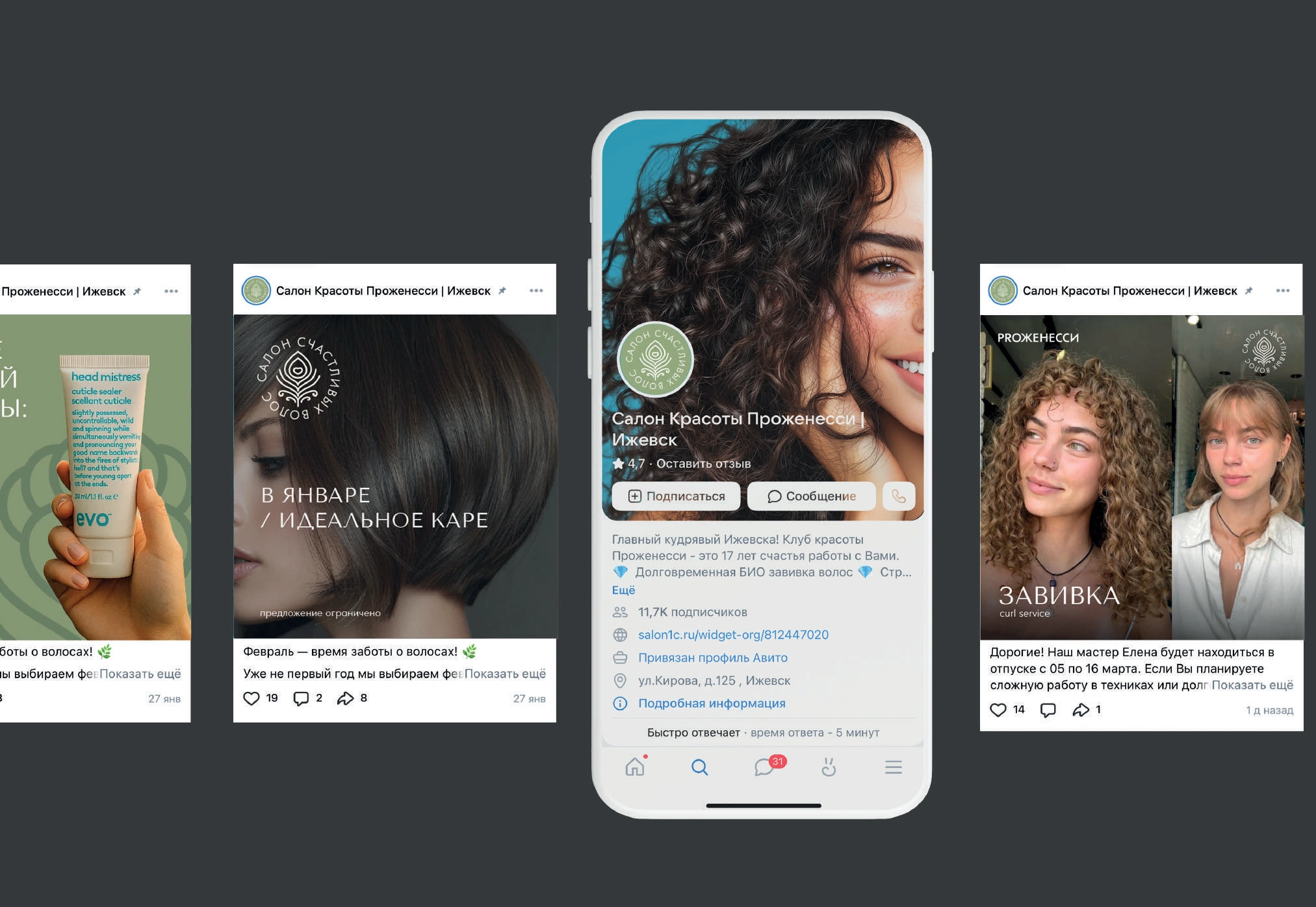
Social layouts connect portraits and hair photography with the brand colours and graphic elements. A consistent system supports announcements, advice and everyday salon stories.
The brand guidelines bring the pieces together: logo versions, colour, typography, layouts and applications. They give the salon a practical framework for keeping future communication recognisable.

A system
to work with.
How we turned the visual identity into a practical guide: core rules, graphic principles and selected applications.
Explore the guidelines