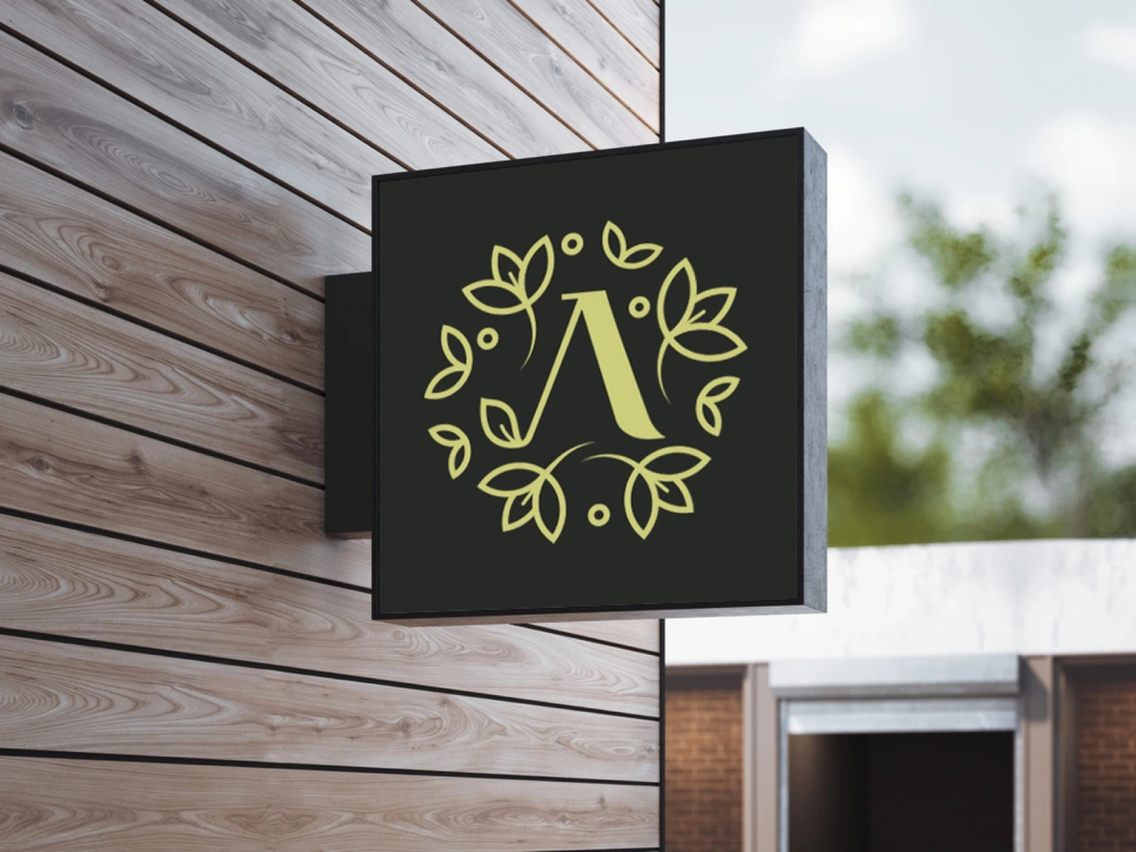

A letter inside
a world of leaves.
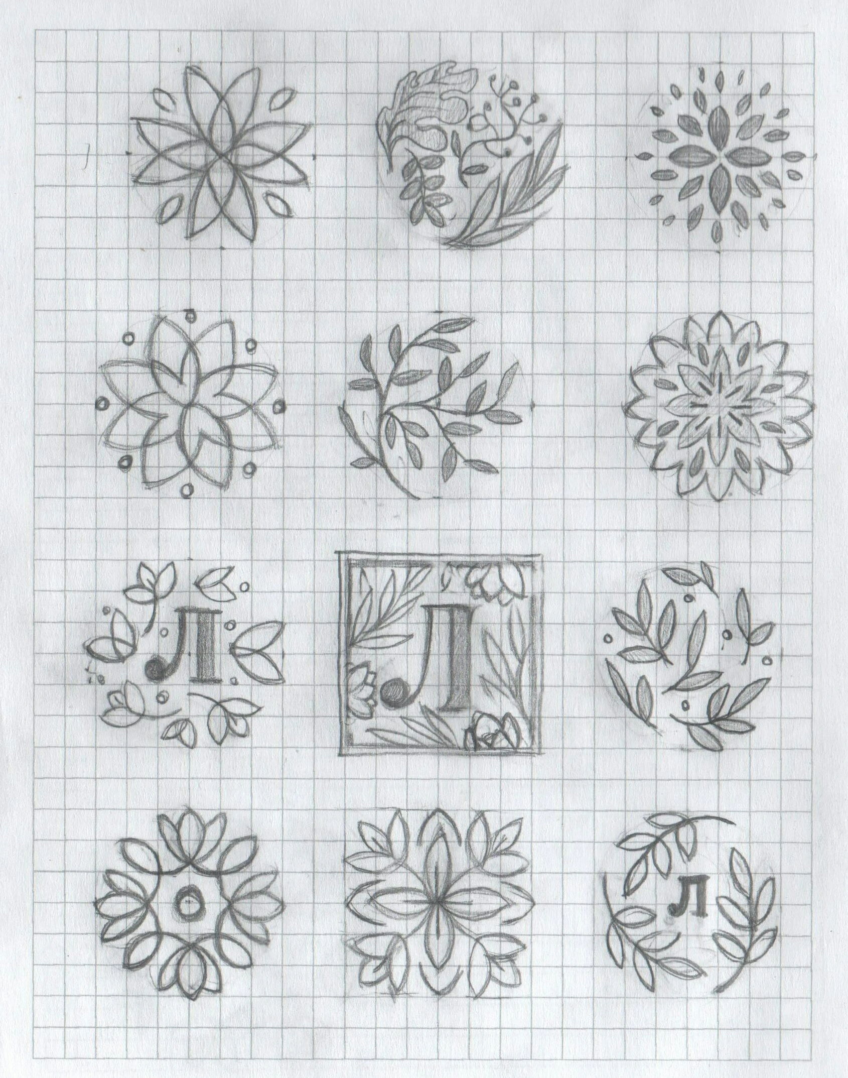
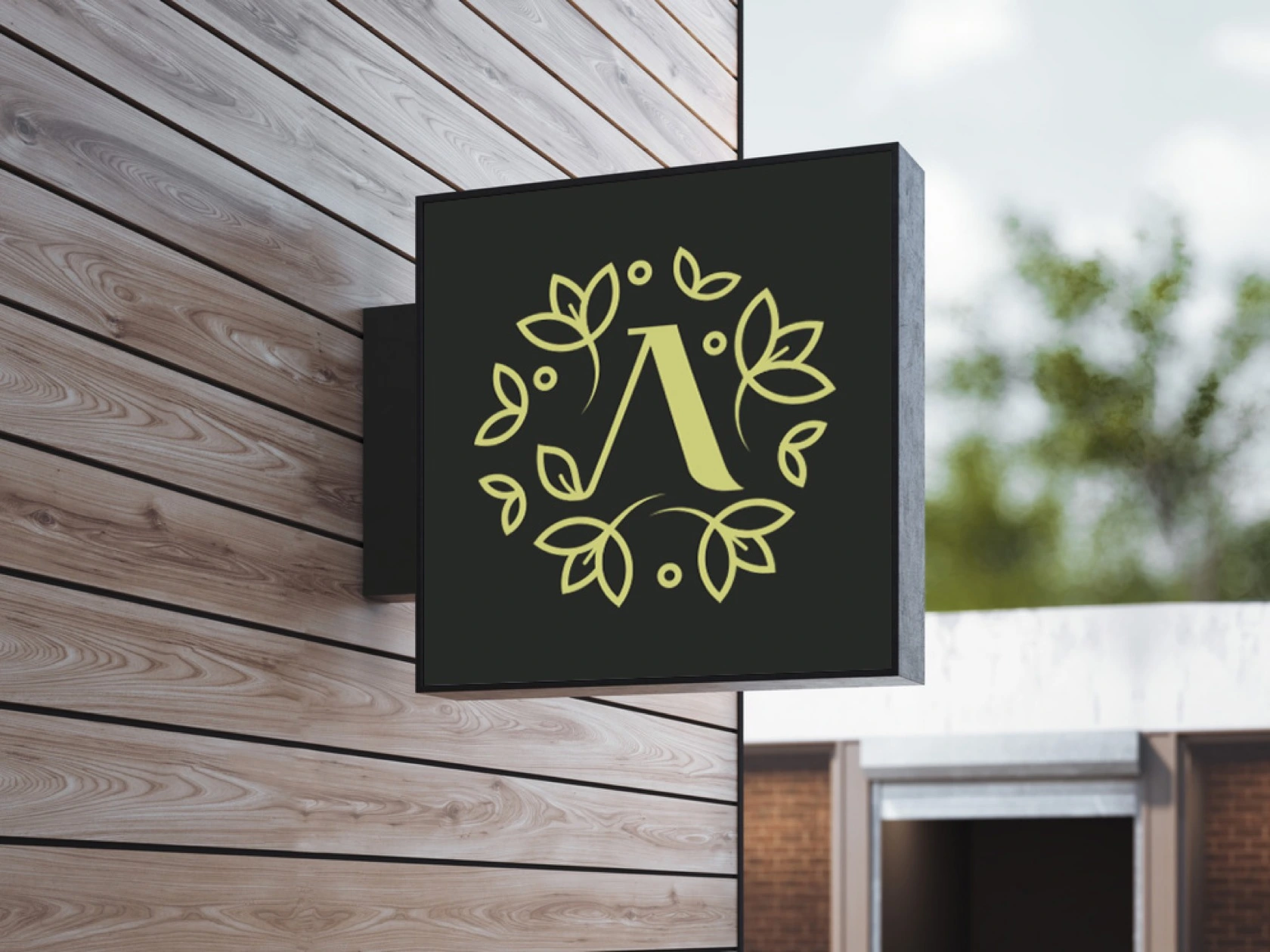
The visual search began with semantic groups and a moodboard to define the tone of the salon. Early drawings showed that the Cyrillic initial Л gave the identity more individuality than a generic floral emblem.
The next iteration focused on three connected decisions: the style of the leaves, the links between them and the letter, and the drawing of Л itself.
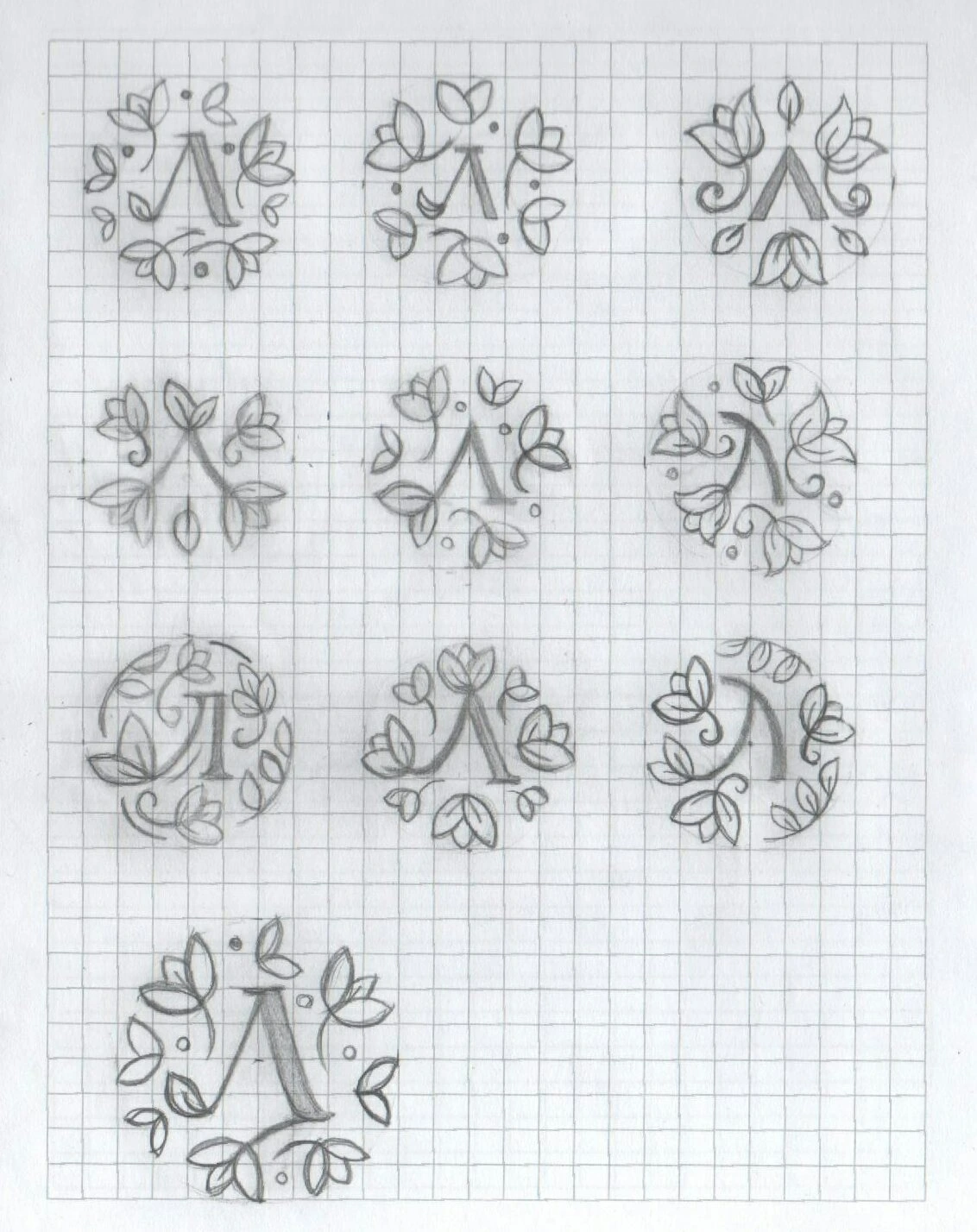
A shared rhythm.
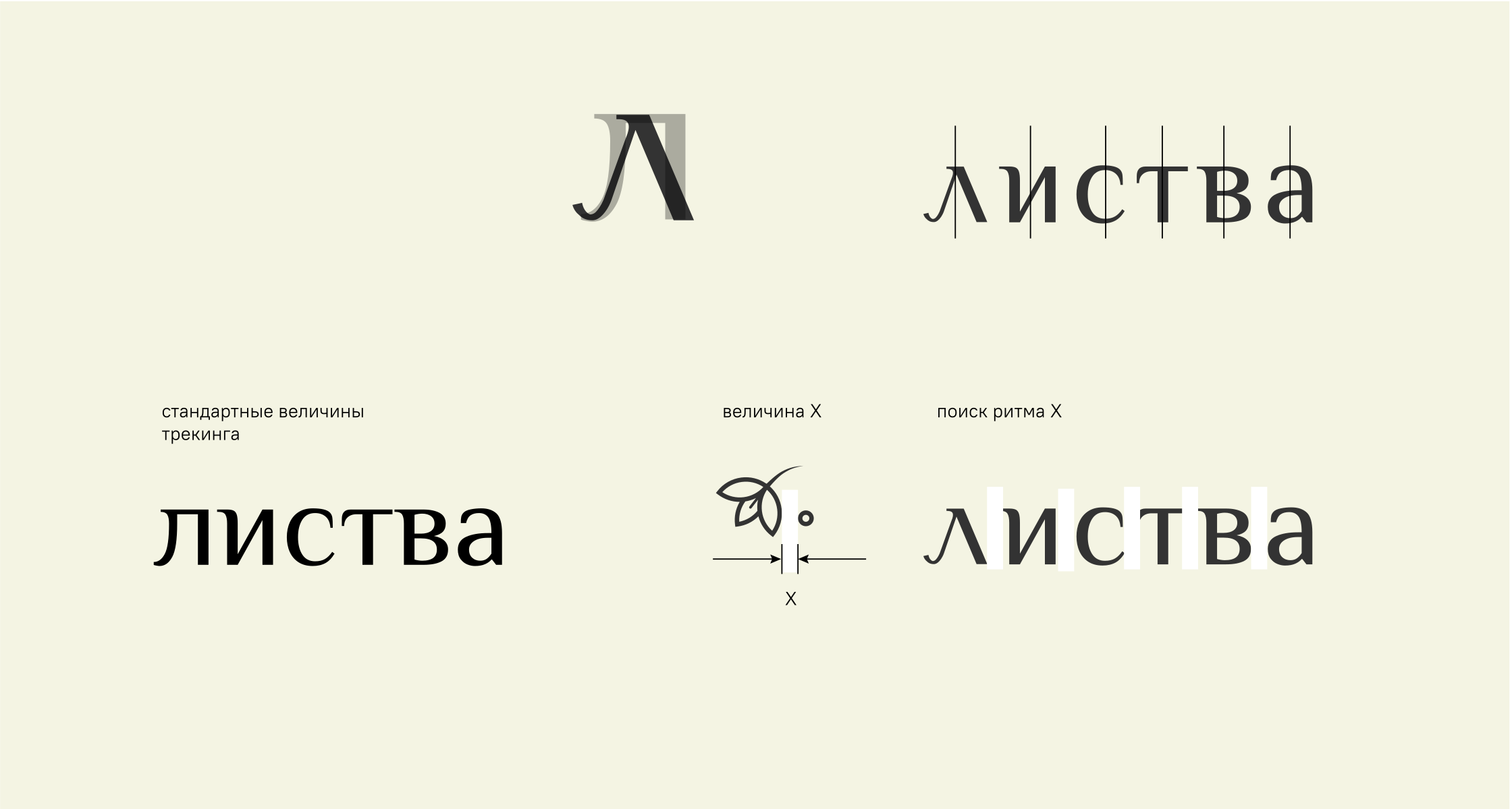
A custom Л.
The symbol combines an organic, changing leaf contour with a traditional, stable letterform. That contrast guided the type search rather than a random comparison of fonts.
Philosopher Regular provided the starting point. The initial Л was redrawn, and spacing was tested against distances within the ornament so that the symbol and wordmark would share a rhythm.
Листва
The finished wordmark uses modified lettering; the font sample shows its starting point.
One recognisable
signature.
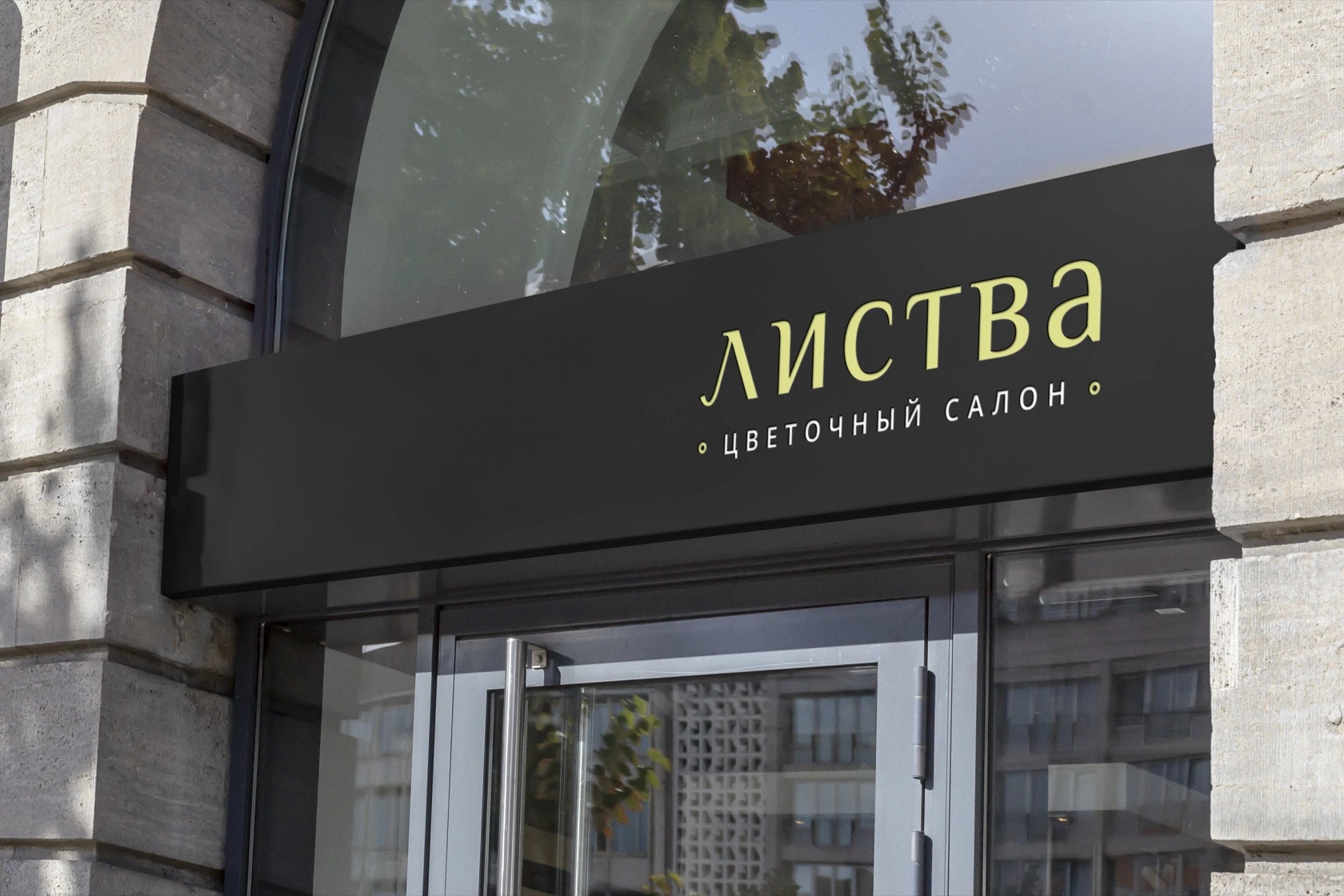
The symbol, wordmark and flower-salon descriptor form the signature. Light, white and dark applications preserve the same drawing and proportions.


From expression
to application.
The guideline brings the approved versions together with colour and type specifications.
Explore the brand guidelines