Recognisable.
Repeatable.
The original online guide gathers the brand’s core elements for designers, managers and suppliers. This English guide preserves the original rules for the symbol, complete signature, palette and communication typography.
Protect the
original drawing.
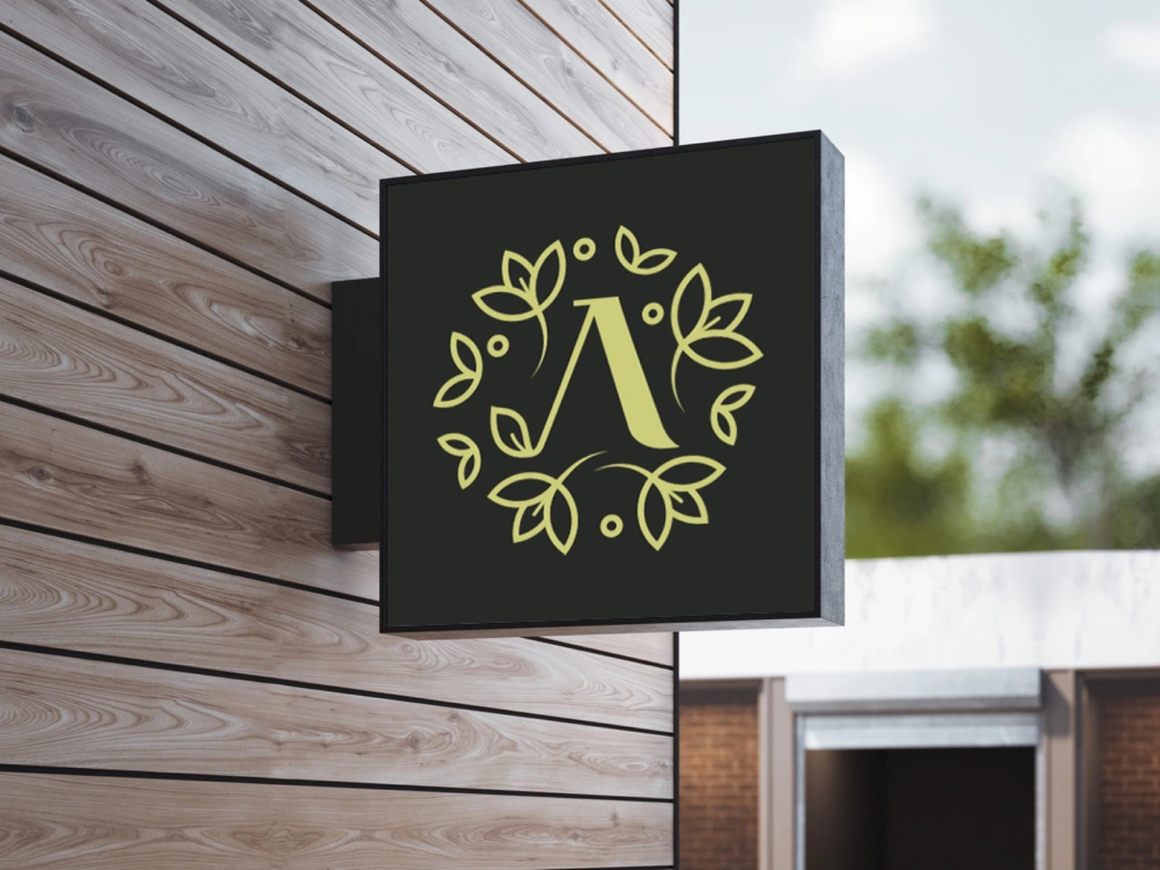
The symbol combines Л with a leaf ornament. Preserve the letter proportions, line weights and relationships between elements.
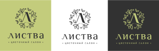
Use the approved background versions rather than introducing new colour combinations. The original guide recommends the right-hand version in the diagram for signage; the coloured-background alternative belongs on the specified olive background.

Three parts.
One composition.
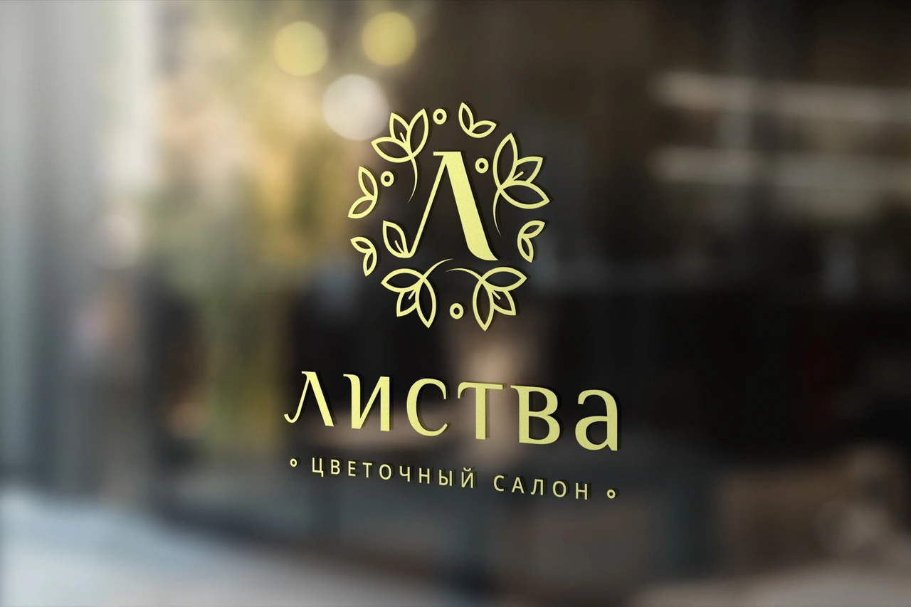
The signature contains the symbol, wordmark and flower-salon descriptor. Keep their proportions and arrangement intact.
Olive, rice
and black.
The guide specifies two natural light colours alongside black. These screen values reproduce the published palette.
Olive
#C3CC7CPrint / CMYK 26 / 9 / 65 / 0Rice
#E2DFAFPrint / CMYK 12 / 6 / 36 / 0Black
#000000Print / CMYK 0 / 0 / 0 / 100Screen colours use the original guide’s HTML values; print specifications retain its CMYK values. They describe separate output conditions.
A clear voice
beyond the logo.
Open Sans is the communication typeface; Open Sans Semibold is used for the descriptor. This is distinct from the modified Philosopher lettering in the wordmark.

The same drawing.
Different surfaces.
The projecting sign, shopfront fascia and window use the approved symbol and signature at different scales. The pale identity remains clear against dark architectural surfaces.
The identity,
ready for everyday use.
The original Russian guide remains the reference for source files. Its downloadable assets require registration.
View the original Russian guide