One identity.
A shared standard.
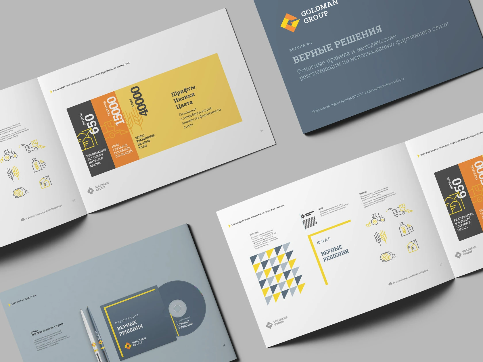
The original guide connects the brand idea with clear rules for the signature, graphic language, typography and applications.
- Client
- Goldman Group
- Our role
- Brand platform
Brandbook & print standards
Transport guidelines
The idea
behind the rules.
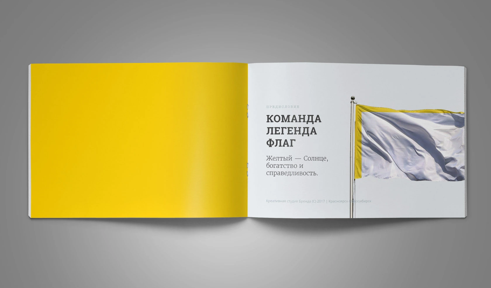
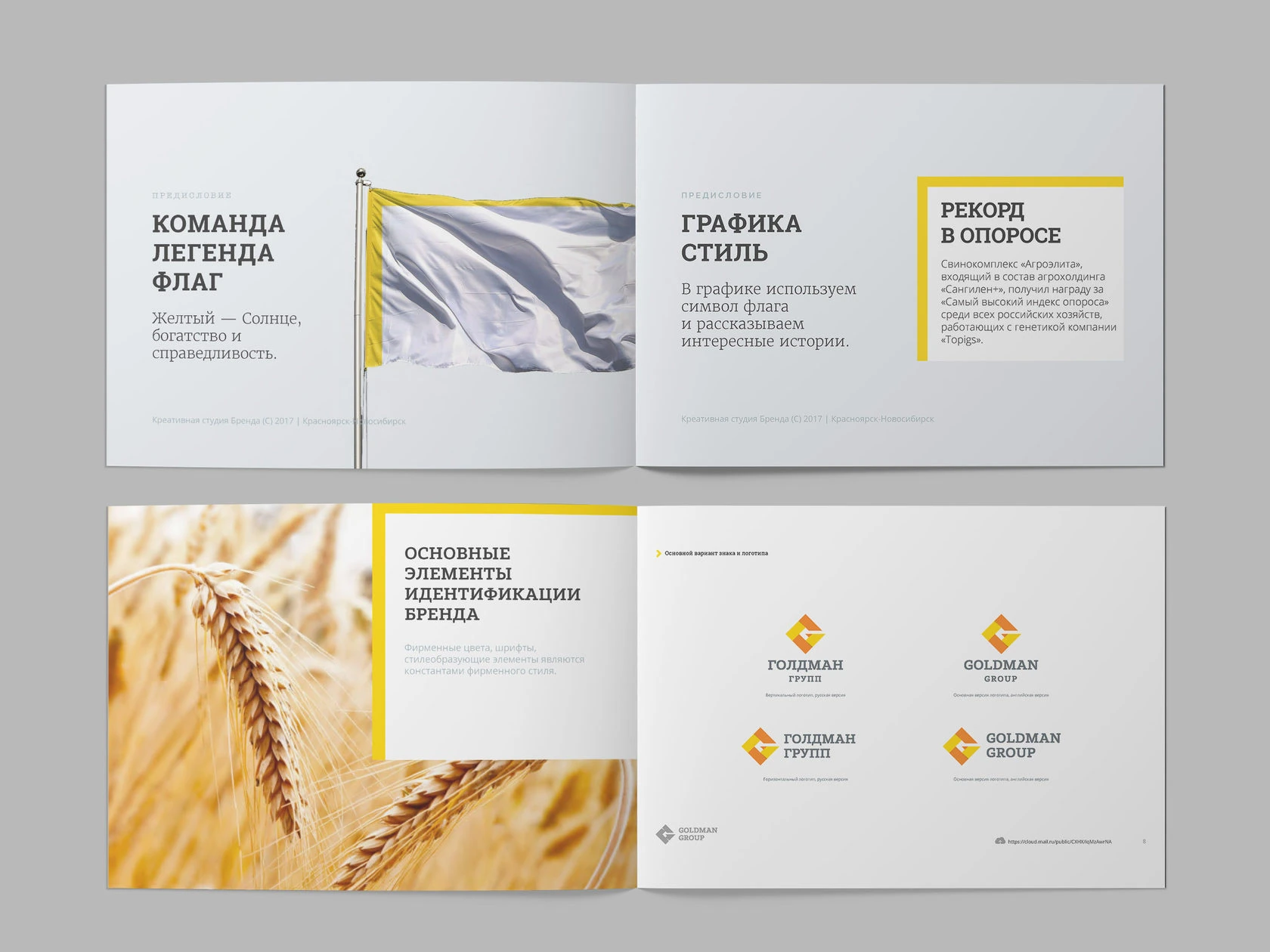
The opening spreads introduce the brand’s team concept and its visual world. The guide connects that foundation with the system of signatures and applications.
A recognisable mark.
Clear conditions of use.
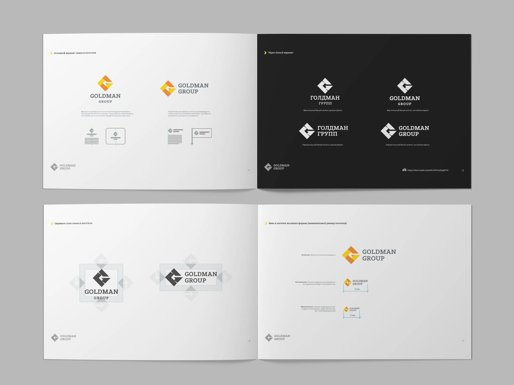
The original guide shows the logo arrangements, positive and reversed versions, construction and rules for placing the mark.
A consistent voice,
in colour and type.
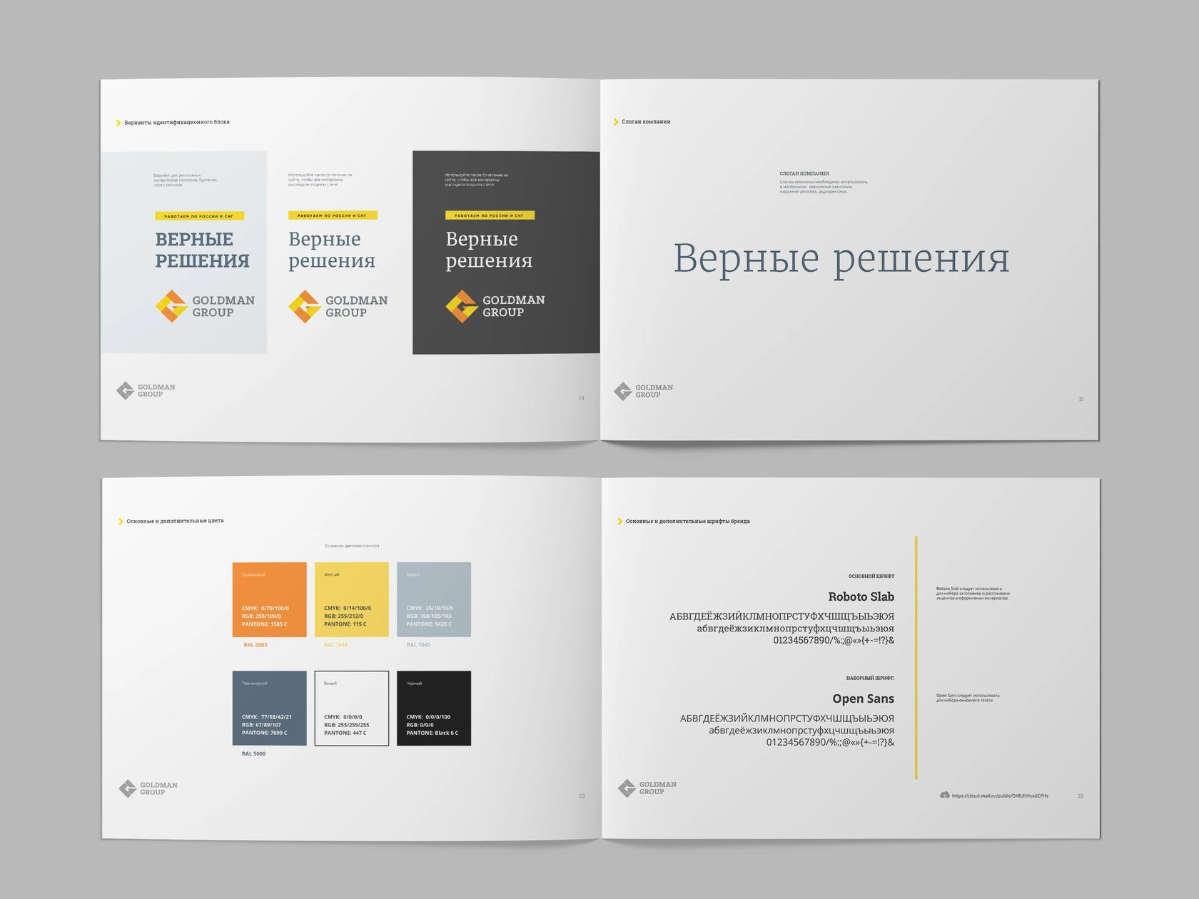
Colour and typography standards establish a shared hierarchy for headlines, supporting text and corporate information. The original Russian specimens remain intact.
The parts become
a visual system.
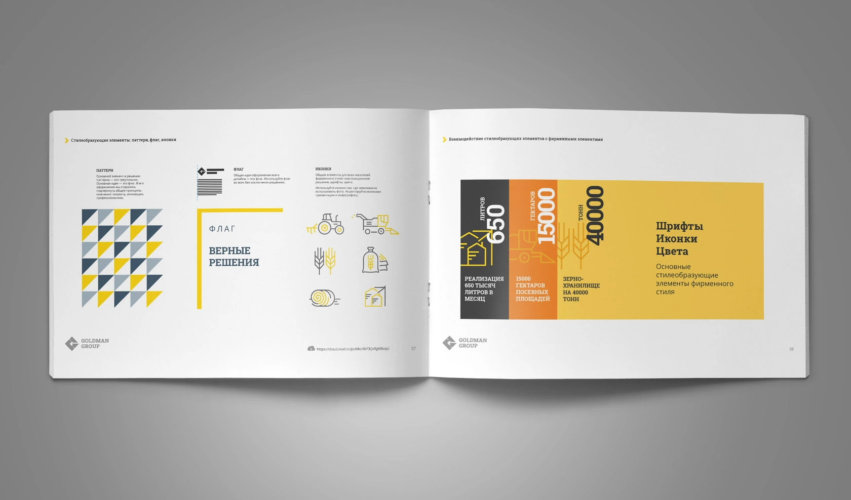
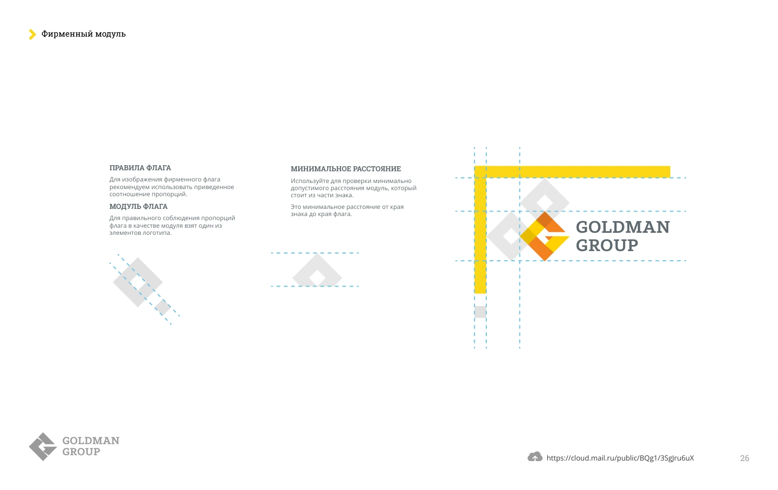
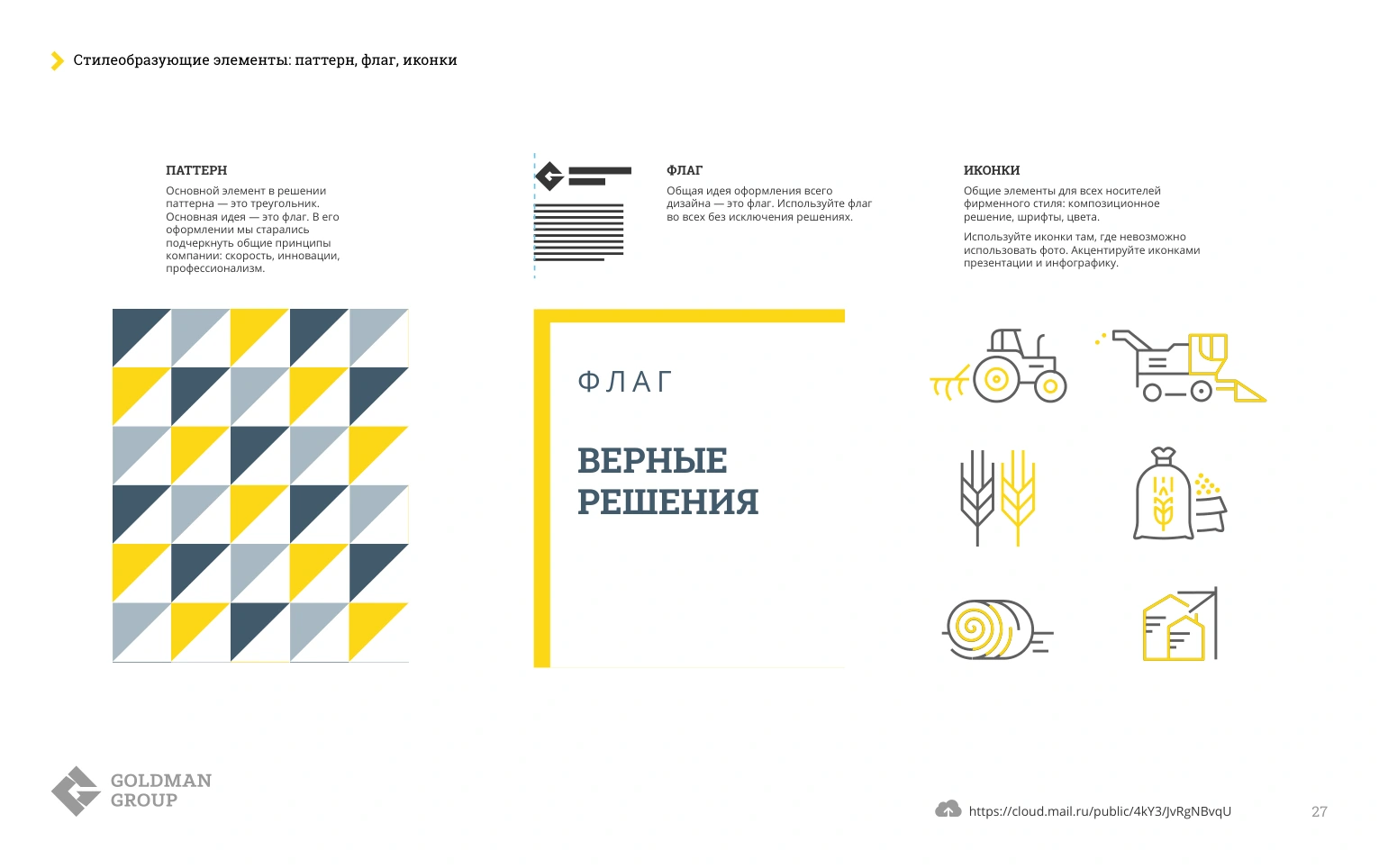
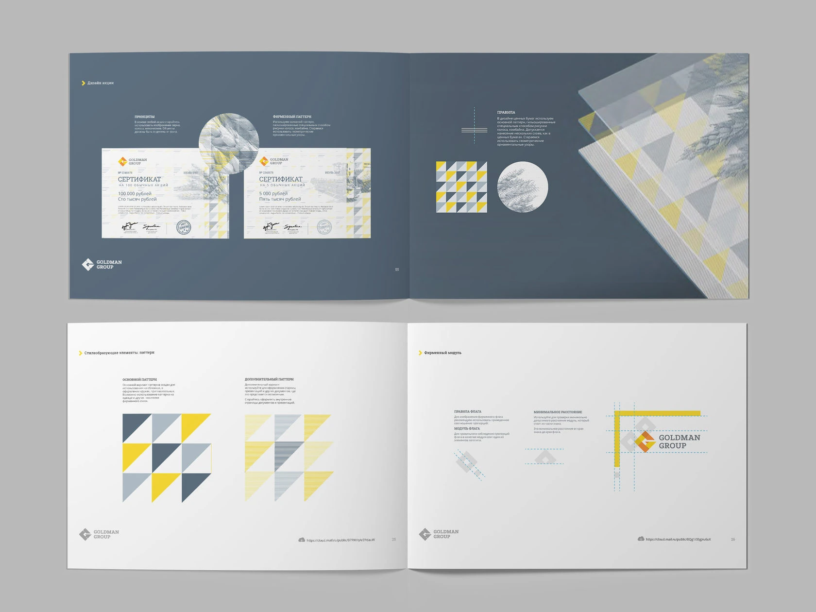
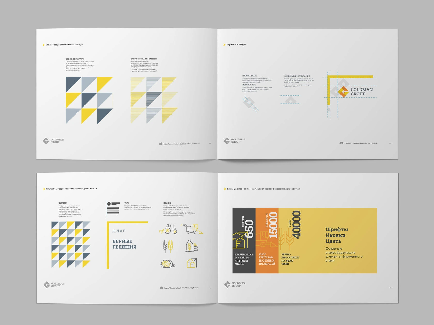
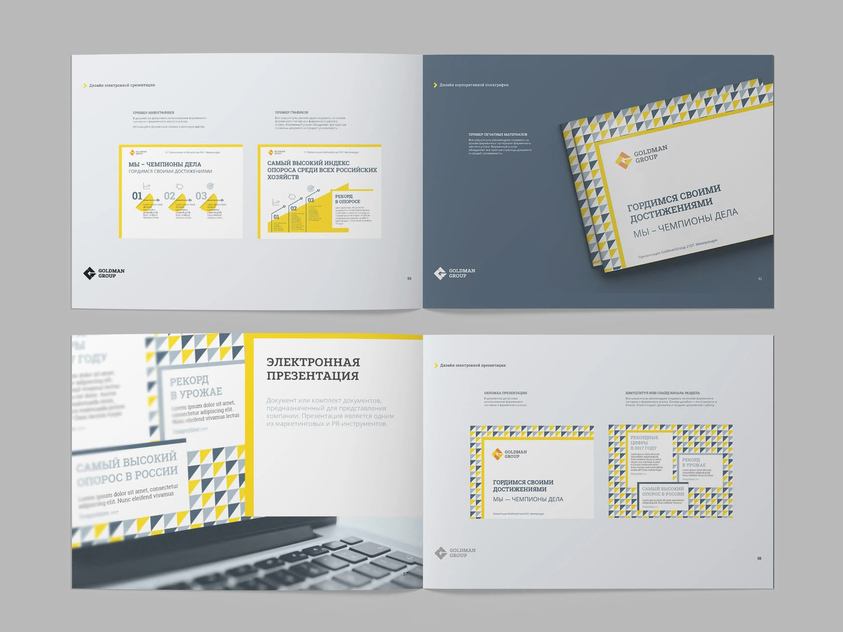
Geometric elements extend the signature into patterns and layouts. The spreads show how the graphic vocabulary combines with the logo and information.
One language.
Across the working day.
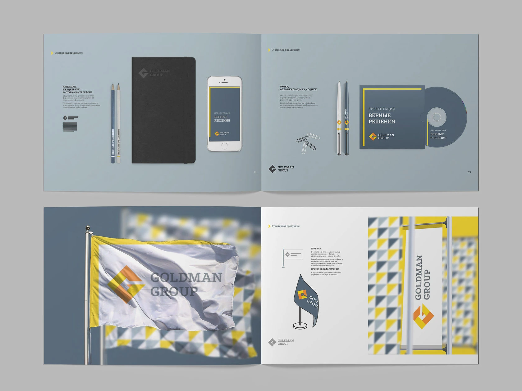
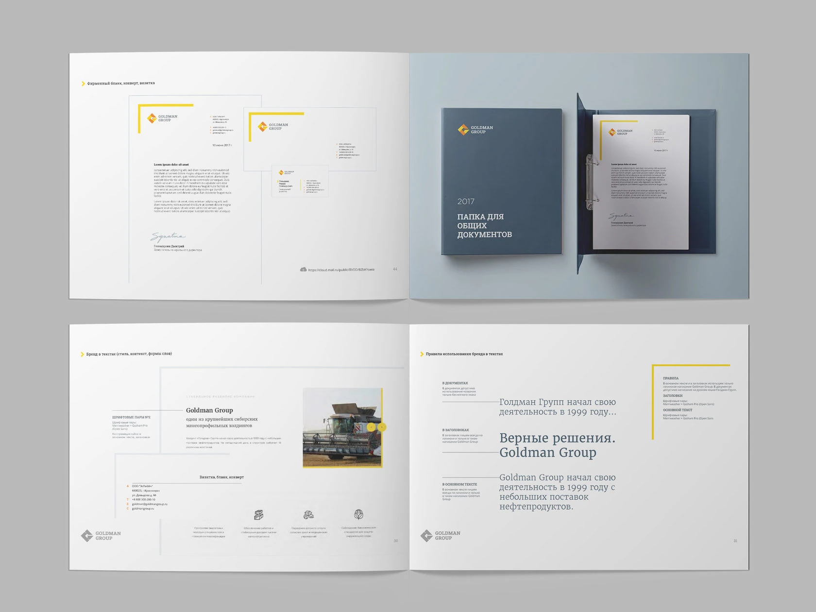
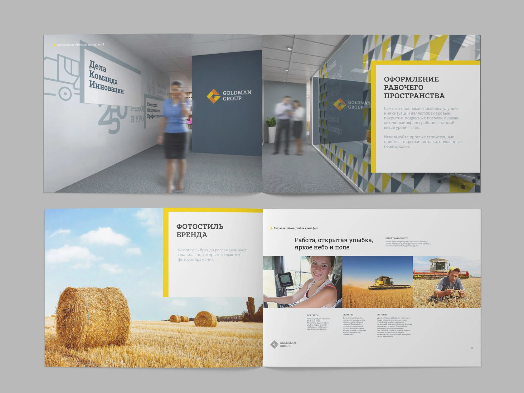
The guidelines apply the identity to stationery, corporate documents, presentation materials, spaces and photography. Each example keeps the relationship between the mark, graphic elements and content visible.
From print
to the wider world.
The final examples take the system into merchandise, flags, transport, outdoor communication and clothing. These are the original application studies and presentation mockups.