One element
A circle connects the mark and the larger images.
A visual identity for the Centre for Digital Ecosystem Services, built around one idea: a portal connecting ideas with their real-world implementation.

The brief called for technological simplicity, reliability and a sense of the future. The brand needed a connecting idea, rather than a literal picture of software.
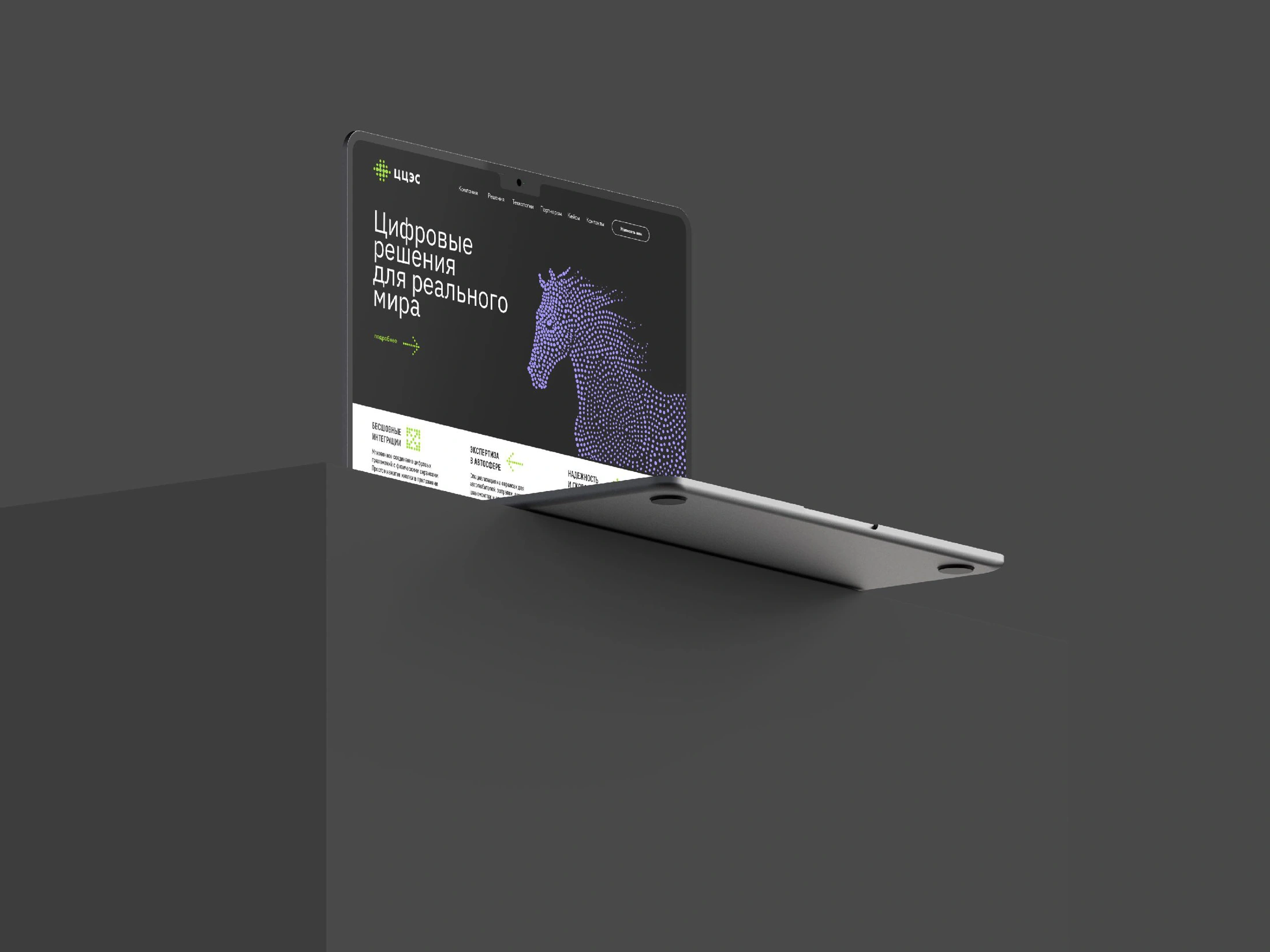
“The digital portal” connects the digital and physical worlds. A horse built from points gives the service a symbolic presence: energy, movement and the connection between an idea and its implementation.
The mark brings separate circular elements into one structured network. Different scales and connections give the symbol both a clear centre and room to expand.
The compact sign sits beside the Cyrillic abbreviation ЦЦЭС. The original vector signature stays direct and readable, while the surrounding visual language carries the more expressive part of the identity.


The point grows from a small identity element into a way of building images. Dense and open areas describe a recognisable form, giving an abstract digital language a physical presence.
The horse is a metaphor for the service, rather than an animal portrait. Points gather into an energetic suggestion of a form, then open into a stream: a visual connection between an idea and its implementation. The original illustration preserves this rhythm and energy.
A circle connects the mark and the larger images.
A suggestive silhouette leaves space for movement and transformation.
Violet points, lime accents and a black field connect the identity.
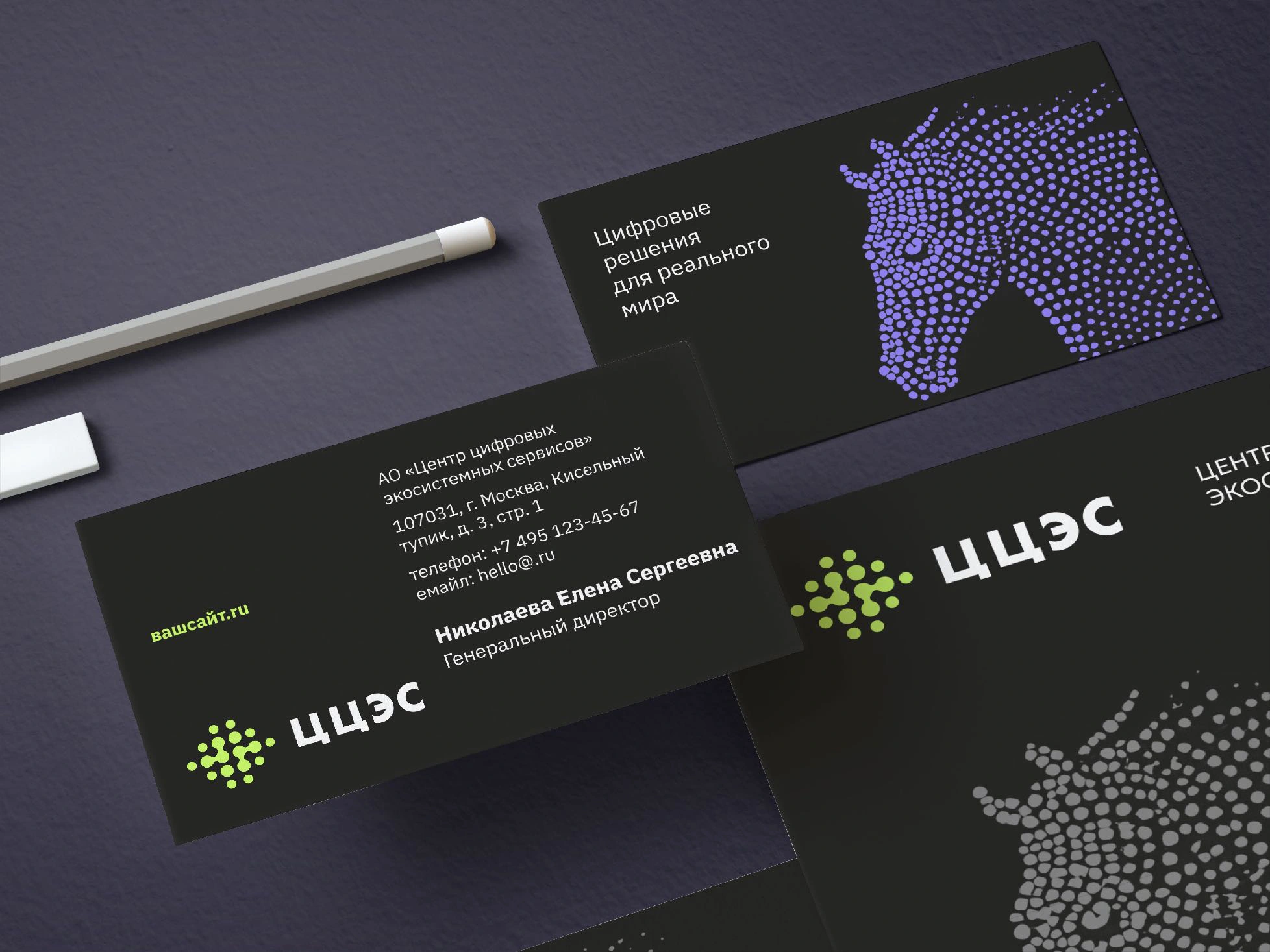
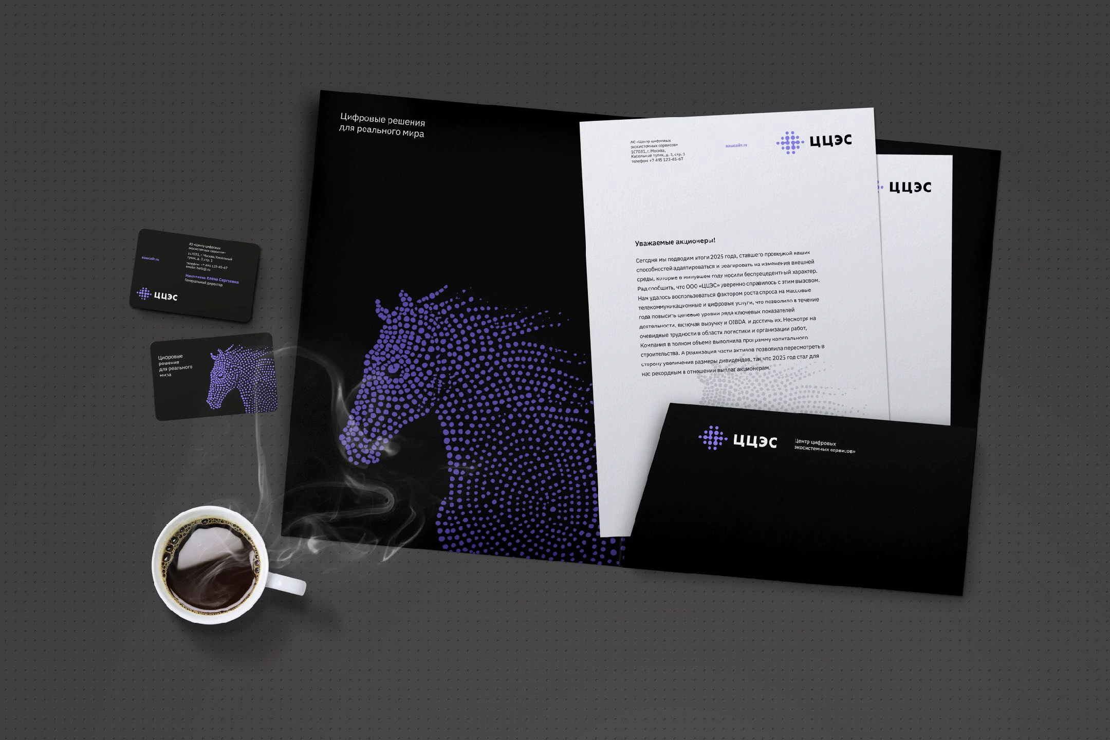
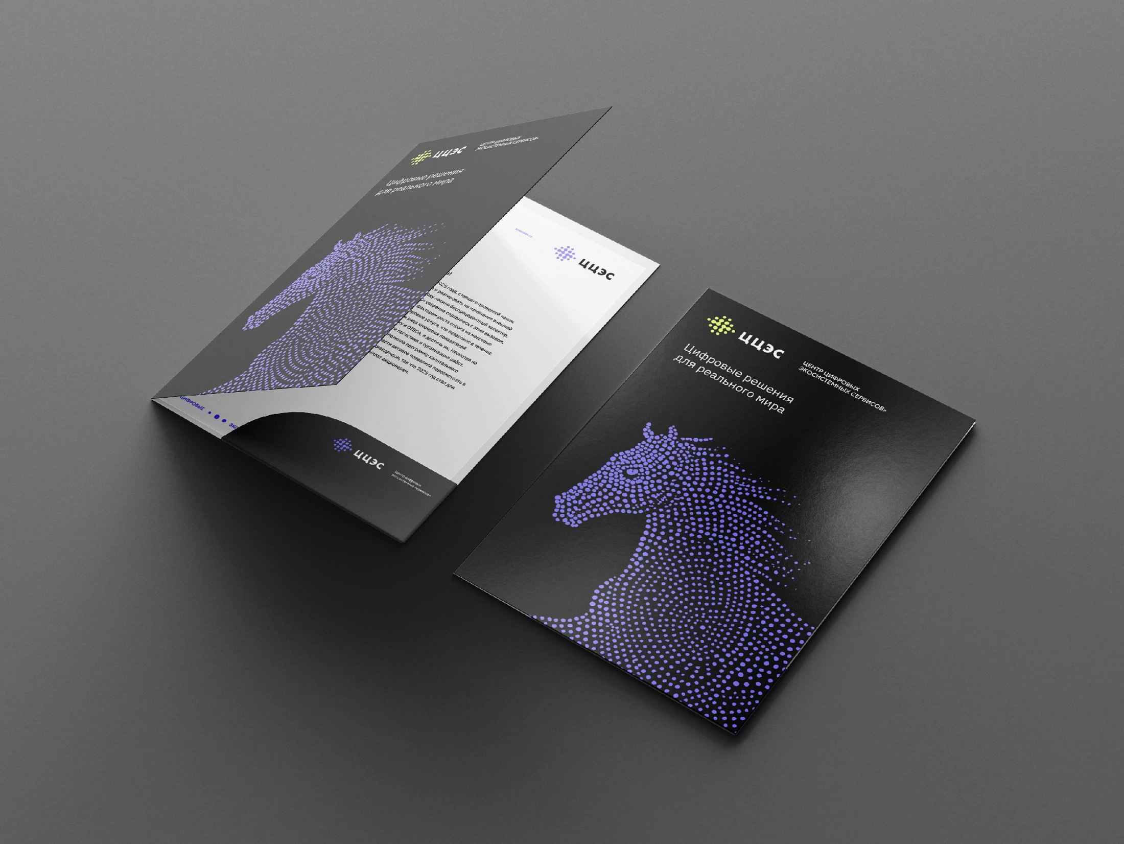
The approved identity carries the horse and its point-based language across business cards, folders and stationery. Changes in scale keep the image expressive, from a small detail to a full cover.
The original layouts show how the image, signature and typography work together. Clear text sits alongside the point-based illustration, allowing the digital metaphor to remain expressive without replacing the practical information.