

01 / Billboard
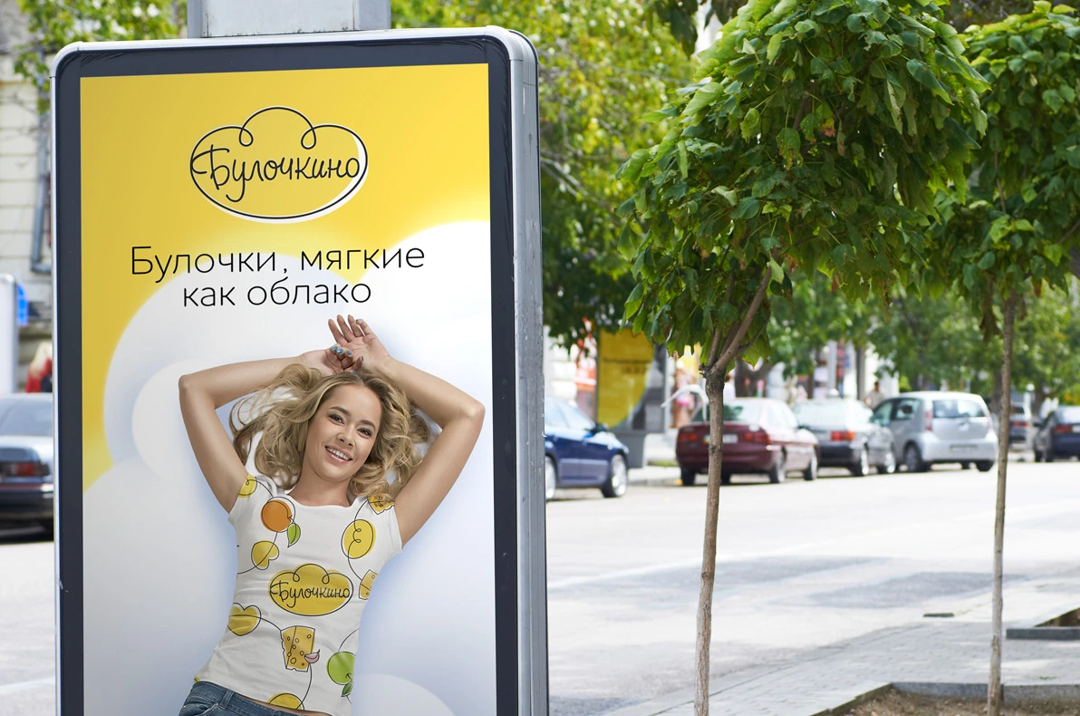
Softness, on a bigger scale.
The cloud image becomes a wide-format outdoor advertisement.
A simple pleasure, given a memorable name and a light-hearted character. A cloud connects the brand, its packaging and an original advertising campaign.

Voskhod Bakeries was preparing a new range of affordable puff-pastry snacks with familiar fillings. The task was to create a name, a distinctive identity and a packaging system that could bring the range together.
Two qualities guided the work: airy, soft pastry and plenty of filling. The brand needed to communicate both with the same straightforward, approachable voice.
We developed the name Bulochkino from the familiar Russian word for a bun. Its everyday warmth suits an accessible bakery range.
The positioning turns the product’s softness into an image: “Buns as soft as a cloud.” That cloud became the link between the name, the mark and the campaign.
A yellow cloud gives the handwritten name its recognisable shape. The light, looping lines continue into illustrations of the fillings, creating a visual family that feels friendly and easy to recognise.
The system moves between a full-colour mark, a version for coloured backgrounds and a single-colour signature.



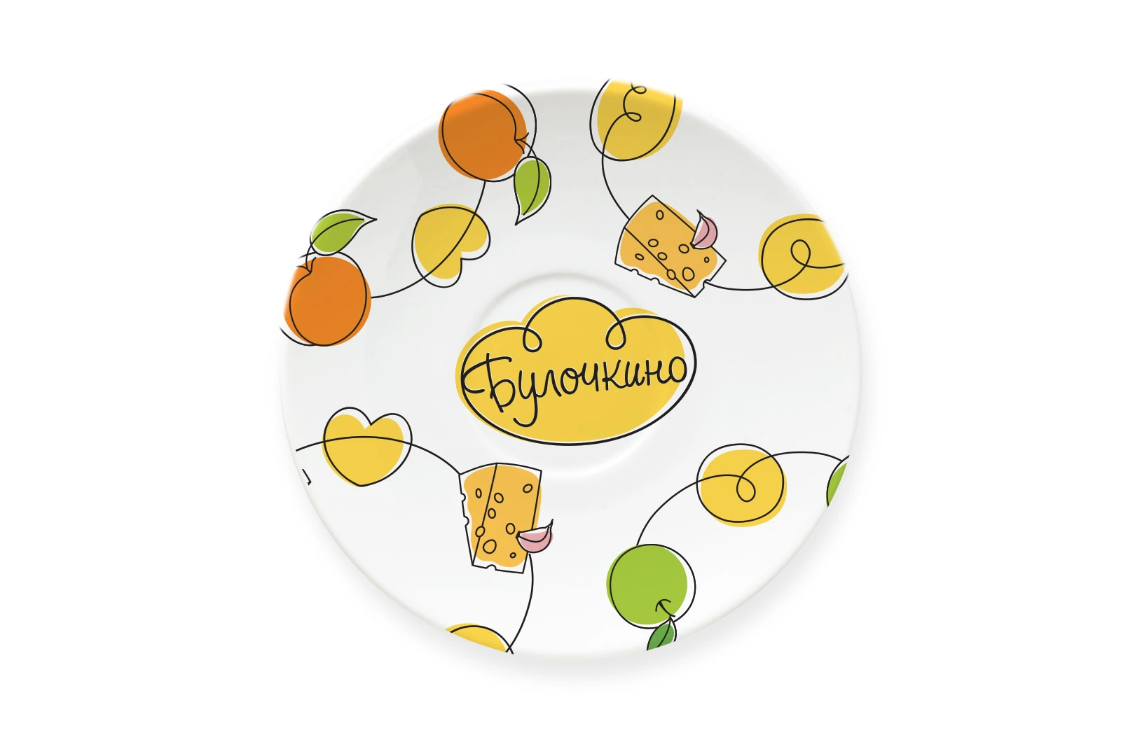
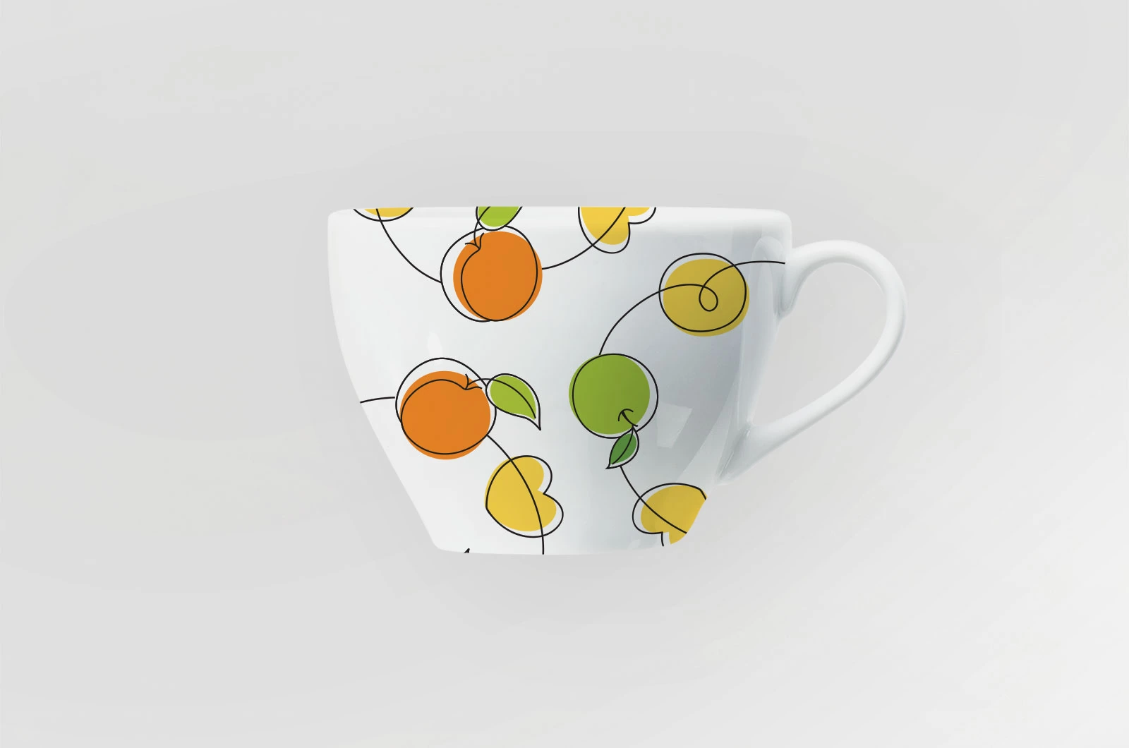
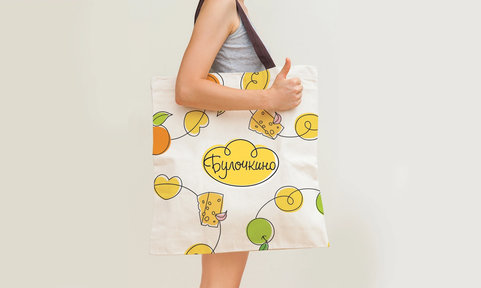
The looping black line carries the character of the handwritten logo into a repeat pattern. Yellow bun and cloud shapes sit slightly apart from their outlines, with white edges keeping the graphic light and informal.
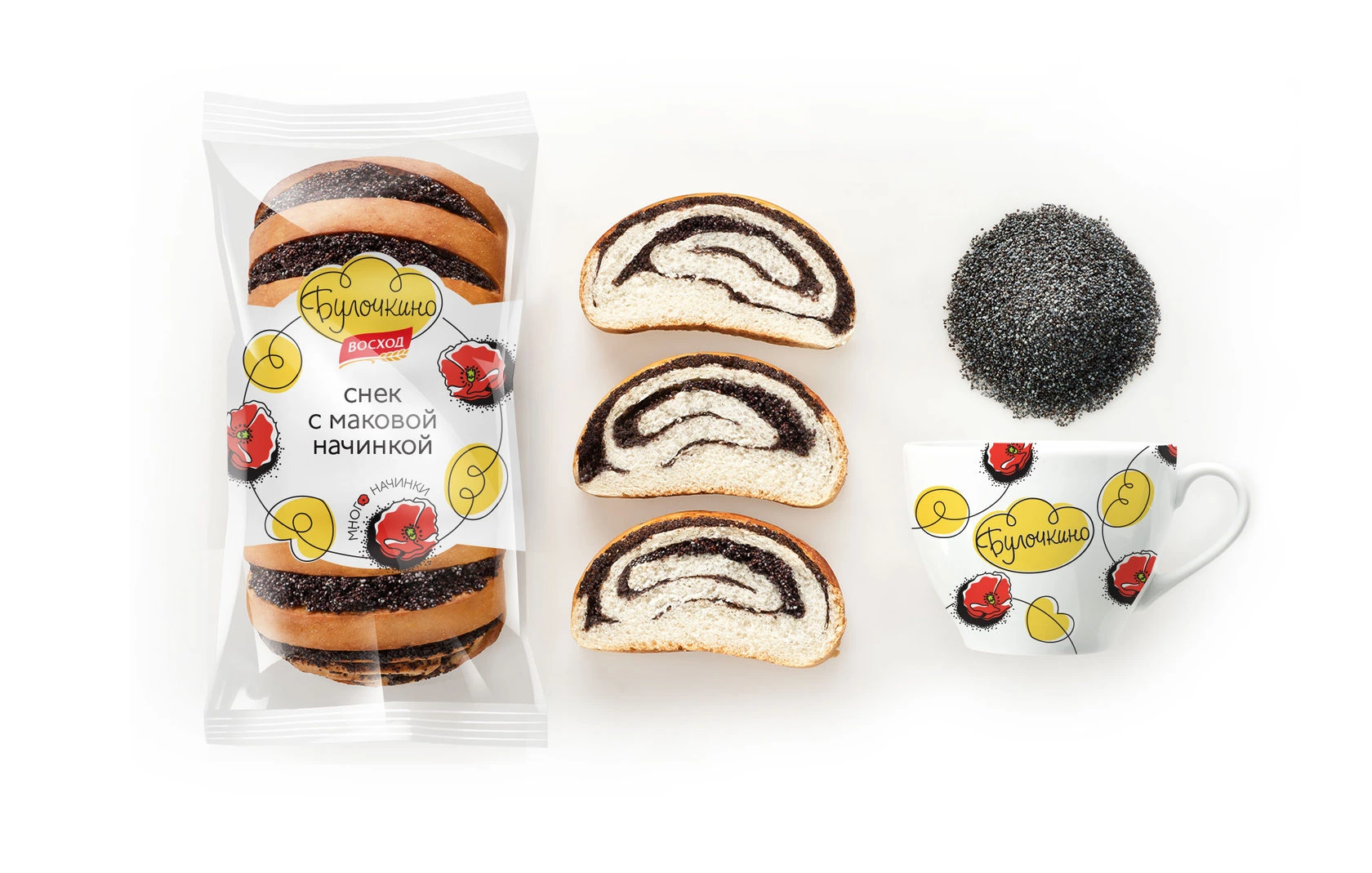
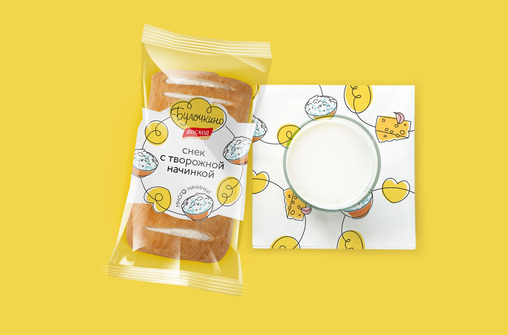
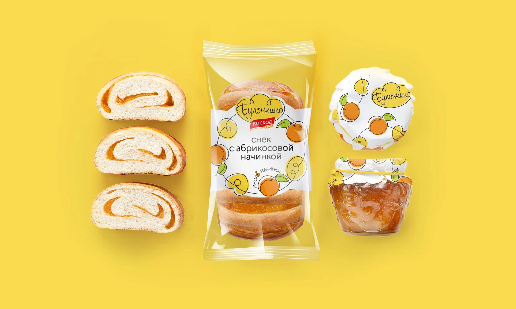
The same drawing style gives each filling its own image: cherries, cheese, apple, curd, blueberries and poppy seeds. Colour tells the flavours apart; the shared outlines, loose curves and highlights keep them in one family.


The pattern adapts to the shape of a cup, frames the centre of a plate and continues across a fabric bag. The logo and the illustrations can work together, while the line and colour still identify the brand on their own.
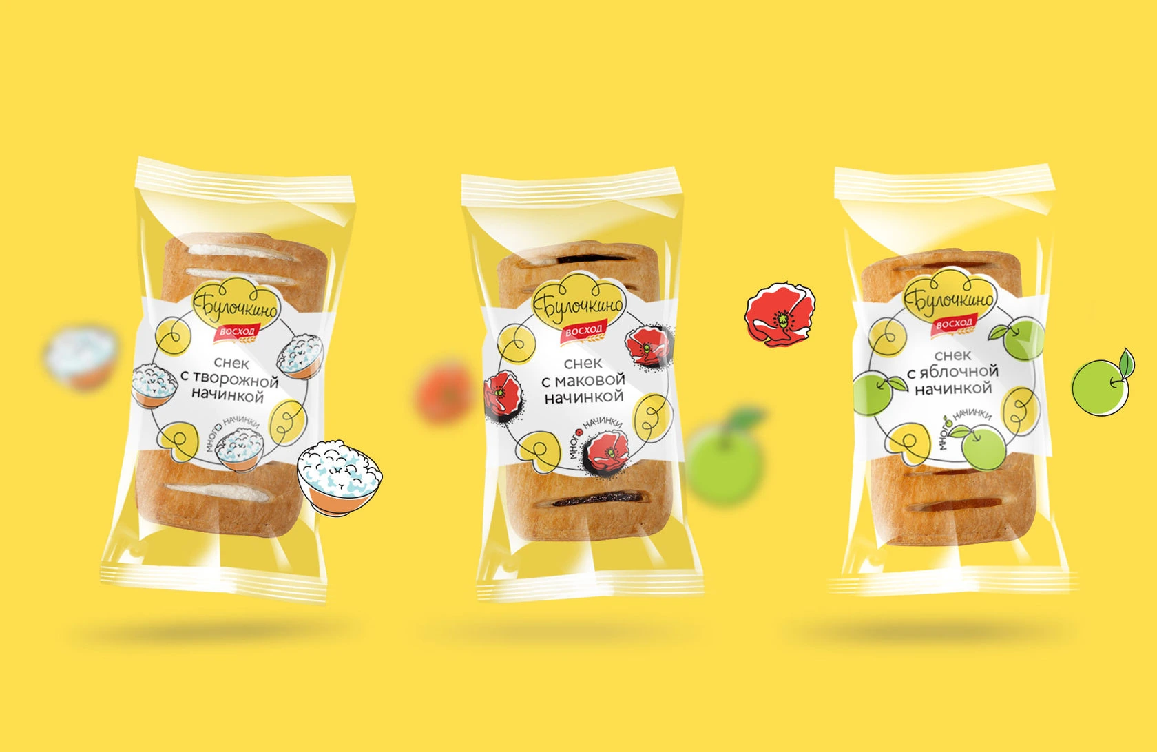
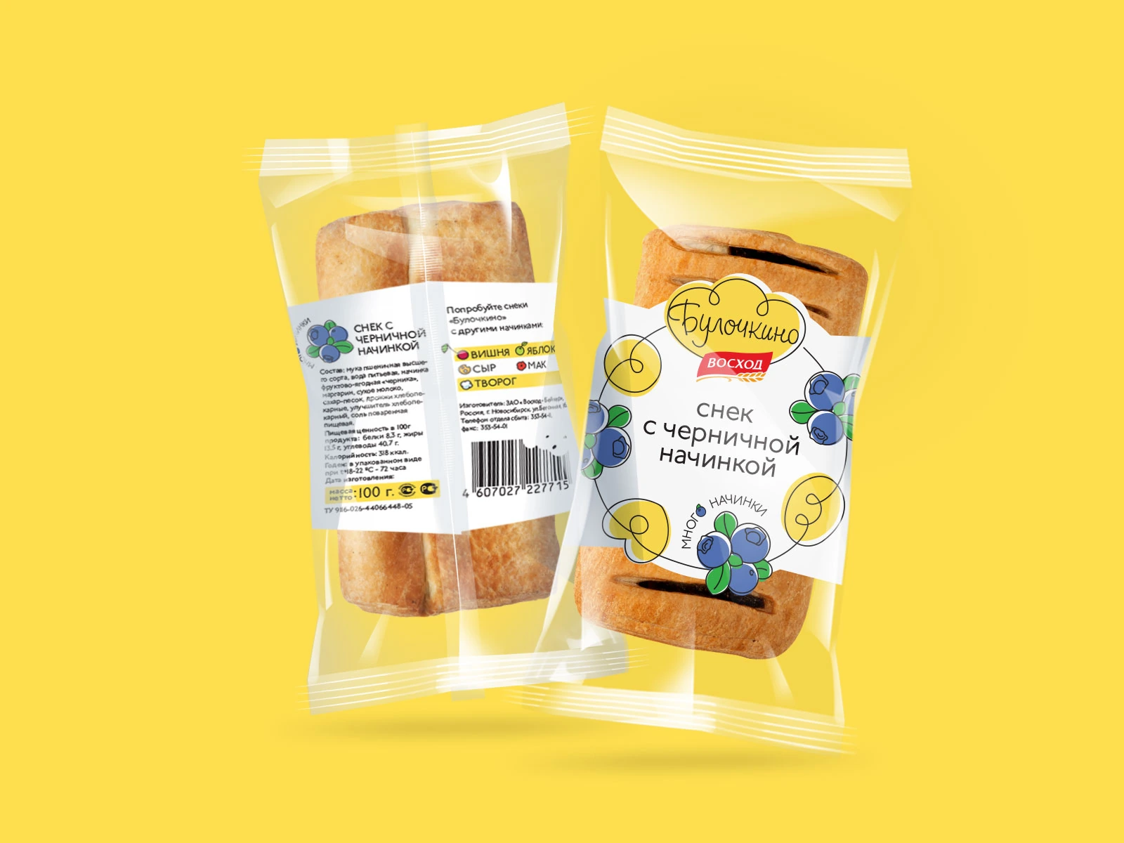
The white label gives the coloured illustrations a clear background. The name, the flavour and the promise of plenty of filling sit together on the front, while the transparent film keeps the pastry visible.
The reverse combines practical product information with an overview of the fillings. A shared architecture connects the range; individual illustrations help each flavour stand apart.
The advertising concept takes the metaphor beyond the pack. Dasha lies on a sculptural white cloud against a yellow background, wearing the brand’s illustrated T-shirt.
The campaign deliberately leaves the product out of the image. The photograph expresses softness through an inviting, weightless moment — with the name and graphics connecting that feeling back to Bulochkino.
The cloud began as a product metaphor. In the photograph, it becomes a place to rest.
Concept, photography, art direction and production work together around the same simple promise.
The original advertising concept, adapted to different formats while keeping one clear visual idea.

Positioning, naming, the cloud mark, flavour illustrations, packaging and campaign imagery form one connected brand. Every expression returns to the same idea: an everyday pastry with an unusually light character.