
Friendly
An open expression and a recognisable smile.
From a detailed mascot to a flexible brand world. A new expression of Green Lama, built around making everyday care feel lighter.
A friendly helper.
An expressive identity.
A connected product world.

The first identity established a caring personality. As the project expanded into packaging, marketplace content and digital communication, the character needed a wider expressive range.
The original llama had a distinctive look: green fur, glasses, a patterned scarf and detailed shading. But that complete portrait was less flexible as a starting point for many different situations. The next step was a character that could act, react and help.
See how the original identity began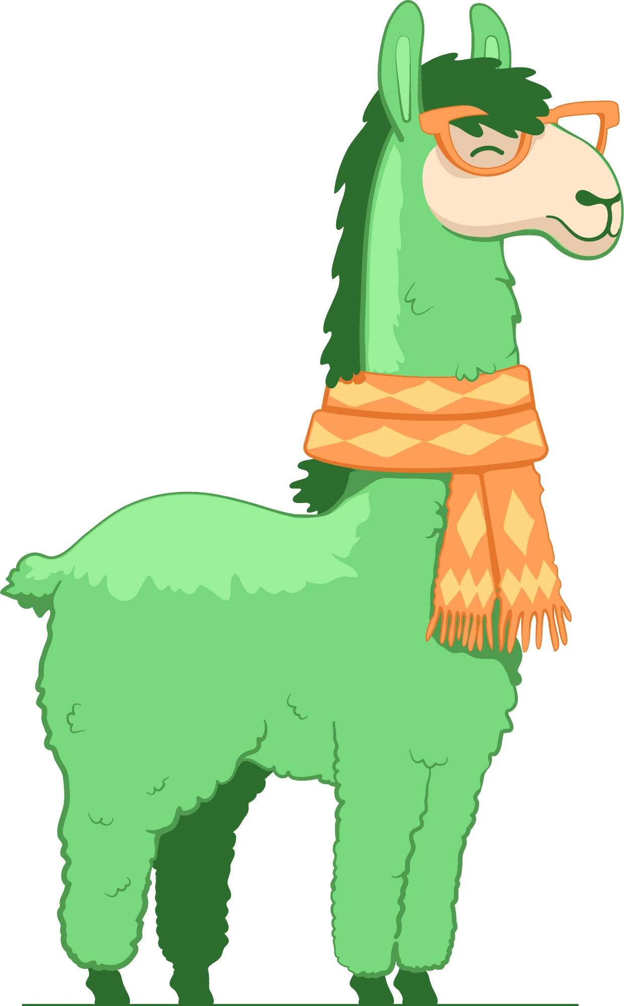
The earlier metaphor, “green heart”, expressed care. The new platform carries that warmth into a more active idea: “cleanliness with a smile”.
The brand is framed as a friendly helper in everyday household tasks. Its character is friendly, cheerful, caring and smart; its voice is optimistic, with a light touch of humour.
An open expression and a recognisable smile.
A simple body that can take new poses and interact with objects.
One visual language across packaging, illustration and product content.
The new llama replaces the detailed fur and accessories with a white, cloud-like body and dark, hand-drawn lines. The contrast shifts attention to the face, gesture and action.
That is what makes the redesign more versatile: it can be a small figure on a label, the centre of an illustration or a companion to a practical explanation. Different situations no longer require a different visual language.
The mascot brief describes a friendly, playful helper with a smiling face, clear lines and a fluffy, foam-like body. Its ability to take different poses is part of the system.
The llama interacts with a washing machine: the product category becomes a small, recognisable story.
The updated packaging uses a bold, compact two-line wordmark. The character now has its own space in the composition, so the name and illustration can perform different roles.
The name anchors recognition. The llama tells the story. Colour helps organise the product world.

The system extends from the turquoise oxygen-cleaner pouch to household-care canisters. A prominent name, product information, distinctive colour and a relevant character scene form a repeatable hierarchy.
The llama on the washing machine introduces laundry care. A cup connects it with dishwashing. The yoga pose brings a calmer expression to fabric care.
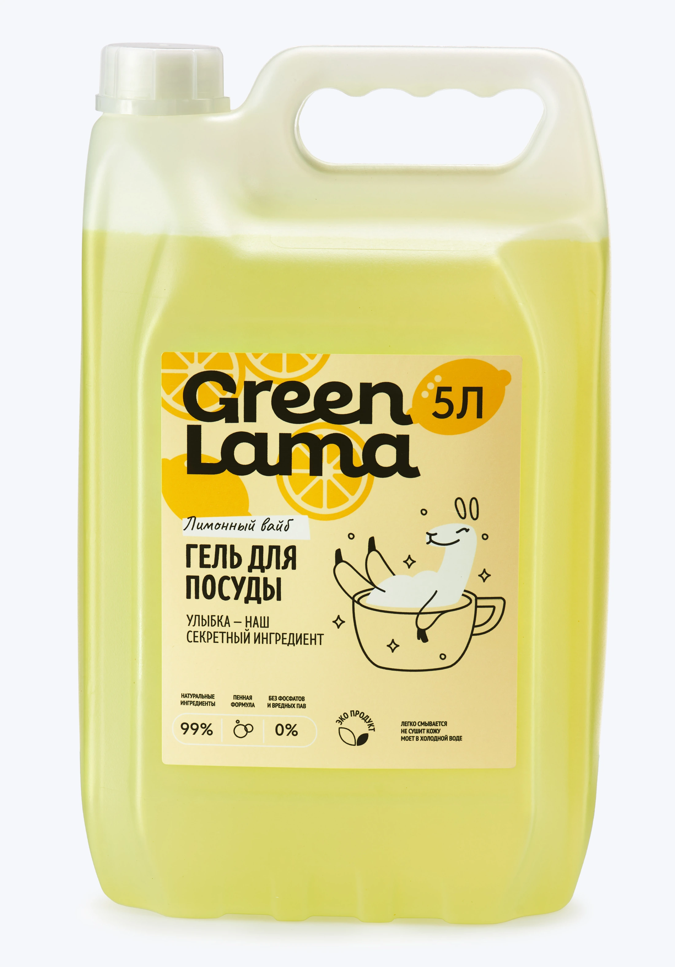
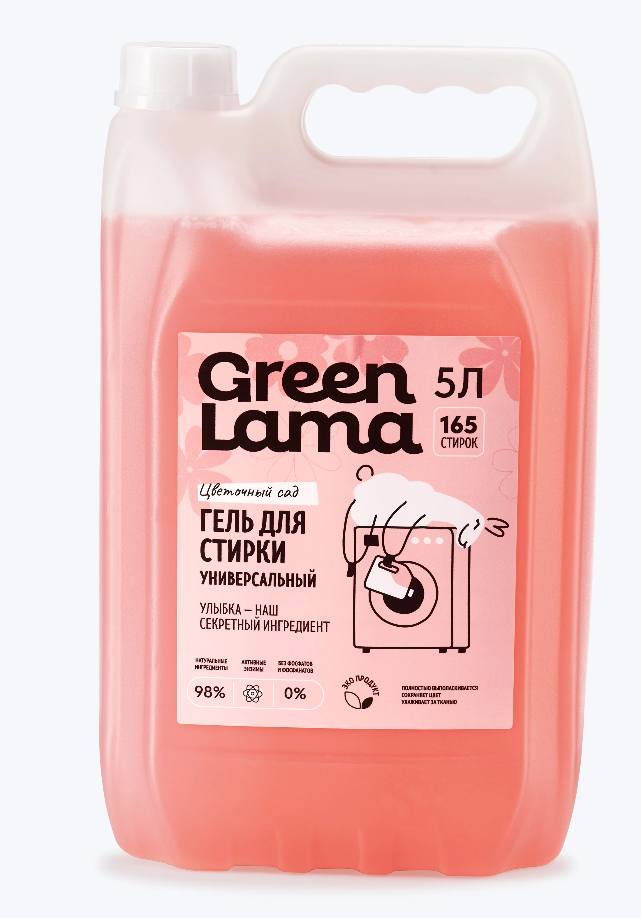
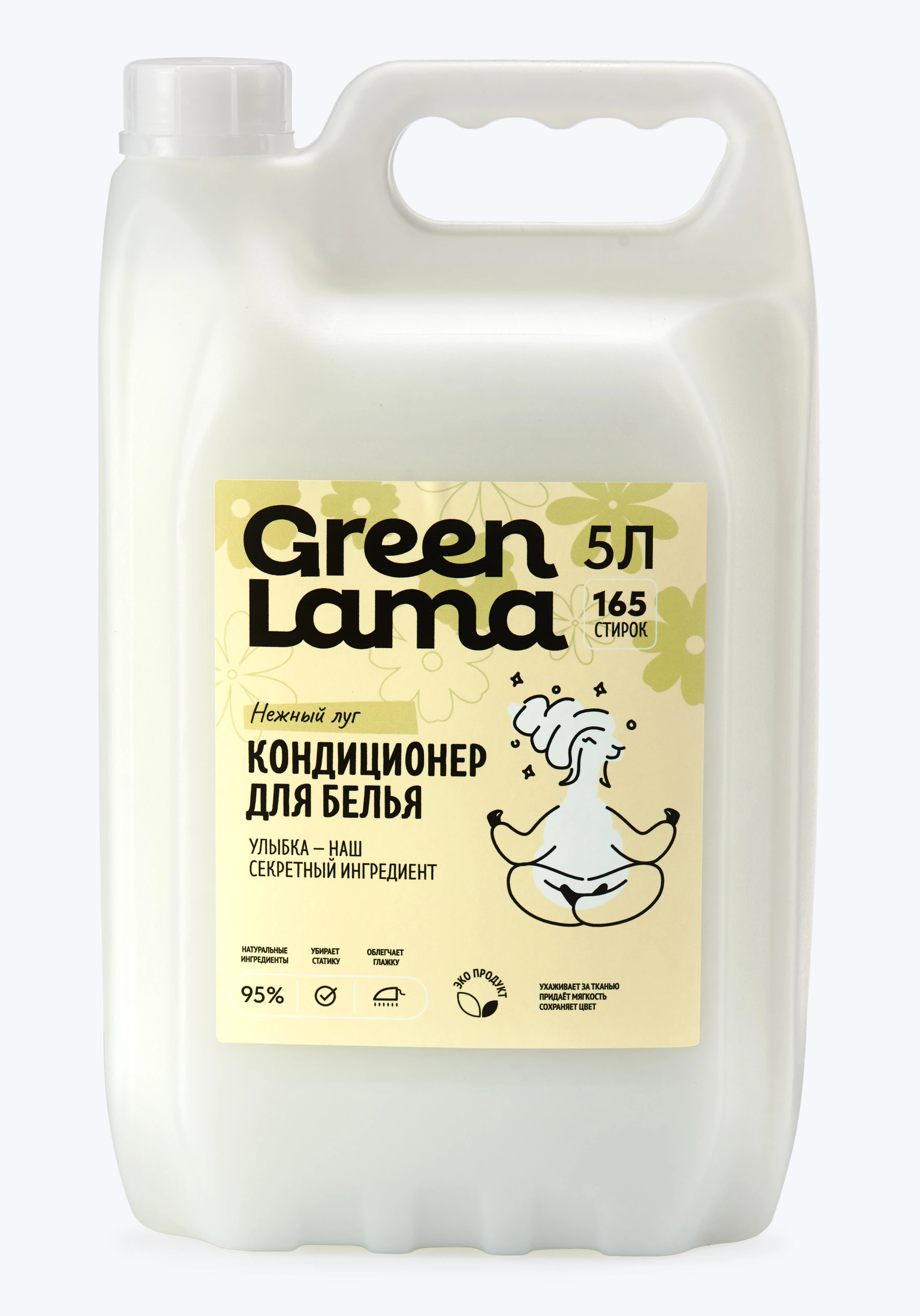
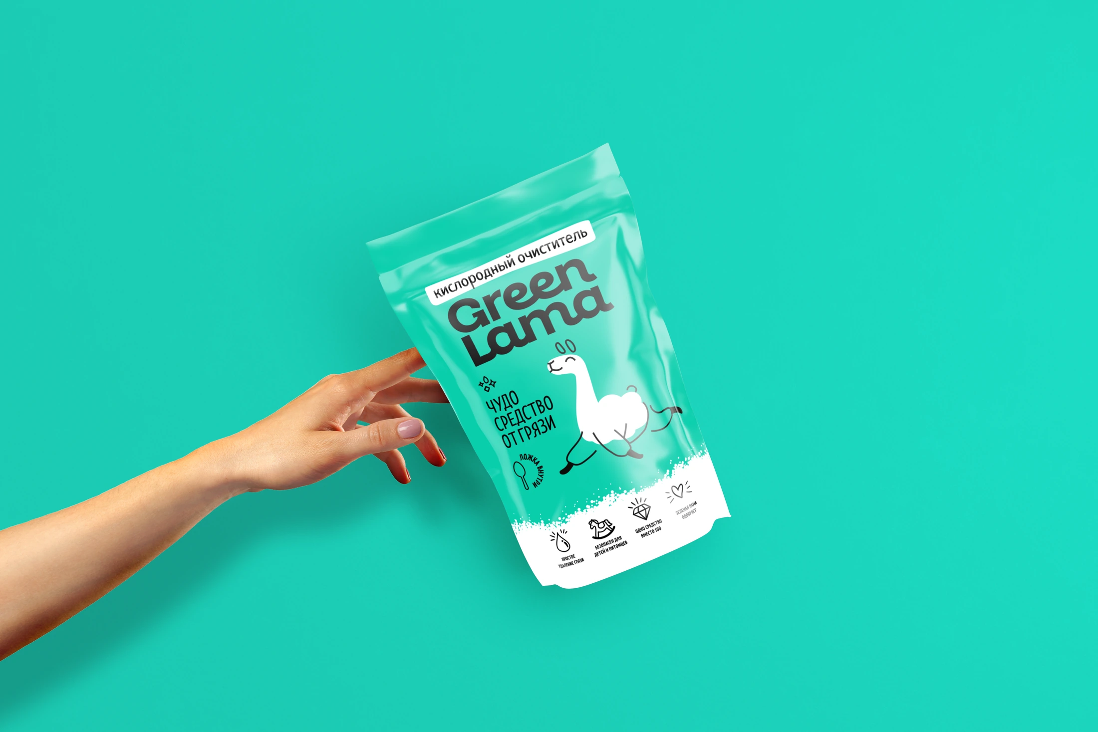
The wordmark establishes the brand first.
A clear information hierarchy explains the category.
The llama adds an emotional point of recognition.
Small illustrations and icons carry the visual language into supporting information.
Marketplace content has a different job from a label. It needs to introduce, explain and reassure across a sequence of screens. The original Wildberries and Ozon assets use the same turquoise, bold lettering, illustration and conversational tone.
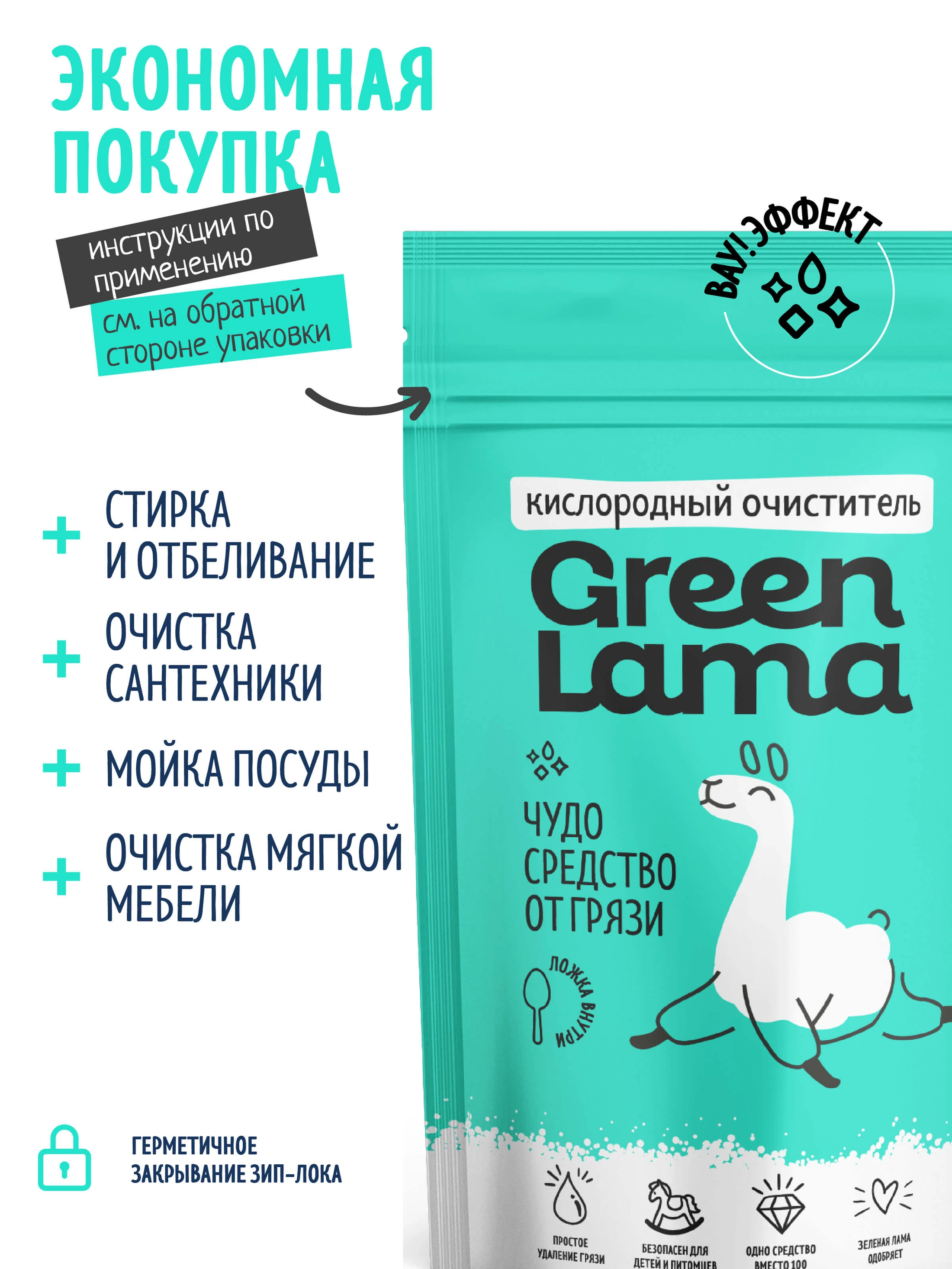
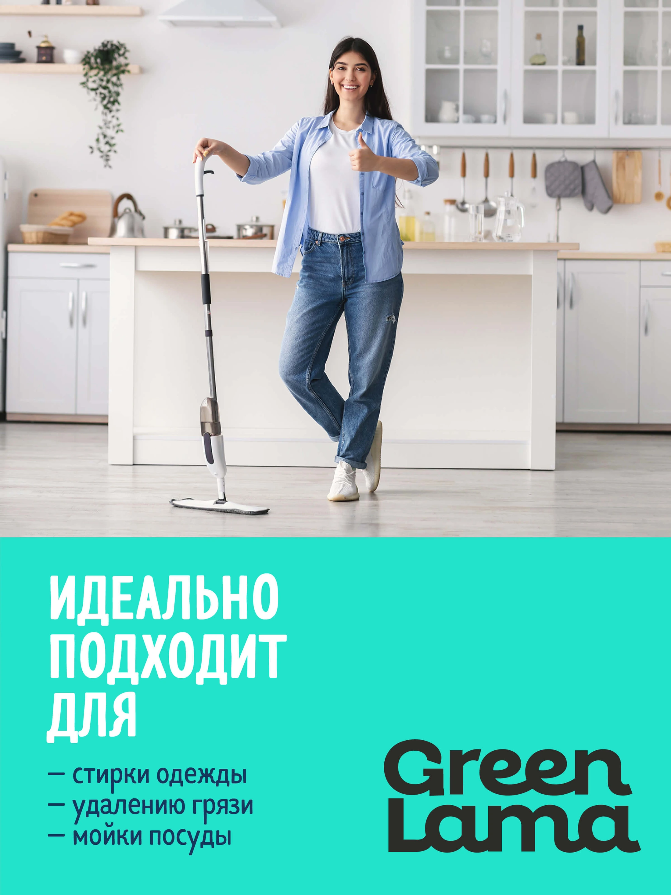
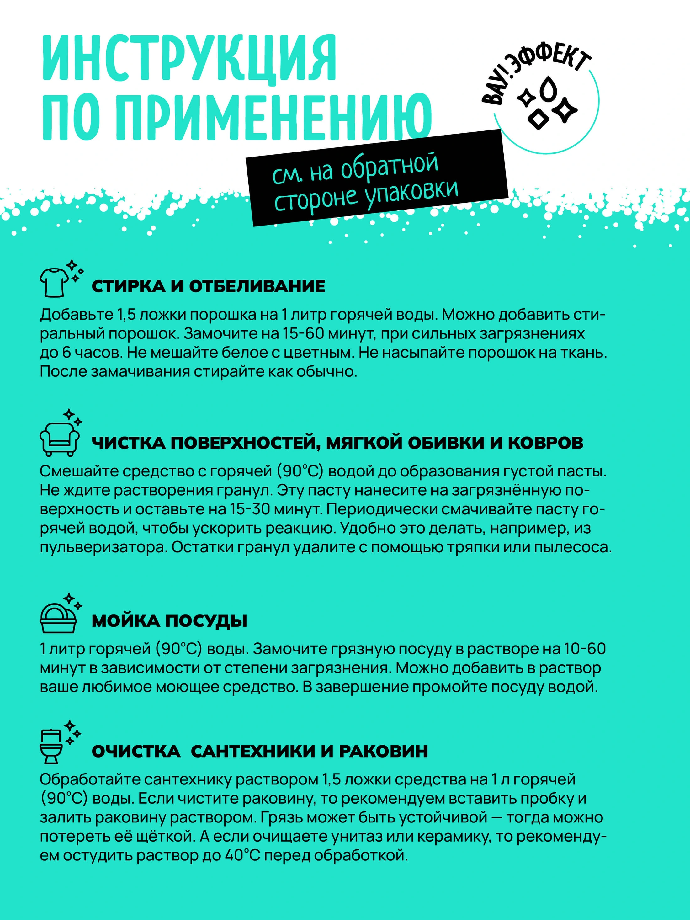
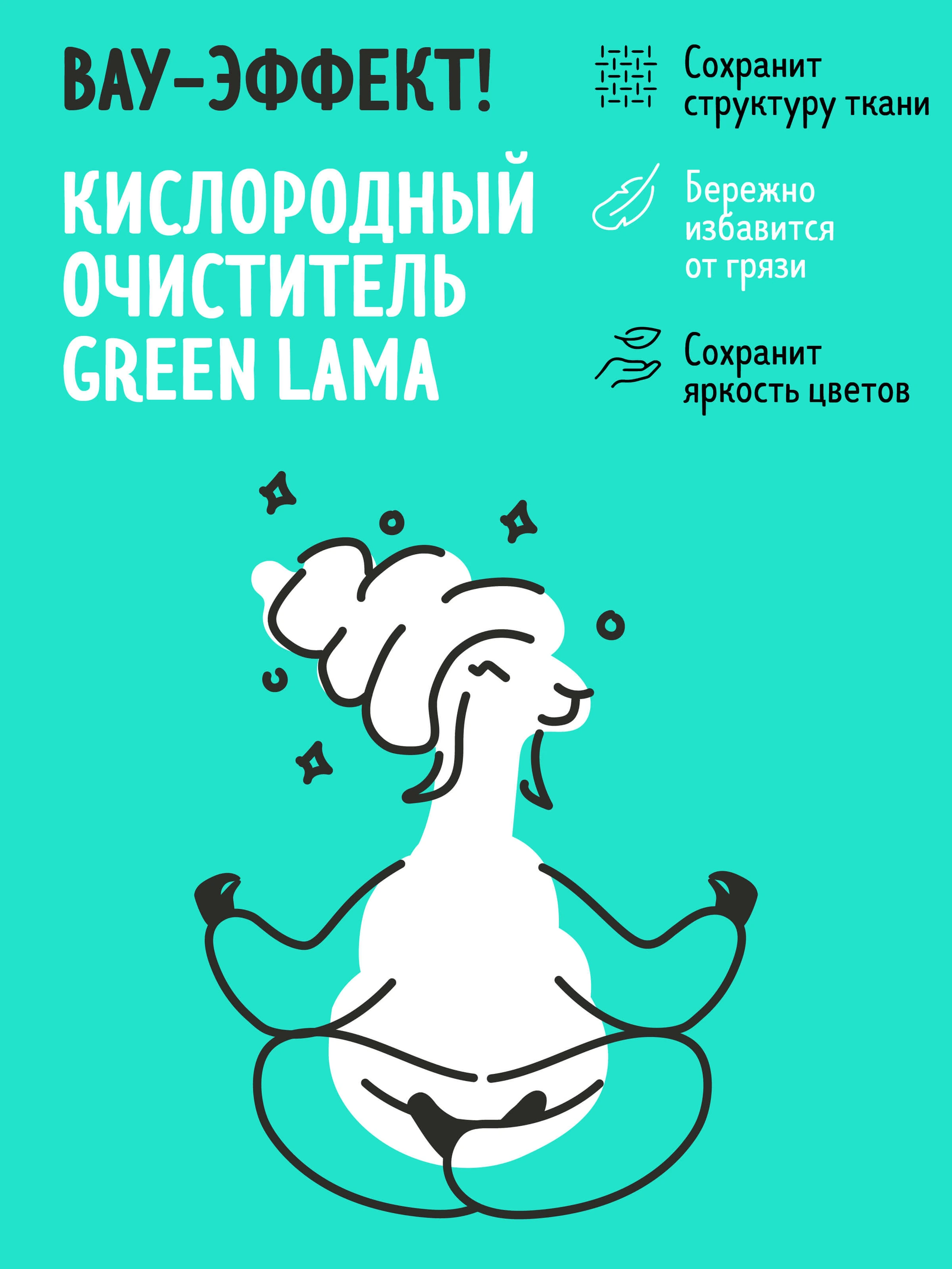
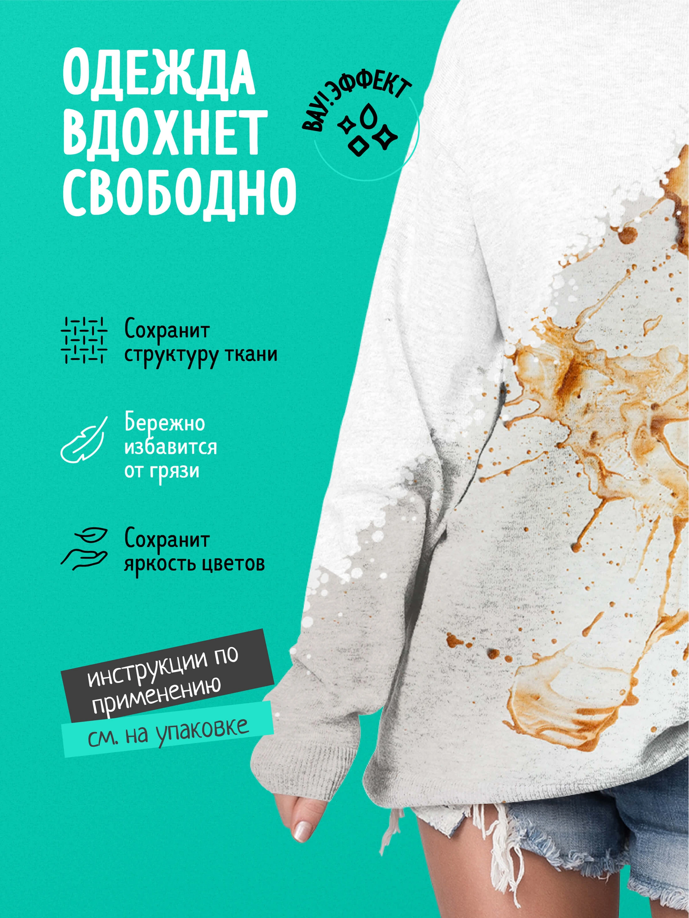
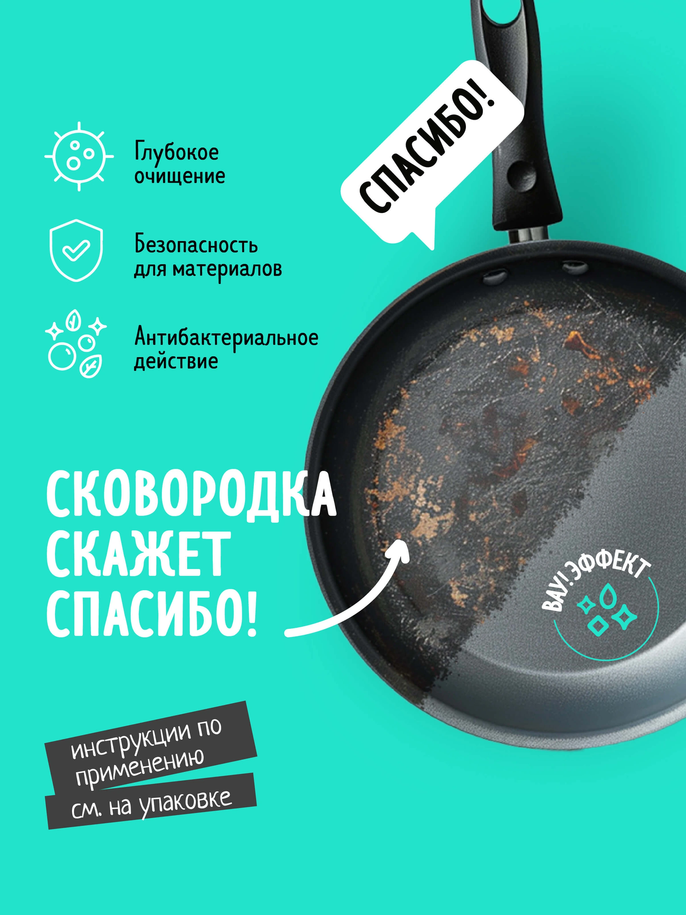
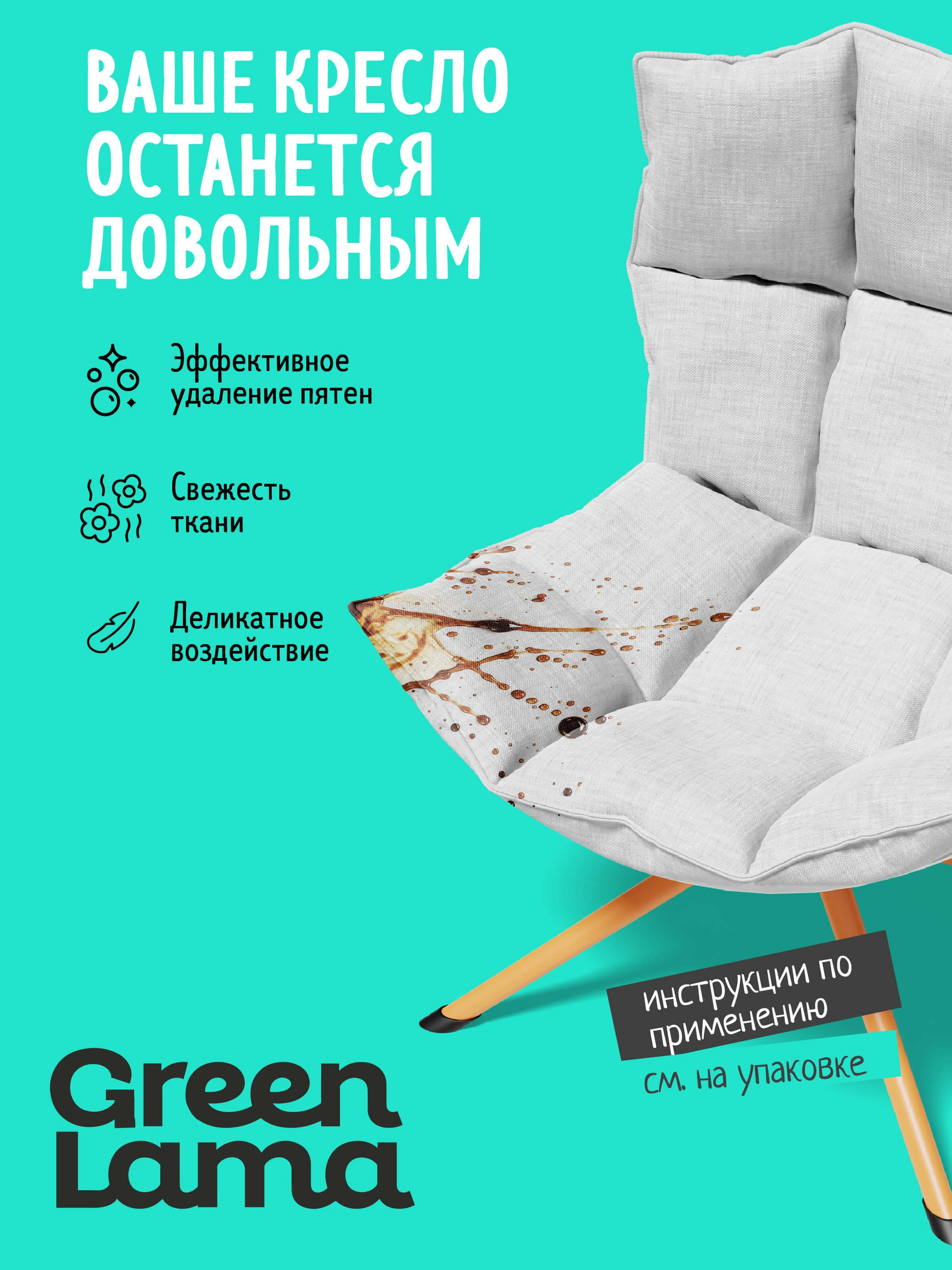
Original Russian-language marketplace artwork. English captions explain the communication design.
Beyond oxygen cleaner, the marketplace system gives laundry gel, fabric conditioner and dishwashing gel their own atmosphere. Colour, photography and the llama connect each sequence to the same brand.
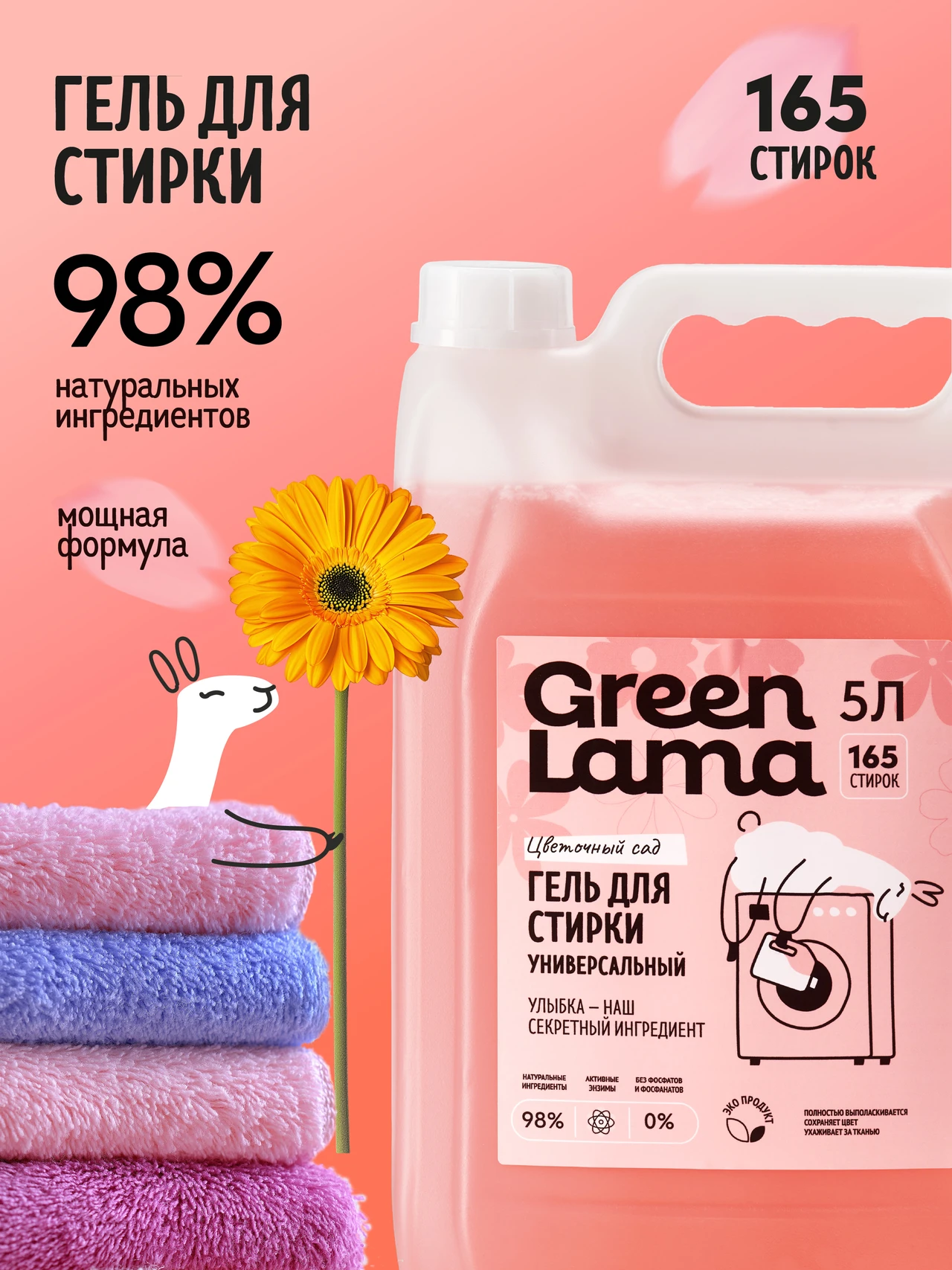
Warm pink, folded towels and flowers introduce the product. The surfing llama brings the foam story to life, while close-up imagery gives the information a different visual rhythm.
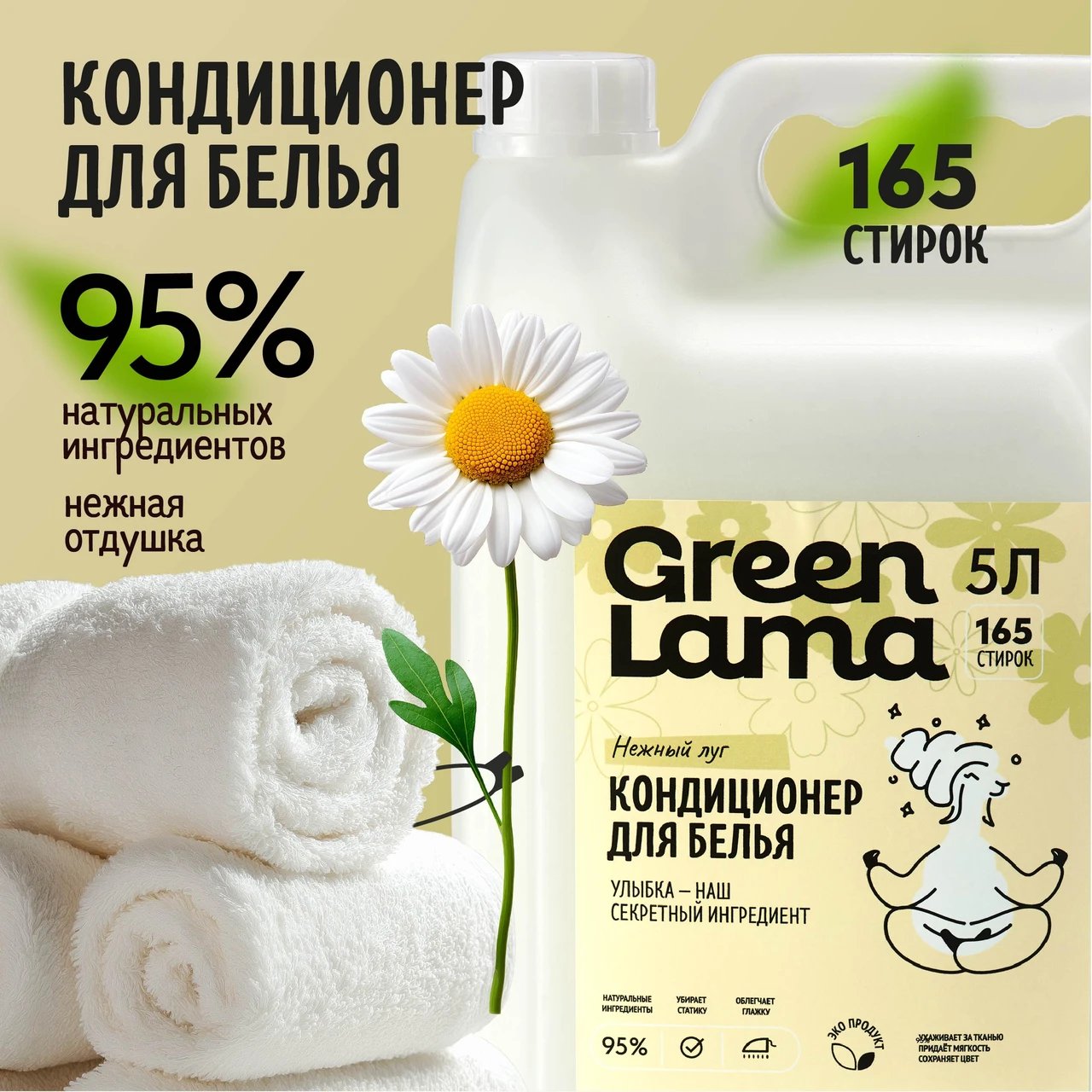
Cream tones, fresh linen and a feather create a gentler world for fabric conditioner. The same character adapts to this quieter mood without losing its identity.
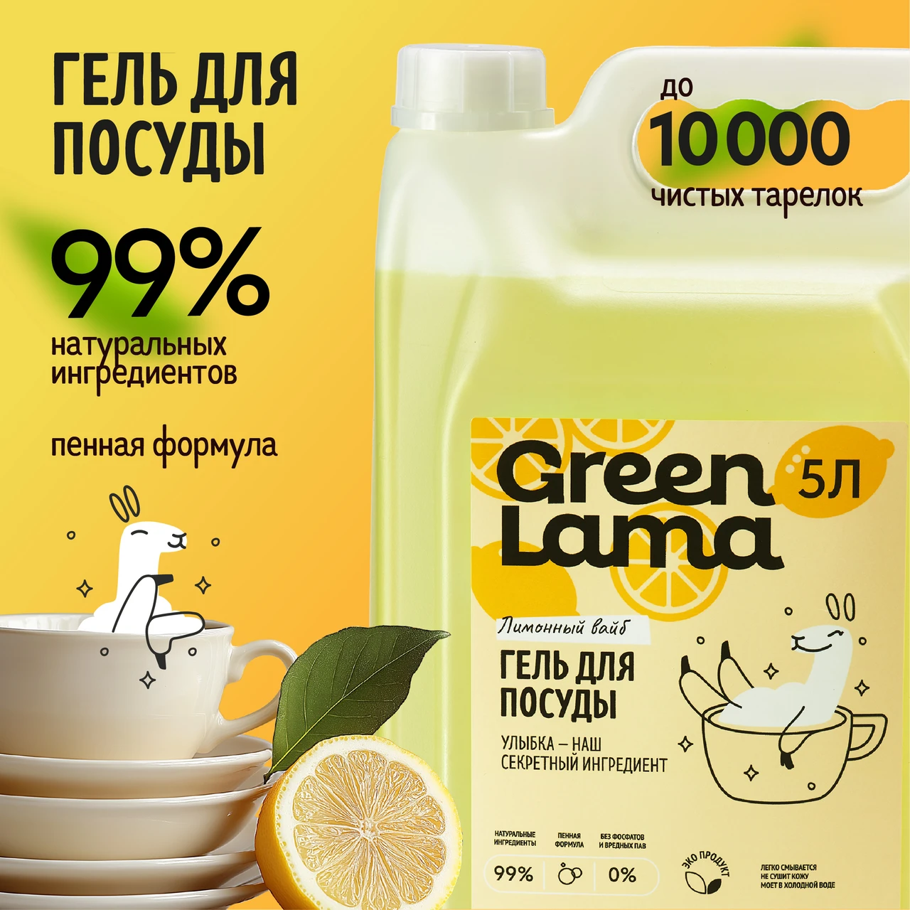
Lemon yellow, tableware and expressive foam give dishwashing its own energy. Product shots, character scenes and family imagery work as a connected sequence.
Original marketplace designs in Russian, with English commentary on the visual system.
The same identity carries through atmospheric product scenes, range introductions and customer communication. Photography builds a setting; the llama gives practical messages a recognisable voice.
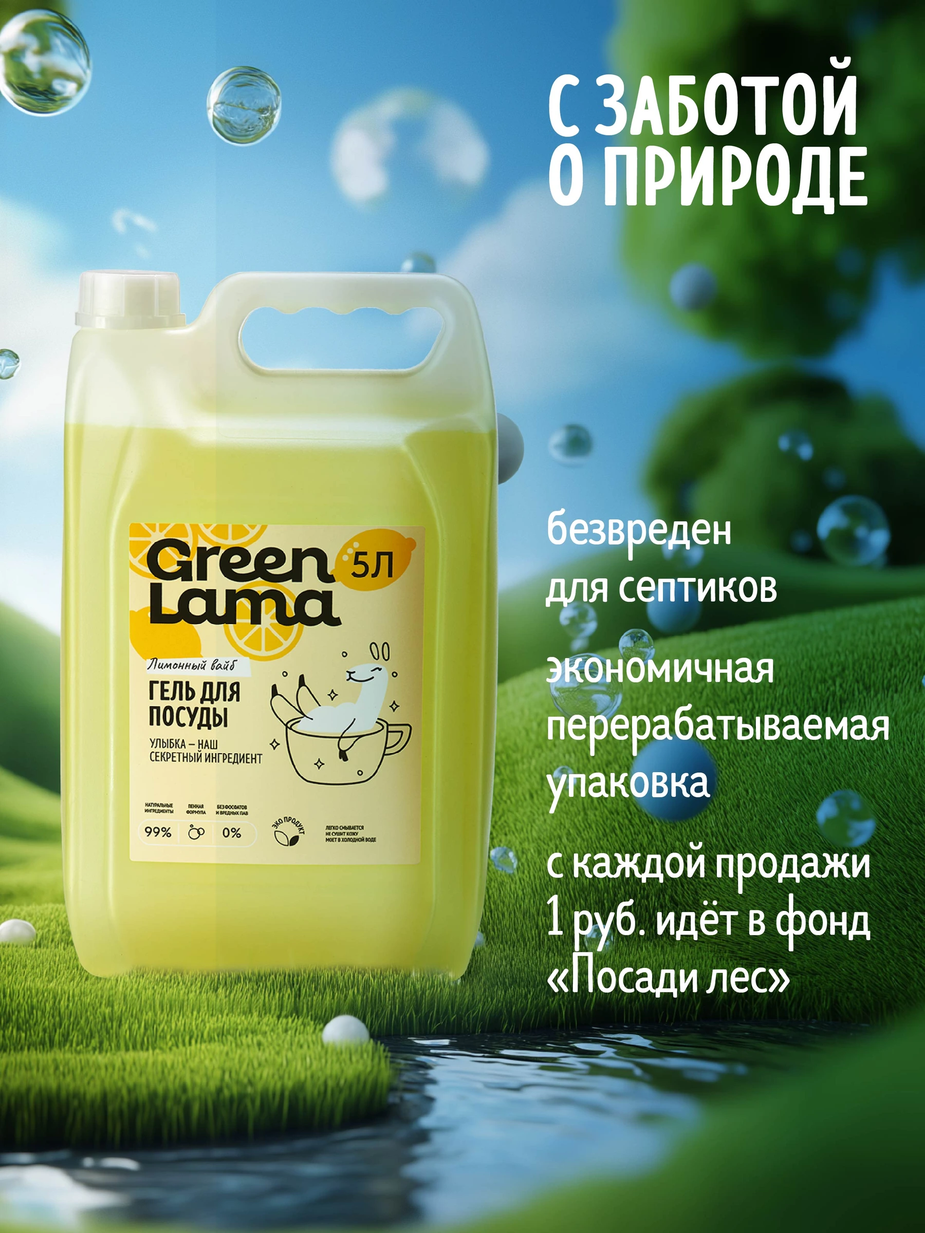
A lush green setting extends the visual story beyond the kitchen.
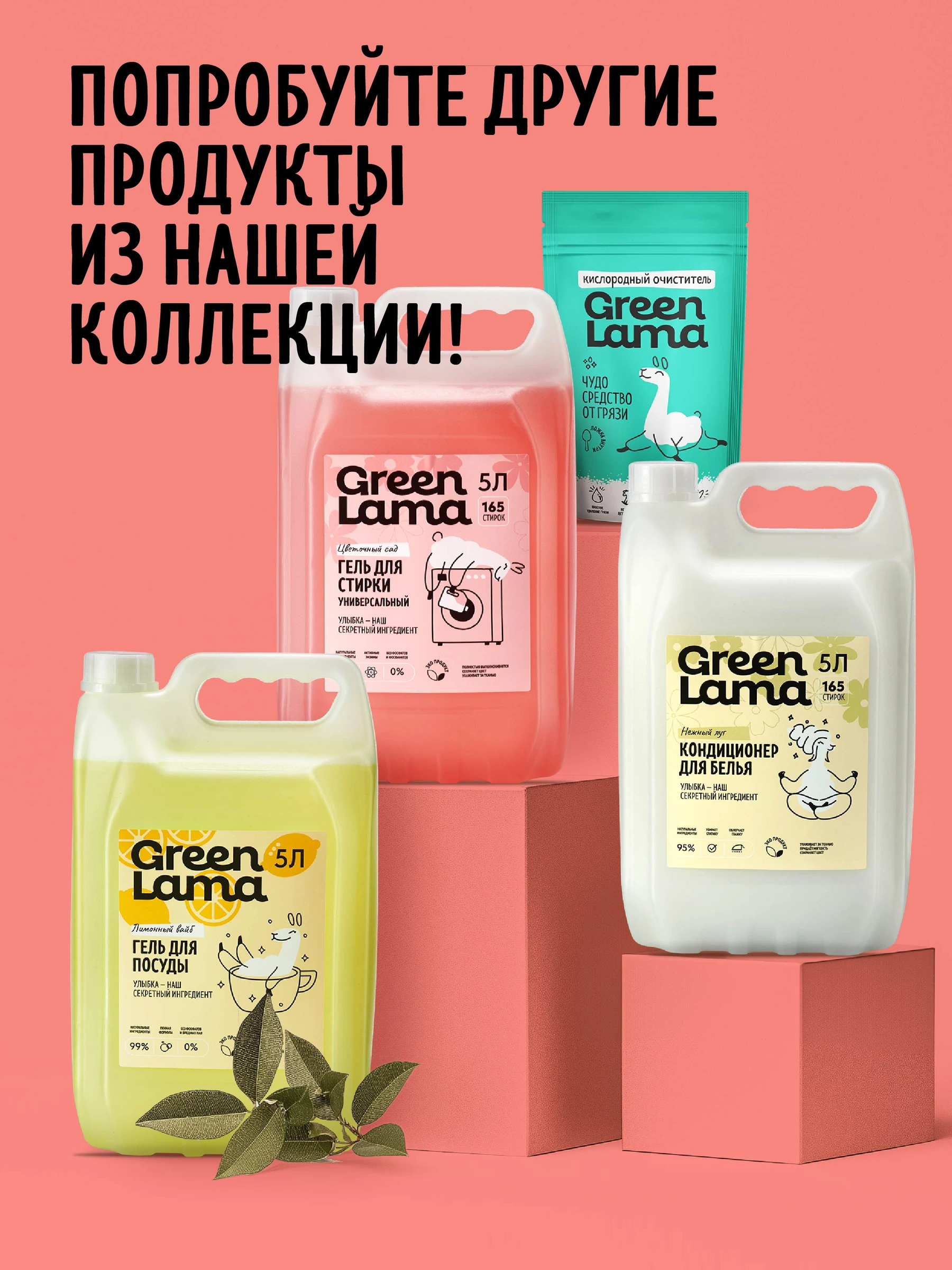
A staged product range connects different categories through colour and composition.
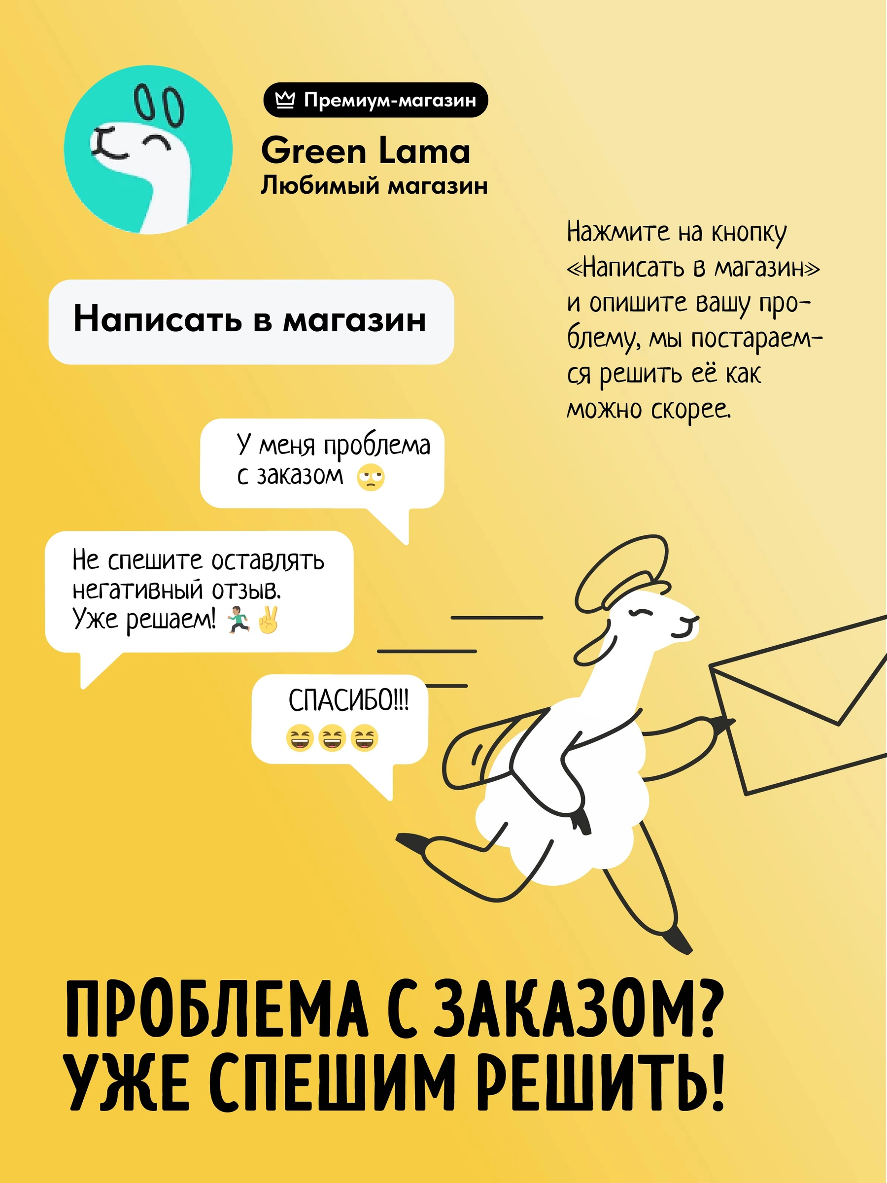
The llama turns a customer-support message into a friendly brand interaction.
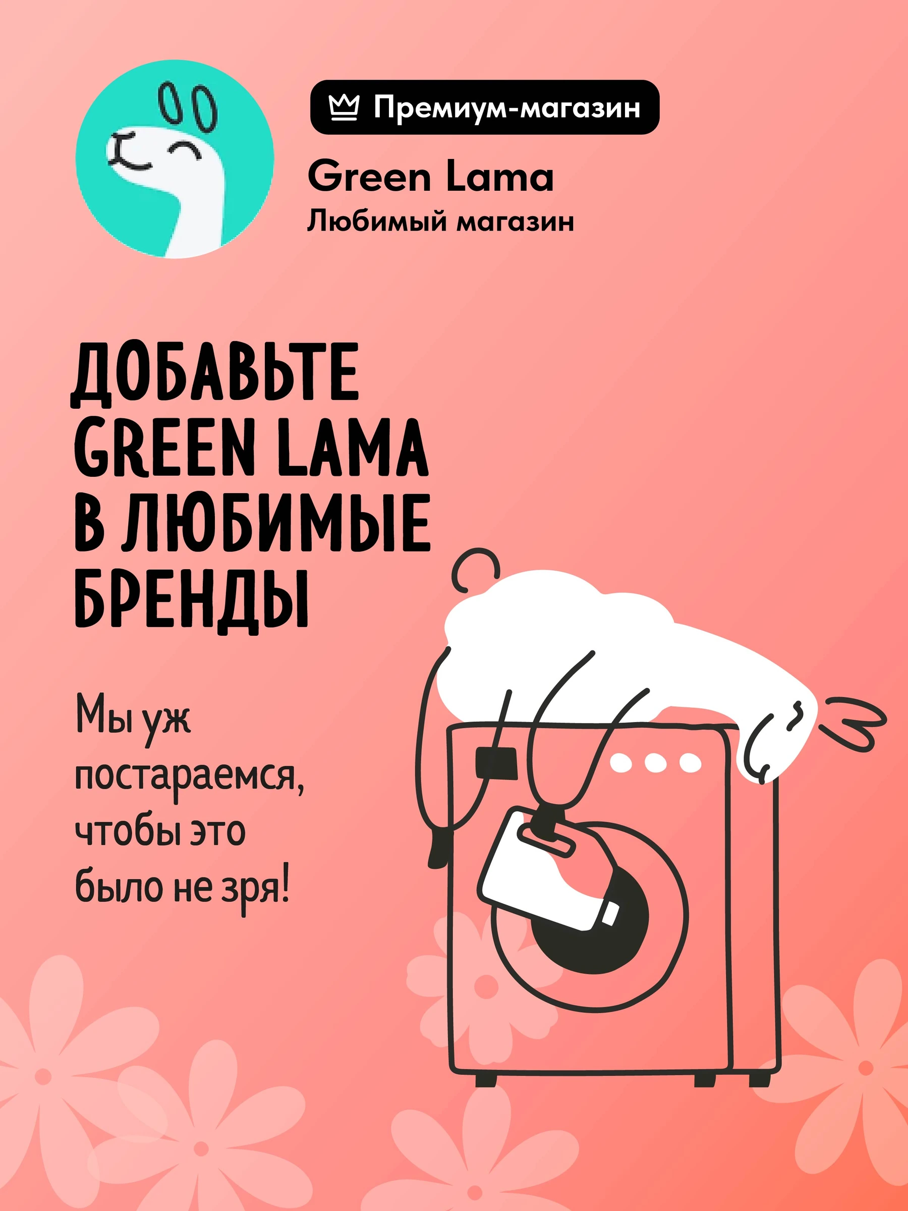
The washing-machine scene carries the character into the store’s follow-up communication.
The website materials carry the turquoise field and expressive composition into a wider format. Product photography and everyday situations provide context while the brand’s colour and tone keep the experience connected.
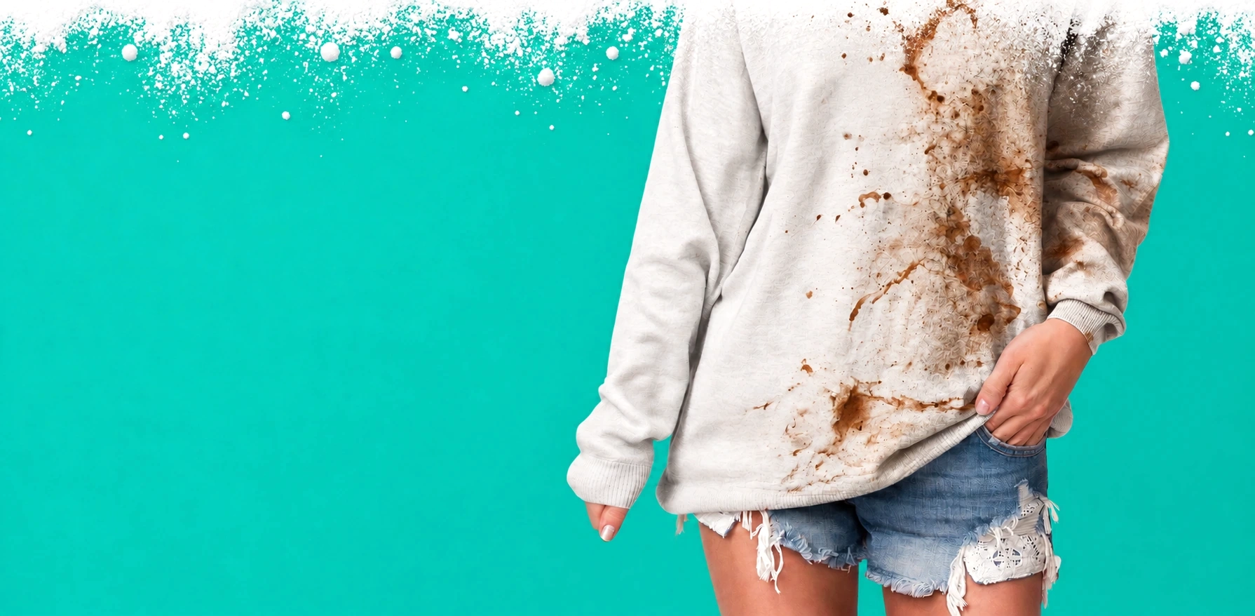
The platform defined the role: a friendly household helper. Character design turned that role into a flexible set of actions. Packaging gave those actions a practical context. Marketplace and digital content expanded the same language into a complete presentation.
Explore our branding methodThis case presents the 2024 continuation of Green Lama, with the earlier character shown for context. Original packaging and commercial artwork retain their Russian copy. English text explains the design decisions.